HOME | DD
 AP123 — Sympathy

Published: 2005-03-15 21:21:25 +0000 UTC; Views: 1122; Favourites: 24; Downloads: 321
Redirect to original
Description
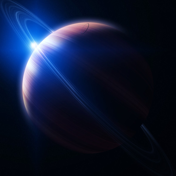
Please have some sympathy for me ;D! Pretty slick with the wording eh! Well just finished it, and hope you like it.Comments, crits,


 and watches are appreciated


Related content
Comments: 27

Awesome,
BTW can I barrow this for a pic I'm making, don't be afraid to say no.
👍: 0 ⏩: 0

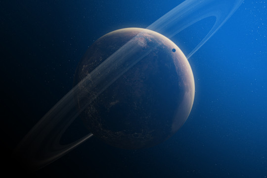
have never seen a piece of space art with such mix of simplicity, depth and realism
i'm in love with this one
no doubt, one of my favourites, ever
👍: 0 ⏩: 0

Love the asteroids. They're asteroids right? My screen is a bit dark and I'm too lazy to adjust it.
👍: 0 ⏩: 0

WOOOOOOOOOOOOOOOOOOOOOOOOOOOOOOOOOOOOOOO OOOOOOOOOOW... GOD, IT WAS MADE FOR GOD....


👍: 0 ⏩: 0

One, solitary critiscism:
The biggest planet's atmosphere has an outer glow that extends round to the sides of the shadow. Personally I beleive that this is the worst thing that can happen to a space piece.
The rest is beautiful, I love it. Especially the attention paid to the pretty stars... and the detailing such as the asteroids. Good work!
👍: 0 ⏩: 1

Thanks. The atmosphere is stretched out to the shadow, because the way the light hits the planet. Most atmospheres go beyond the shadow, since the planet is round it gives it that effect.
👍: 0 ⏩: 1

Yeah... may be realistic, but this is the only effect i don't like.
👍: 0 ⏩: 0

Oook, I really like it. I wish I could get my star fields as clean as yours.
My view on using filters:
There is absolutely nothing wrong with using it. Doing otherwise would lead to one taking an enormous and unnecessary amount of time on something that could take a few seconds with a filter. That saved time could then be used to make it look even better.
The tools are there to be used people. Use them.
Cool piece. faving it!
One thing about the axion stars: shouldn't they be...cleaner? More X like?
👍: 0 ⏩: 0

Very nice work. The empty starfield at the top creates a special feeling.
👍: 0 ⏩: 0

Well to me it looks like the texturing of the nebula section is a bit static and could use some more development- I +love that planet though, the starfield also looks a bit static to me but it's overall fairly effective. Cool asteroids. hmm, another thing I notice is that the stars seem to steal attention a bit when they are grouped around the edge- especially around the top. Could work some more with the colours aswell IMO (ie the purple flare affecting surroundings etc). See ya.
👍: 0 ⏩: 0

Simple yet articulate, man. Nice piece, great planet
and starfields! + fav
👍: 0 ⏩: 1

Thanks willy 
👍: 0 ⏩: 0

great lighting. i like how u did the planet. its well textured. did u make it from scratch or ready made textures were applied/painted on?
👍: 0 ⏩: 1

Thanks annis, the planet is from my work Kenton. I just shrunk it down, and rotated it. I'm suprised it kept most of the details 
👍: 0 ⏩: 1

you painted this? how in the world could you paint something like this? looks more like filters and such in photoshop
👍: 0 ⏩: 1

Ofcourse I painted it. No filters were used, 100% tablet. If you still dont believe me i'll send you the .psd file so you can take it apart piece by piece! Sorry if it looks like filters, but your not looking deep enough. Thanks for the comment
👍: 0 ⏩: 2

No filters? not even noise stars, find tha thard to believe and it looks like i can see some texture work so not all tablet i guess
Still i like the serenity of this piece Andy. Nice and simple.
👍: 0 ⏩: 1

Noise filter was used for starfield! Sam, I painted the designs with my tablet, but used texture erasers to get those designs! So were both right in a way
👍: 0 ⏩: 2

ah ha! I KNEW IT HAHAHHAHA.
um yeah...nice..
👍: 0 ⏩: 0

i beleive you man. looks unbeleiveable. even moreso that you painted it. mind if i look at the psd to see what it looks like peice by peice anyway? i think it could help my space art skills. i 
👍: 0 ⏩: 0

that's so beautiful!
very nice texture you have done here!
so detailed, so clean, so minimalistic!
i love your work, cause it's not overcrowded
with nebulars in hundreds of different colors
and your starfield is so amazing!
love it so much!
definitely a
👍: 0 ⏩: 1

Thanks bro 
👍: 0 ⏩: 0


