HOME | DD
 Apollyon888 — Vitreous Extrapolation 2
Published: 2010-08-03 02:36:02 +0000 UTC; Views: 526; Favourites: 16; Downloads: 9
Redirect to original
Description
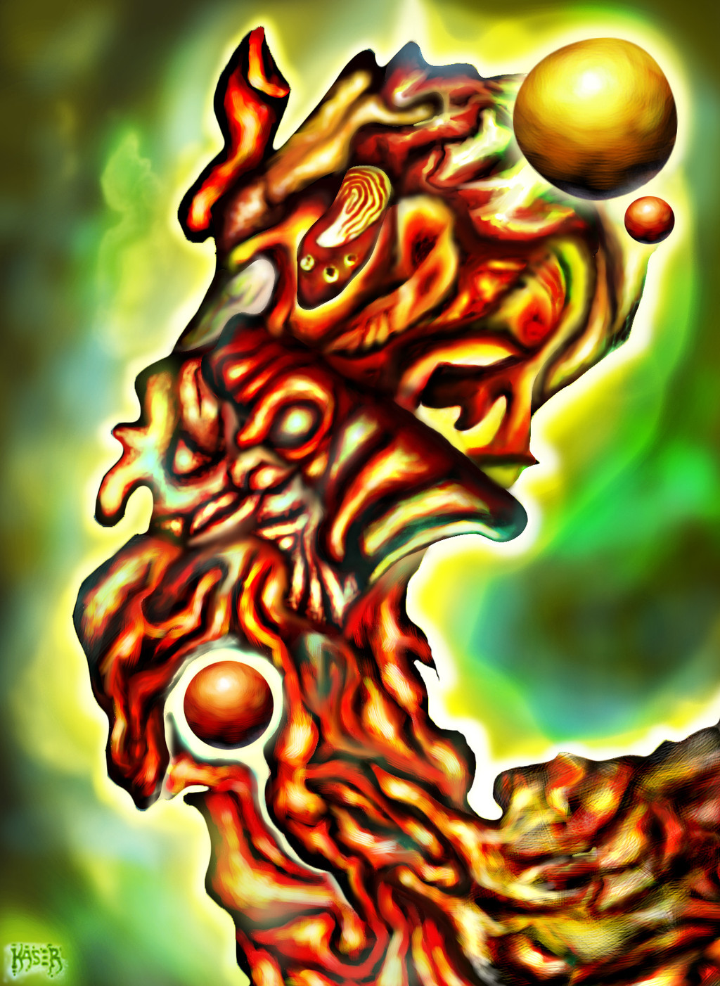
This is a digital re-do of an old drawing of mine. Entire piece done with brushes in photoshop on top of my original drawing. I'm learning as far as digital painting goes, so please please please critique the crap out of this piece for me. I need to learn more and improve. Don't worry about being harsh, I need the help. Thank you (Smile)")
Related content


Comments: 6


thanks, you're very kind
👍: 0 ⏩: 0

this is cool, I like everything, but the yellow orb at the top right, it just doesn't seem to "fit"
👍: 0 ⏩: 1
Thanks Dan. Agreed, it looked better in the pencil drawing I think, that sphere somehow looks to have lost it's "place" after being painted over. I hadnt noticed it.
👍: 0 ⏩: 0
Thanks Steve, that was very useful actually. I already use a lot of masks and layers and the such, but I hadn't thought of selecting by color range for fine tuning and adjustments. I'll give a shot and see if I can bring down the annoyingly extreme saturation levels here and there, and maybe play around with some other stuff too. I appreciate it man, thanks.
👍: 0 ⏩: 0

I'll do my best with a critique here. First off, it looks like you're doing fine with transposing from traditional media to digital. Since the image is very abstract in its conception (as opposed to a highly representational image) I'll offer some thoughts that may reflect more on my own "eye" than on the intent behind creating the image.
The first thing I noticed was the intense color saturation, which might be "maxing out" the display and producing a slight clipping here and there. One thing I often do is put one or more Adjustment Layers on top of the layer stack and fine tune the hue, saturation, contrast, etc. You might try some variations at different levels and see the extent to which you can tune an image without even touching a brush.
Another useful feature (and this is more like a rundown of Photoshop features than a critique - also pardon me if you already know this stuff
Wow, I don't want to bore you with this tech stuff (especially if you already know it!) But I myself will often make a number of variations on a painting using these and similar methods to control how I'm affecting the image quality - and to isolate the effects to certain areas or color ranges or brightness levels.
There's really no "right" or "wrong" way to use Photoshop - that's what makes it such a fantastic program. But a lot of the power lies in making use of some of these features, like using the channels and adjustment layers and curve editor and so on and so forth.
Before I write "War and Peace" here, I'd better cut short and offer a suggestion: Take the image you have, and play around with some adjustments using some sort of mask. There's no "wrong step" or "mistake" you can make here. It will just give you insight into all the tools and their potential.
Whew! I hope that isn't overly confusing - it can be hard to articulate some of these things - much easier if you can see it in practice. I hope this is helpful in some way
👍: 0 ⏩: 0