HOME | DD
 apox0n — First Breath of Spring
by-nc-nd
apox0n — First Breath of Spring
by-nc-nd

Published: 2011-03-27 01:39:56 +0000 UTC; Views: 602; Favourites: 22; Downloads: 10
Redirect to original
Description
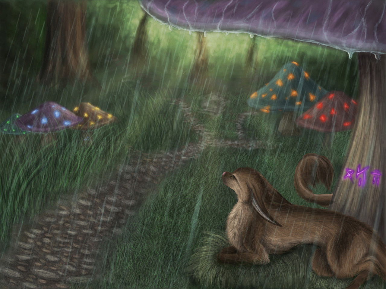
i believe i've mentioned my great dislike for winter?well... spring hath sprung, compliments of Ben!
i left out his rainbow wings because honestly, i felt that may have been a little much...
---
this will be available as a single print in the AC art show, and i'll be submitting it into the conbook as well.
so obviously any critiques are welcomed beforehand!
Related content


Comments: 11

This looks awesome, I think it is really amazing, the detail work looks really incredible and I really like the colors as well as the glow effects. Awesome work.
👍: 0 ⏩: 1

In reply to your request for critiques:
Good Points
Lovely character design work! The feeling is gentle, the plants are very nicely controlled and the tree is really dynamic. you've done a lovely job on combining the fantasy/sci-fi element of the staff and the landscape has sufficient attention to it to sell it as real. In animation this'd be called 'staging' and you've nailed it so well. It looks rough (in brush strokes) but it's pretty consistent throughout.
The Not so Good Points
The mountains. Objects in the distance should lose detail. With the speckled surfaces, they're brought more to the foreground than background. Perhaps what would have worked better may have been to make them more like glaciers instead of smoothly rounded off hills. This'd have give them more contrast for one, and you could then have added a smokey layer on top of them to knock out detail. They're just a little TOO obvious as they are, when I feel the focus OUGHT to be on your character and plants are priority #1, the tree and snow #2, the staff #3 and the mountains waaaay down there at around #11, between the sky, the rainbow, the reeds and sticks, the shadow, shading, lighting, your char's eye, footprint, etc etc. And I just noticed the reflection in the snow from the rainbow. Great attention to detail.
This is a lovely piece of work!

👍: 0 ⏩: 1

:3
awesome! thank you so much!
i wasn't sure about the mountains, to be honest. i was going by memory of what our mountains at home look like, right after a snowfall, it's weird, but you can actually pick out individual trees sometimes... kinda like this: [link]
i think you're right though. i'll try and mute them/blur them a bit more :3
thank you so much for the input!
^___^
👍: 0 ⏩: 0

This is amazing, I wish I were as talented ad you *0* keep up the great work!
👍: 0 ⏩: 1
awww, thank you!
:3
i shall have to try!
👍: 0 ⏩: 0

your shadow work is amazing. And your fur just keeps getting better
👍: 0 ⏩: 1

This is wonderful! The only thing I have an issue with is the composition. It's long so it seems it's supposed to be a banner of some sort. Him and the tree seem a bit far away from each other.
But. That could just be my own personal preference talking.
👍: 0 ⏩: 1
it is indeed intended to be a bannar-ish design. i'll have it on an extended/panorama type print. and frame... and matte. i hope. lol.
thank you very much for the input!

👍: 0 ⏩: 1