HOME | DD
 arleetec — Digital Modus
Published: 2001-07-17 02:19:48 +0000 UTC; Views: 1019; Favourites: 2; Downloads: 214
Redirect to original
Description
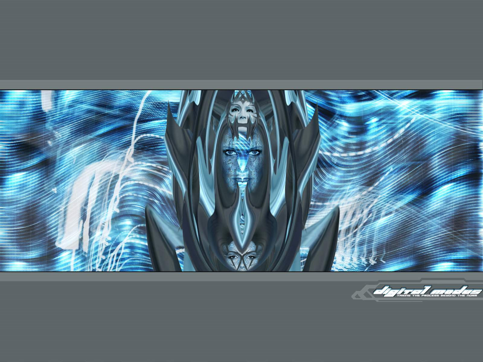
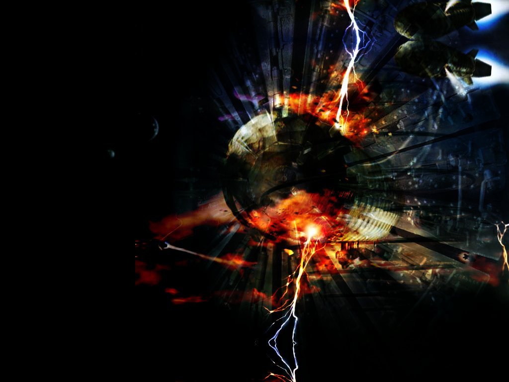
Whew finally finished this one, its the last one in my "Aquarian" series. Wanted to make it useable and at the same time provide the user with some eyecandy. Your comments as always is appreciated. Thanks*Zoom to see the details, screenshot is 1600x1200 and the other resolutions are in the zip*
Related content


Comments: 43

Wow! room for my icons and sweet eyecandy, another one that made my desk, good job.
--------------
Graphic-forums.com
👍: 0 ⏩: 0

this is great, should put it on one the servers at work, will work great im sure. peace man
-----
::Come Back! Thats My Monkey::
::Home Of The Bad Monkey::
::http://PlayBuddy.Tripod.com Hey this is my Link!::
👍: 0 ⏩: 0

it has both of the only 2 colors that i permit on my desktop. very fine detailing, totally groovy. i love this, very special work arlee.
rajiv--
👍: 0 ⏩: 0

Why on Earth didn't i know about u before the other day...weird
Great piece man, the colours and smooth shapes in the focal point work awesomely, as does the certain symmetry that this piece shows. I think althogh it creates a little contrast, the blue in the centre could be a little more desaturated. The parts left and right of the faces also have a bit of aliasing, maybe a blur would fix that. The borders work well at focusing the image which is good, as is the piece as a whole.
I love it man, great work
||D.V.S||
👍: 0 ⏩: 0

Great mixture of colors and the blending is top notch. I think this wallpaper is off the charts, and I'll be sad to the see the series end. Excellent wallpaper.
metadream.com - Sal Loria
deviantMAG.com - Senior Editor - Software Reviews
deviantART.com - Addict
👍: 0 ⏩: 0

oh wow dude, this is cool shiot!!
the cool blues give it a neat icy effect, although I'll have to disagree with chilly art right now.. its too damn cold!!
how amazing the human mind is, and how amazingly ignorant the human mind can be...
👍: 0 ⏩: 0

Wow, i've to agree: "wicked" indeed... wish i could blend like that.
PMQ.
👍: 0 ⏩: 0

What a trip! And a 1600x1200 to boot; don't find many walls that come ready to go on a 21" display. Neato!
👍: 0 ⏩: 0

symetrical and chaotic at the same time, I enjoy what you did with the center, and while I prefere black in the letterbox area, I understand why you did it in grey, it just fits better. I love blue.
*********************
This post brought to you
by the letter x the number
42 and by readers like you
*********************
www.studio-42.net
***************
👍: 0 ⏩: 0

You waork is always so great... but what can a say... I HATE IT... as a wallpaper and would prefer to see it as somewhat of a splash screen of some wicked games... but that's my own oppionion... I really like how everything blended in nicely and look so neat... great stuff keep it up...
: :
End Of The World http://www.darkomen-networking.com/karn/
👍: 0 ⏩: 0


slick, sleek, and sexy. very easy on the eyes as well, as a good wall should be.
[death is the first dance eternal]
👍: 0 ⏩: 0

that's some yummy eyecandy, alright. fantastic creation, arlee. i like the the swirly blue movemnt at the background. and the center image is simply wicked. keep it up!
👍: 0 ⏩: 0

damn i never realized that you were such a talented artist i guess i'll have to check out your stuff on a daily basis now, man really i love this wallpaper, i wish i could do that!
Good Riddance,
Nick Pellegrino (Cype)
👍: 0 ⏩: 0

8;2;2001
Digital Modus ; https://www.deviantart.com/deviation.php? id=60535 by arleetec ; https://arleetec.deviantart.com is a wallpaper that yes, is four times the size of my screen resolution, but is so detailed that i'd sit and stare at it in a browser for hours just to create the illusion of something so wonderful on my desktop daily. after all of the smudging, layering, designing, after it all, i am left awestruck at the piece before me. even the screen shot of the image is stellar. i browsed through the many comments on this wallpaper, and saw a consistency there, everyone loves this wallpaper, it is, simply, "wicked." the use of bright, soothing blues on a grey scan-lined letterbox is something that can never be overdone, and works astoundingly with this piece. i don't know how else to praise this creation, the face that makes up the center of this piece is so detailed, so ethereal, you get grasped by the hand and pulled inside. beautiful job.
*- absolutely breath taking, ricky.
you can't keep me silent.
👍: 0 ⏩: 0

Holy shiaT! damn nice!!
[Angles DO Excist]
[www.gaiden.n3.net]
👍: 0 ⏩: 0

Smooth wall paper. Perhaps use the scan lines as a mask for some gradients that are wavy (for the water feel).
Otherwise a satisfactory piece.
👍: 0 ⏩: 0

my favorate part is this middle section nifty work
yet again from arl
👍: 0 ⏩: 0

very nice...i'm with everyone else though-i'd like to see the middle much bigger...
why use your mind when your genitals will serve you just as well anyways?
👍: 0 ⏩: 0

hmm.... well auhm..where to begin? i LOVe the colors :mah fav: i love how its integrated so smoothly with the faces and everythything mys flows so smoothy..... ahhh fuxor it...its my new BG
A++ man A++
oint of Fact: its all fun and games until someone gets there ass kicked...
👍: 0 ⏩: 0


wonder how i missed this... anyway.. this is awesome work... im gonna shrink it and use it as my bg..
sophus
:AIM:s0phus
I dare you to challenge me in a battle of wits... I shall be unarmed... as usual...
👍: 0 ⏩: 0

I think that if there would have been man face in the middle itwould have been even more powerful...........
try it out.
but is not bad either.......
virtual planet :: http://www.planetavi.com
👍: 0 ⏩: 0

the middle is pretty damn cool, very creative :]
i don't like the background tho ;[
Make.shift*
http://www.makeshift.ca
👍: 0 ⏩: 0

Incredible work you have here. I mean just plain awesome. Theres nothing else I can say that would do it justice. Awesome job.
Nate
-------------
::::check.out.Digital.Obscurity//
http://www.digitalobscurity.com
::fully.redesigned.for.your.pleasure:::: :
👍: 0 ⏩: 0

Hmmm
As critical as I can be, the only thing that I can say is that I wish the central image filled more of the 1200 pixel height-
Excellent work.
The Darkzone: https://darkzone.deviantart.net
👍: 0 ⏩: 0

Wow nice!
I really like those lines; they have a hypnotizing effect on me
Good Job!
👍: 0 ⏩: 0

FANTASTICALISTIC!!!!!!!!!
[-|-|-|-|-|-|-|-|-|-]
The Way Out is Through
👍: 0 ⏩: 0

damn that's tight. I love all of it. the totem pole of ice queens is gorgeous in the center and the flowing blue fill is great.
LT http://www.longtooth.com
👍: 0 ⏩: 0

enough eye candy to chock a horse
it is not that the to the world you are a person, but the person that you are the world
==> www.determinereality.cjb.com
👍: 0 ⏩: 0

the center part is simply wicked. dont much care for the area outside the letterbox, which would normally be one color (like black). the scanlines seem to distract from the image, but that could just be me.
:: jark ::
:: deviantART dot com loves you ::
::[ oderint dum metuant ]::
👍: 0 ⏩: 0

well i think the title fits well.. your unique style is very apparent in this piece.. much more than your other ones.. im likin it alot.. and the details are xcellente..!!
ps. those borders work very well in balancing this one.. good job as always! ))
:fuzzys:
http://www.absolutely-fuzzy.com
👍: 0 ⏩: 0

This one is more spooky more eerie then the first two. I really love the result though. The only thing that bothers me about this one is the title. The first two in the series had a more "watery" name that seemed to fit better. Well as always I'm in awe of your skill.
This one goes on my desktop right now.
👍: 0 ⏩: 0

ohmyf%$@nggod! ahahaha, this is wickedly kickass arlee! I love what you did with the background; those neat swirly/wavy lines. Damn man, how do you DO this?! This is going on my desktop (once I get back to .ca that is). DD for this one! Please? *grin*
.:they call me woozie:.
~wooziefied~
👍: 0 ⏩: 0

Good job on this one, my only problem is that wallpapers like these are a dime a dozen. Other than that, AWSOME! Nice cold colors makes it feel like ICE or something along that sort. Maybe energy? Most people say that Warm colors are better than cold, I say FUCK the temperature, use the colors that best fit. And they fit perfect.
👍: 0 ⏩: 0

i love blue, and this kicks ass, its so sleeck and clean and so nicely manipulated, great job, love it
------------------
I once heard the shortest horror story:
The last person on earth sat in a room,
Something knocked on the door
👍: 0 ⏩: 0

Ok i'm with the other guys on the middle part. Wicked and that is an understatement, But unlike the others. I do like the way you add the borders. I don't know it gives focus to where it belong. My 2 cents.
BruB
I will be the last voice that you will ever hear, Please do not be alarm!
👍: 0 ⏩: 0

Sawheeet. It's great Arle man, but the borders aren't workin for me, wicked design.
ReoCON
Dead and Forgotten
👍: 0 ⏩: 0

Pretty damn smooth. I'm not so huge on the border, but the inside is pretty cool.
👍: 0 ⏩: 0

the faces are good, the lines are good. pretty cool all around
👍: 0 ⏩: 0

Yea, donno what it reminds me of but definatel wicked
[angelofpeace]|[AoP]|[Exit Reality.]
👍: 0 ⏩: 0

Supremely wicked piece of work. I like the colors and the faces. Great job.
👍: 0 ⏩: 0

Wow, that's simply wicked man. I love the colours or blue. It makes it seem so cold. The integrated faces and images are wickedly done. Fantastic work.
Mathias
http://www.brazengraphics.com BrazenGraphics.com
👍: 0 ⏩: 0