HOME | DD
 arleetec — arleetec DA Header v2

Published: 2002-02-19 23:41:15 +0000 UTC; Views: 390; Favourites: 1; Downloads: 64
Redirect to original
Description
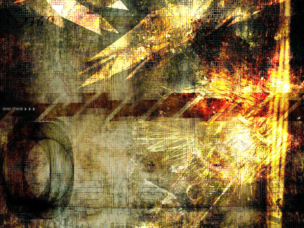
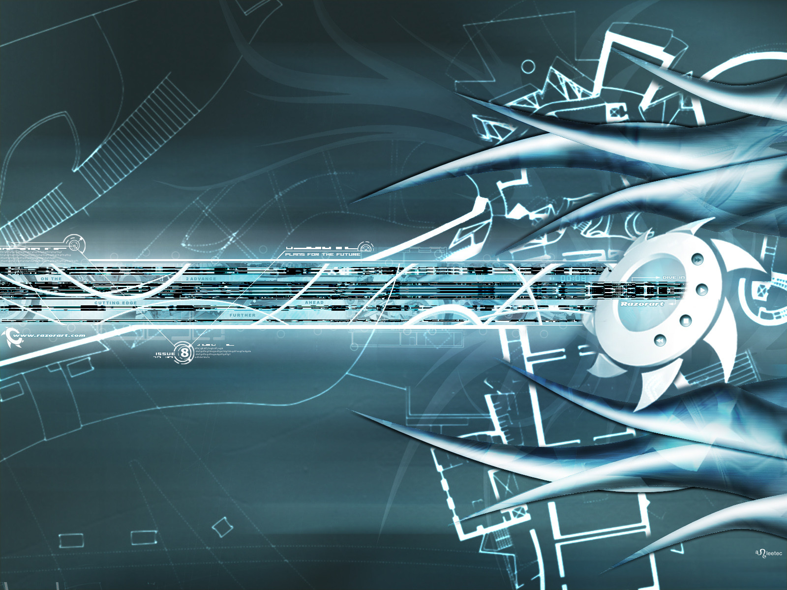
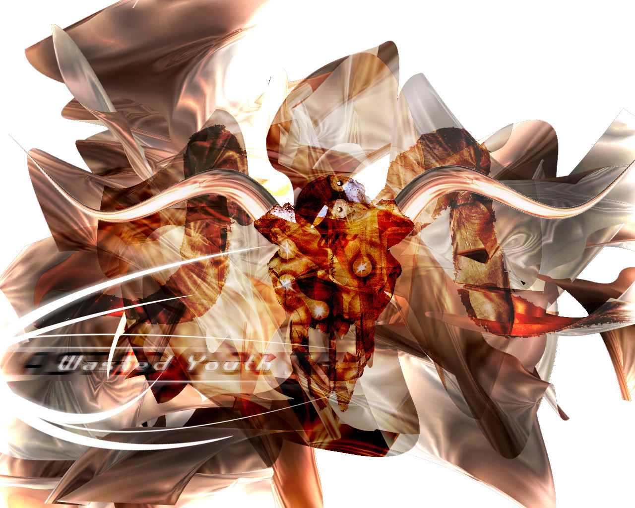
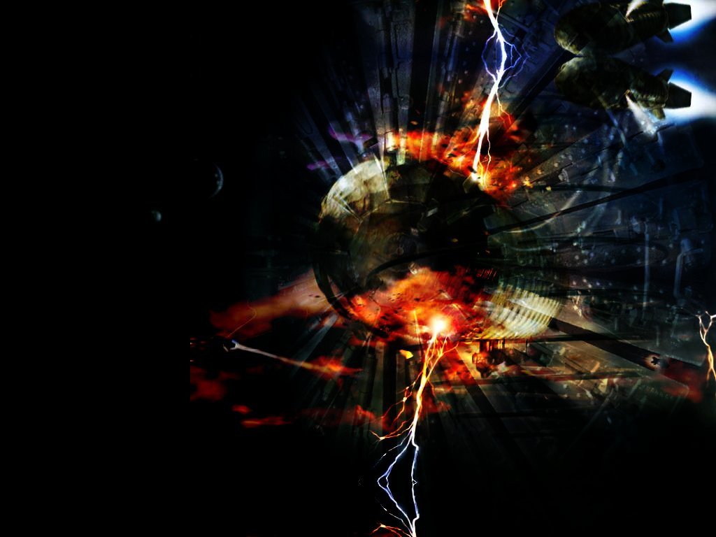
A new header for a new DA v.2. Hope you guys like it.Related content


Comments: 29

haha~it's very funny~ thoughtful i think~
-----
almost confused [link]
👍: 0 ⏩: 0


like it even more now that it works. spooky-ooky
-----
LT http://www.longtooth.com
👍: 0 ⏩: 0

great header arlee, good black bg with a dash of that deviant green.
that face with a nice kickass headdress looks cool!
👍: 0 ⏩: 0

very nice work!
-----
Lifes a bowl of punch go ahead and spike it. -Nick Hexum, 311 - Music -PLAIN
FROM CHAOS IN STORES!
NEW SINGLE AMBER!
👍: 0 ⏩: 0

badass man, i really dig the semi-symettricity (?) of this piece. The font is cool, and the scanlines compliment it well. Tight man, tight.
-----
||D.V.S||
👍: 0 ⏩: 0

I like the contrast to version one (which I'm using right now ). The tentacles in the first one did it for me. I do like the colours and text though. Nice job as always Wai Wai
-----
.:they call me woozie:.
👍: 0 ⏩: 0


Slick header arl, looks great.
-----
sasso
metadream.com - deviantMAG.com
👍: 0 ⏩: 0
thanks, my old favorite header didn't fit no more and this great.
-----
LT http://www.longtooth.com
👍: 0 ⏩: 0

i ususally keep the default header so it will load faster when I surf around, but I'll check this out.
--------------
Graphic-forums.com
👍: 0 ⏩: 0

nice and quick!!!
-----
::Come Back! Thats My Monkey::
::Home Of The Bad Monkey::
::http://PlayBuddy.Tripod.com Hey this is my Link!::
👍: 0 ⏩: 0

As per usual you rule I really like the emphasization (that is probably not a word but I hope you know what I mean) on the darkness in devArt. The details are outstanding and this is my default header as soon as I've entered the settings page.
*slainte *
👍: 0 ⏩: 0


I like it..But is a bit to dark...Otherwise perfect....
-----
---------------------
Why do they sterilise needles for lethal injections?
---------------------
Its me (DevPack): https://www.deviantart.com/packs/view.php ?id=1422
👍: 0 ⏩: 0

I prefer the first one! I'm using it!!
-----
:fuzzys:
http://www.absolutely-fuzzy.com
👍: 0 ⏩: 0
pixelcatalyst [2002-02-20 04:20:14 +0000 UTC]
This fits well with the overall lay-out of deviantart2.
-----
http://pixelcatalyst.plastiqueweb.com
👍: 0 ⏩: 0


Seems like I have a problem trying to use it for DA v2. Keep getting the unable to get image crap. Do u have this problem?
-----
👍: 0 ⏩: 0
Cool! A change for a new header. This is very stylish. Just wish the text could be a bit more dynamic, seems to be a little flat for me.
-----
👍: 0 ⏩: 0

cool. I like the ones that seem to match the color scheme, however
-----
rince. noopy
hadowness. oder
👍: 0 ⏩: 0


nice, i like the design in the middle with the eyes. and the rest is pretty simple. cool header.
-----
5t3iggy
.:I decided i want you now i know...i need:.
👍: 0 ⏩: 0

It's perfectly 'you'
-----
RobC
::Thump Cartoons::
http://thump.americandrone.com
👍: 0 ⏩: 0


way kool man!
-----
=-justin-333-=
Life Is But Another Way To Torture ones Soul, But A Soul Would Not Exist Without Life
👍: 0 ⏩: 0

Good indeed, may I beg for a bit brighter text?
-----
_-_-_-_-_-_-_-_-_-_-_-_-_-_-_-_-_-
Writing is what I do inbetween breathing.
👍: 0 ⏩: 0
