HOME | DD

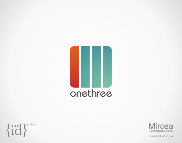
arpad — OneThree logo contest I by-nc-nd

Published: 2008-06-04 00:36:11 +0000 UTC; Views: 25154; Favourites: 172; Downloads: 0
Redirect to original
Description

[link]
Related content
Comments: 97

benedik [2008-06-04 08:39:37 +0000 UTC]

nice, really nice

👍: 0 ⏩: 1

arpad In reply to benedik [2008-06-04 16:25:40 +0000 UTC]

Cheers!

👍: 0 ⏩: 0

Excitera [2008-06-04 08:37:20 +0000 UTC]

your logo is the best of all in this contest!

👍: 0 ⏩: 1

arpad In reply to Excitera [2008-06-04 16:26:16 +0000 UTC]

I think so too, lets see what the contest holder thinks at the end!

👍: 0 ⏩: 0

Inspironx [2008-06-04 08:37:05 +0000 UTC]

Very nice.

👍: 0 ⏩: 1

arpad In reply to Inspironx [2008-06-04 16:26:22 +0000 UTC]

Thanks!

👍: 0 ⏩: 0

nortonnn [2008-06-04 08:29:18 +0000 UTC]

ahahah Niceee,
1 3
well done.

👍: 0 ⏩: 1

arpad In reply to nortonnn [2008-06-04 16:26:39 +0000 UTC]

I'm glad you saw that

👍: 0 ⏩: 0

BObul [2008-06-04 06:34:41 +0000 UTC]

like it

👍: 0 ⏩: 1

arpad In reply to BObul [2008-06-04 16:26:46 +0000 UTC]

Cheers

👍: 0 ⏩: 0

EnzuDes1gn In reply to ??? [2008-06-04 06:26:36 +0000 UTC]

wicked stuff, the best i have seen for this comp thus far

👍: 0 ⏩: 1

arpad In reply to EnzuDes1gn [2008-06-04 16:27:01 +0000 UTC]

Thanks bad

👍: 0 ⏩: 1

EnzuDes1gn In reply to arpad [2008-06-04 17:06:38 +0000 UTC]

bad love it

👍: 0 ⏩: 0

mermer In reply to ??? [2008-06-04 06:05:50 +0000 UTC]

nice logo!

👍: 0 ⏩: 1

arpad In reply to mermer [2008-06-04 16:27:13 +0000 UTC]

Hi there my cactus friend! Thanks!

👍: 0 ⏩: 1

mermer In reply to arpad [2008-06-05 19:27:23 +0000 UTC]

no prob.

👍: 0 ⏩: 0

D3STRUCTO [2008-06-04 06:01:46 +0000 UTC]

childish... pfft

I think the colours chosen are vibrant and stand out well.. good job!

👍: 0 ⏩: 1

arpad In reply to D3STRUCTO [2008-06-04 16:27:39 +0000 UTC]

hehehe, that's the right word, V-I-B-R-A-N-T

👍: 0 ⏩: 0

JK89 In reply to ??? [2008-06-04 04:37:48 +0000 UTC]

At first look I thought It's only "3", but I saw "1" latter. Nice concept. Good luck.

👍: 0 ⏩: 1

arpad In reply to JK89 [2008-06-04 16:27:53 +0000 UTC]

I'm glad you got it

👍: 0 ⏩: 0

alisalem [2008-06-04 03:45:44 +0000 UTC]

Looks nice man. Colours are kinda childish though lol.

👍: 0 ⏩: 1

arpad In reply to alisalem [2008-06-04 04:28:18 +0000 UTC]

I disagree with you but thanks for your comment. Saturated blue with light/dark grey is not childish, its juicy.

👍: 0 ⏩: 1

alisalem In reply to arpad [2008-06-04 10:20:50 +0000 UTC]

I take that back...I'm actually starting to like it...Sometimes it takes a while to like something.

👍: 0 ⏩: 0

niponwar In reply to ??? [2008-06-04 03:28:35 +0000 UTC]

amazing

👍: 0 ⏩: 1

arpad In reply to niponwar [2008-06-04 16:28:05 +0000 UTC]

Cheers nipon

👍: 0 ⏩: 0

Miheer In reply to ??? [2008-06-04 03:10:11 +0000 UTC]

neat

👍: 0 ⏩: 1

arpad In reply to Miheer [2008-06-04 16:28:10 +0000 UTC]

thanks

👍: 0 ⏩: 0

BboyWicked In reply to ??? [2008-06-04 02:39:58 +0000 UTC]

There's another one? Lemmie see!

👍: 0 ⏩: 1

arpad In reply to BboyWicked [2008-06-04 16:28:56 +0000 UTC]

Can I show it to you before I upload it? I've seen some deviants try something similar and this one here is much much more original!

👍: 0 ⏩: 1

BboyWicked In reply to arpad [2008-06-04 20:35:00 +0000 UTC]

Yes, you can show it to me.

👍: 0 ⏩: 0

djsupes In reply to ??? [2008-06-04 02:12:33 +0000 UTC]

yup, ull win. what font is that it looks wicked.

👍: 0 ⏩: 1

arpad In reply to djsupes [2008-06-04 02:22:00 +0000 UTC]

Thank you. The font is called Bryant

👍: 0 ⏩: 0

FlamingMushroom In reply to ??? [2008-06-04 01:54:06 +0000 UTC]

This one's great.

👍: 0 ⏩: 1

arpad In reply to FlamingMushroom [2008-06-04 16:29:08 +0000 UTC]

Thank you Flaming!

👍: 0 ⏩: 0

dandenney In reply to ??? [2008-06-04 01:10:33 +0000 UTC]

awesome... as usual

👍: 0 ⏩: 1

arpad In reply to dandenney [2008-06-04 16:29:22 +0000 UTC]

I'm glad you like it catch

👍: 0 ⏩: 0

Kip0130 In reply to ??? [2008-06-04 00:55:56 +0000 UTC]

i can see the 1 and the 3 in this logo great job. and the typo is pure magic.

👍: 0 ⏩: 1

arpad In reply to Kip0130 [2008-06-04 16:29:43 +0000 UTC]

I love this font, its Bryant! So smooth and readable!

👍: 0 ⏩: 1

Kip0130 In reply to arpad [2008-06-04 19:14:13 +0000 UTC]

its very readable

👍: 0 ⏩: 0

Zeinovich [2008-06-04 00:54:36 +0000 UTC]

very nice

👍: 0 ⏩: 1

arpad In reply to Zeinovich [2008-06-04 16:29:48 +0000 UTC]

thank you

👍: 0 ⏩: 0

Celestialfruit [2008-06-04 00:46:18 +0000 UTC]

good luck, I had a look at the entries, there is some stiff competition~~ Yours is wonderful.

👍: 0 ⏩: 1

arpad In reply to Celestialfruit [2008-06-04 16:30:09 +0000 UTC]

Yeah, some of the logos just rock! Thank you Celestial!

👍: 0 ⏩: 0

spud100 In reply to ??? [2008-06-04 00:41:09 +0000 UTC]

Ah, you changed it? I think I liked the one you showed me a bit better. This one is good too though

👍: 0 ⏩: 1

arpad In reply to spud100 [2008-06-04 00:42:16 +0000 UTC]

I'll post it too

👍: 0 ⏩: 1

spud100 In reply to arpad [2008-06-04 00:50:24 +0000 UTC]

Alright, cool

👍: 0 ⏩: 0


<= Prev |