HOME | DD
 arpad — Often tf - beta version POSTER
by-nc-nd
arpad — Often tf - beta version POSTER
by-nc-nd

Published: 2007-05-06 03:00:23 +0000 UTC; Views: 292266; Favourites: 871; Downloads: 25
Redirect to original
Description
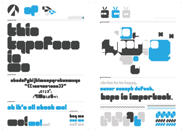
download OFTEN typefaceHello,
this is my never-ending type project Often. My first drawings were inspired by Albert-Jan Pool's DIN typeface (which was a redesign of the german DIN 1941) and the bestseller Gill Sans by Eric Gill.
I tried to smooth and blend the harsh and letterhead style of DIN with the elegancy and roundness of Gill Sans.
Hope you like it, feedback appreciated. Thanks.
arpad
Related content


Comments: 188


nice! would be awesome if I could actually use this
👍: 0 ⏩: 0


Any chance of getting special characters in this font? I LOVE it and use it on my site (ravenectar.com) but some of my artists have foreign names with accents and it breaks with this font.
👍: 0 ⏩: 0


")


I faved this a very long time ago. Now that I have my own computer, I can't even download this.
This makes me sad.
Why was the download link removed?
👍: 0 ⏩: 0


Yeah, this is nice and all.
Just that there isn't any download link.
I suppose that i have to be happy just staring at the picture. D:
👍: 0 ⏩: 0

Why do people say "Thanks you" ? There is no download link and I do not think they will just download the poster and say "thanks you"..
👍: 0 ⏩: 0


aztracker1 [2012-07-09 18:14:23 +0000 UTC]
I really like this font... I think the comments on the lowercase g and s are valid... also, the w seems a little off... overall, this is an absolutely gorgeous font... don't suppose you'd allow it's use for an (L)GPL web project?
👍: 0 ⏩: 0

At first I did not see download link, but now I have the font on my HDD: D
It's a good trick
👍: 0 ⏩: 1
On left side of page You have "Add to fav" and Download.
👍: 0 ⏩: 0

I'm not entirely sure about the top and bottom of the 's'.
Looks nice otherwise, though.
👍: 0 ⏩: 0


The kerning seems too tight and the 'h' is too narrow. Other than that I think this typeface is quite remarkable. I very much like its general appearance but the 'g' is particularly striking. The 'k' is a bit too awkward to me though.
👍: 0 ⏩: 0


Maybe you could raise the bar in the 'E', 'F', a little bit. It feels out of sync. (too low?) The 'Y' (capital) doesn't match the rest of the font letters. Have you considered using the Capital 'X' as a basis?
👍: 0 ⏩: 0


Es genial la tipografía que has creado. Mucha gracias por compartirla. ¡Artista!
👍: 0 ⏩: 0

| Next =>