HOME | DD
 newklear — Type Study - Neue Helvetica
Published: 2007-04-13 03:28:27 +0000 UTC; Views: 65583; Favourites: 826; Downloads: 0
Redirect to original
Description
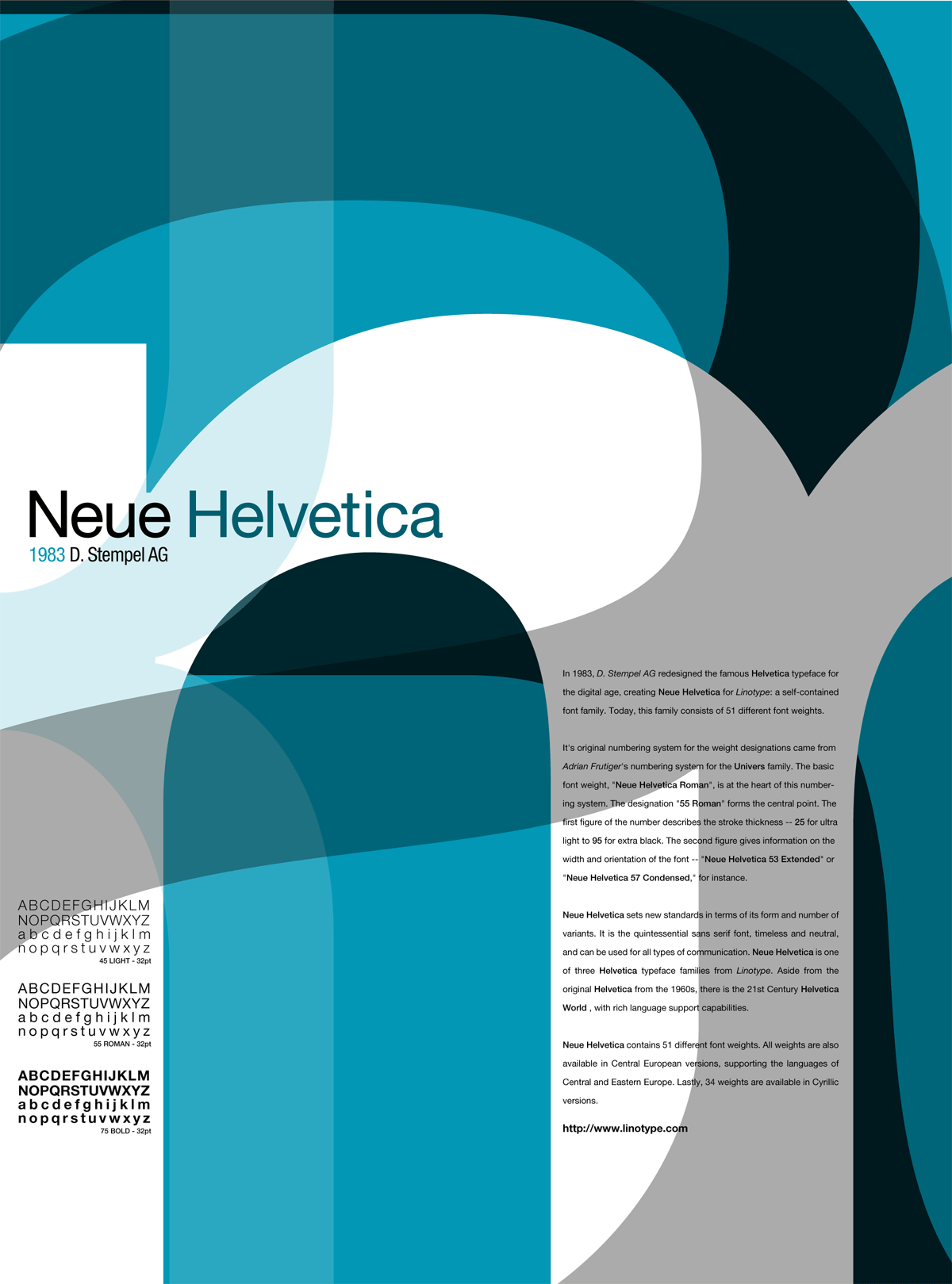
Purpose: So, seeings I'm more than a little bit rusty... and been on a design kick lately, I felt like it was about time I challenged myself to do something new to bring my skills back up to par. This is the first of those challenges.------
Background: Basically, the idea was to create an informational poster for a typeface using a limited range of colours (there's three here, simply because I couldn't get the Pantone mix I wanted) and only typographical elements. In this case, I opted to use the following characters to form the basis of the background: m, a, R, {, all in 55 Roman weight (excepting the m, which was in 75 Bold to allow more room). Also, I made sure to only use variants of Neue Helvetica (55 Roman [+ Italic], 57 Roman Condensed, 65 Medium, and 75 Bold). Body copy is taken directly from the aforementioned website.
------
Job spec: 3 Colour Pantone spot, 30"x40" @ 300dpi for gloss stock
------
Others in the series: Type Study - Comic Sans MS , Type Study - AdobeGaramondPro
Related content


Comments: 67


Hey Ben, can you explain to me what a type study is?
👍: 0 ⏩: 1
Ah. Like fonts and letters and such 

👍: 0 ⏩: 0

love it
im creating Helvetica pieces for college work, any tips to suggest??
👍: 0 ⏩: 1

Be as organic as possible. As this series progressed I found I was trying to emulate this particular piece and it lost the magic I had originally. Don't force it and it'll work out a lot better for you.
👍: 0 ⏩: 0


I need Helvetica Neue lite... I need it. That font is PERFECT. It's got a late 90s modern feel for me. I have no idea how to get this font, however ;_;
👍: 0 ⏩: 0


Very elegant compodition, like it a lot. Good job mate.
👍: 0 ⏩: 1
Featured here [link]
👍: 0 ⏩: 0


i dig this; i'm definitely going to purchase a print
👍: 0 ⏩: 0

Great work.
This piece has been added to the favorites of
👍: 0 ⏩: 0

Wow.. this is great! I love the way you arange the type into layout.
Awsome
👍: 0 ⏩: 0


Terrific!
I think Helevetica (Neue) is the best Sans font ever. I love using it everywhere.
👍: 0 ⏩: 0

a beautiful design for a gorgeous typeface! Awesome!
👍: 0 ⏩: 0

love this man, the use of typo is great,
im starting uni next year and i hope that i can get to a level as high as yours
👍: 0 ⏩: 1

👍: 0 ⏩: 0

I love the colours you have used in this.
The shapes are great!
👍: 0 ⏩: 0


")
To be fair, it's not exactly a new concept... we used to have to do them in class all the time as exercises to keep our type skills sharp.
👍: 0 ⏩: 0


This is really, really nice. Hope I can do stuff this good in the future.
👍: 0 ⏩: 0

Good old helvetica! I just did a typography assignment where I had to do 140 different layouts using only helvetica! You certainly get to know it well after that.
Great work - I love the overprinting!
👍: 0 ⏩: 1
The thing about old favourites like Helvetica is you learn to love each little detail every time you use it for something different. Like the teardrop bowl on the a, which is why it features so prominently here.
👍: 0 ⏩: 0

On the linotype website linked in the description.
👍: 0 ⏩: 0

Really nice! Helvetica is a really nice font, elegant but not too serious... *favs*
👍: 0 ⏩: 0


This is an incredible design. The color mix is is perfect to me and the bold lowercase m in white is perfect. It immediately catches my attention.
There are a few negative spaces that bug me such as the bright cyan space directly below the H in Helvetica and the sliver of black at the top.
Other than that this is a very clean design and definitely makes an impact to me.
👍: 0 ⏩: 1
I agree about the negative space issue, but it's something I unfortunately couldn't rectify using characters with no adjustments made to them. I had to sacrifice some small spots for an overall harmony ")
👍: 0 ⏩: 0


We are doing a project similiar to this in our design class ")
👍: 0 ⏩: 0

I just watched Helvetica documentary DVD  (Smile)")
👍: 0 ⏩: 0
| Next =>