HOME | DD
 Find-The-In-Between — HELVETICA

Published: 2010-08-30 23:02:53 +0000 UTC; Views: 7174; Favourites: 69; Downloads: 0
Redirect to original
Description
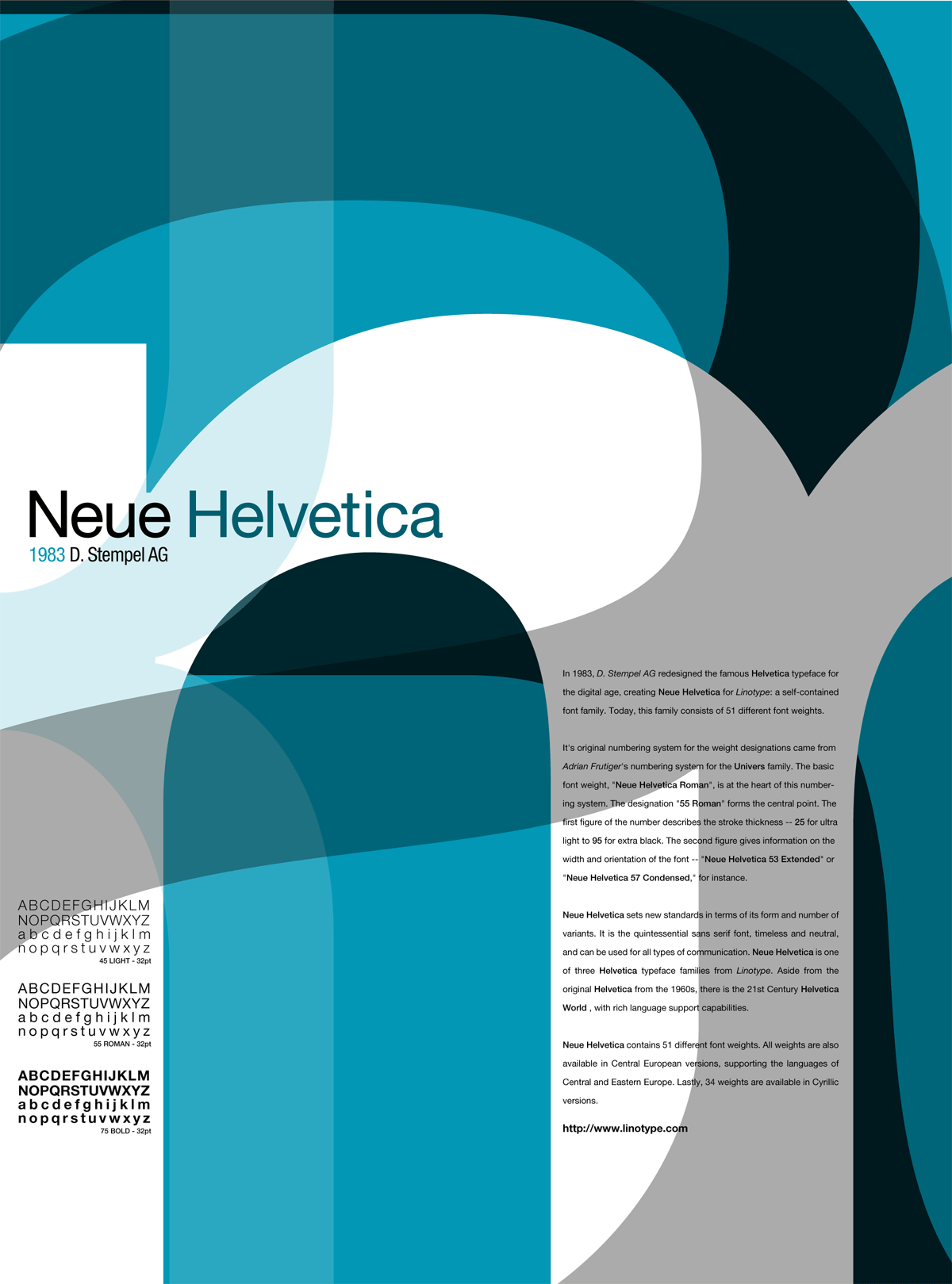
HELVETICA (Smile)")
Related content


Comments: 23

I like the simple yet efficient design, and the use of black, grey, white and red.
👍: 0 ⏩: 0


"HELL"VETICA man types are hell to me but you made it look like it was way too easy ")
👍: 0 ⏩: 1

haha why thank you
")
👍: 0 ⏩: 1
haha yeh bro no worries
")
👍: 0 ⏩: 0


 (Wink)")


you're welcome !!
👍: 0 ⏩: 0

The colors and composition look really good.. But the margins for the paragraphs, paragraph format, kerning and the leading really need work.. if these things were Ok this would look wonderful.. I'm saying this cause this type of little details become really big noticeable details when you're composing about typography. And because I really like the layout in general. Nice work!
👍: 0 ⏩: 1
thank you for the constructive feedback
consideration next time im working with it, thank you
👍: 0 ⏩: 0

nice color choices and layout. the leading is driving me nuts though!
👍: 0 ⏩: 0
