HOME | DD
 arpad — Often tf - beta version POSTER
by-nc-nd

Published: 2007-05-06 03:00:23 +0000 UTC; Views: 290951; Favourites: 872; Downloads: 25
Redirect to original
Description
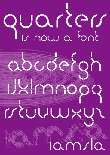
download OFTEN typefaceHello,
this is my never-ending type project Often. My first drawings were inspired by Albert-Jan Pool's DIN typeface (which was a redesign of the german DIN 1941) and the bestseller Gill Sans by Eric Gill.
I tried to smooth and blend the harsh and letterhead style of DIN with the elegancy and roundness of Gill Sans.
Hope you like it, feedback appreciated. Thanks.
arpad
Related content
Comments: 188

I found this font off of an Abduzeedo post. I really like it
👍: 0 ⏩: 1

hello.lovin the work,really is a lovely type.you shud be proud......how do i down load it?
👍: 0 ⏩: 0

This is a really good font
I like it lotz and lotz
Fave +
👍: 0 ⏩: 1

excelent font man, it has a modern look, maybe webby like Whitney. i would really like to use it. i also agree on the "g" the eye is very small compared to other whites in the letters.
(i speak spanish and don't know the actual names for the letter parts in english)
👍: 0 ⏩: 0

I wanted to first mention that I do think this is a fantastic bit of work...few things, constructively speaking:
Your capital S seems a bit skewed to the right.
Capital and lowercase "n"?
Why the completely sans-serif font except for lowercase j and i? seems a bit out of character.
The Capital Y, in my opinion, would benefit from being modeled more after the bar structure in the K, than the abrupt angle incorporated now.
And, it does seem to my eye that the smaller the point size, the more flattened some of the lowercase letters curves seem. Take for instance the curves of "a" and "s" compared with the soft, natural curve of the "u".
These are just a few things I've noticed.
BTW...not at all taken aback by the "g", and the subtle variants of "t" and "e" are fantastic!
Thanks for giving us this look into your work!
👍: 0 ⏩: 0

great font!
although, i think the lower case k stands too tall over the rest of the letters.
on the whole though great work!
j-j
👍: 0 ⏩: 0

ooo I love it ! 
👍: 0 ⏩: 0

I love it!
My only critique is the lower-case 'w', it looks slightly askew when thrown in with the rest of the letters. Maybe it's just me.
Great work! ♥
👍: 0 ⏩: 0

Pretty cool, but I think the Y doesn't fully blend with the rest of the characters, same with the W, I mean, the uppercase characters...
Same with the e ant the t on the lowercase characters, they have something that sets them apart...
And the VWXY they all look weird when they are together.
And the kerning could use some work too... the spaces in some lines look kind of weird...
Man! I hope I didn't come out sounding like an idiot or something, but I really love type and since you have the "Advanced Critique Encouraged"... oh well.
Overall I think it's a gorgeous typeface, you should be proud because it looks great!
Take care.
👍: 0 ⏩: 1

Thanks so much for serious critique, this is exactly the kind of feedback I need. Often typeface will be revised until September, definately. Again, thanks so much my friend
👍: 0 ⏩: 0

Oh wtf? Vc fala portguês. Jeeezuz. Typing in English late at night is such a fucking challenege. Hehauehaua.
+watch pra vc.
bem, vou dormir. jah sw 4 da manhã. =__=
👍: 0 ⏩: 0

This is probably a REALLY late reply. But the font is absolutely beautiful. Only two things... not sure if you decided to adress them or not:
1. Lowercase g looks unbalanced. I'd prefer it if the top half of the g was given more length.
2. Lowercase k looks strange as well. It looks nice in the alphabet but if you look at the word 'make' it looks kind of strange. I think it's because the top right of the K extends higher than the rest of the lowercase letters. Maybe it's just because I haven't seen enough fonts like this...
3. Uppercase Y doesn't match with the lowercase y, or the rest of the font for that matter. I realize that you made it that way so it would match the V and the W, but it looks a tad awkward.
One last thing. Your lowercase e is stunning. I love it.
👍: 0 ⏩: 1

Its never late to read tis kind of feedback, thank you so much. I'll be considering your notes as Often typeface goes into detention room for further questioning heheeh 
👍: 0 ⏩: 1

Lol, não há de quê. Também acho que a letra U maiúscula é um bocado largo demais.
👍: 0 ⏩: 0

Love the typeset, when will it be available for full usage
👍: 0 ⏩: 1

hello,
You can download the beta version. Full usage will be available at the end of the year (hopefully) in type foundries.
Thanks
👍: 0 ⏩: 0

It's nice. I'm looking forward to the final. I just don't see or feel a consistent flow among the letters. I also don't like the 'C' and the other letters that looks like it. Lowercase is wicked.
👍: 0 ⏩: 1

Very nice. I love the lowercase t and g, they are just interesting enough without being distracting. Great job.
👍: 0 ⏩: 1

Thanks so much for the feedback!
👍: 0 ⏩: 0

I personaly love it, lots of deviants tell me to change it!!
👍: 0 ⏩: 1

the lowercase g?!?! It's the best one!
👍: 0 ⏩: 1

Yeah, it's really really great, congrats!
How about the license? Is it possible to you use it? (I mean, the TTF version)
Thanks ^_^
👍: 0 ⏩: 1

Yes I guess, though I got to say that I haven't spoke to any foundry yet
👍: 0 ⏩: 1

Hehe OK. Maybe you should add a license to the .zip file, so that one knows what you can do with it
I'll tell you if I plan to use it 
👍: 0 ⏩: 1

I know but it doesn't say if you can use it or not ^_^
👍: 0 ⏩: 1

Muito boa...gostei muito da harmonia e leveza que cria num texto e também no destaque quando usada com outros tipos. Se permitires usarei esta fonte num próximo trabalho.
👍: 0 ⏩: 1

sorry i didn't notice this version simply perfect i love the font a must have
👍: 0 ⏩: 1

wow very nice.. i am not really into typography but I do know something about it.and i see that you have done a good job in this font
👍: 0 ⏩: 1
<= Prev | | Next =>


