HOME | DD
 artbyelm — fOUR
Published: 2004-09-19 02:16:47 +0000 UTC; Views: 798; Favourites: 17; Downloads: 125
Redirect to original
Description
 (Smile)")
Related content


Comments: 33


Thank you very much. I'm glad you like it!
👍: 0 ⏩: 0

Thank you very much! I'm glad you like it.
")
👍: 0 ⏩: 0

i'm impressed with the quarterisation of this piece - strange that you're an abstract artist like me, into pets, psychology and painting like me and beautiful like me too
lol
gonna have to watch you - us abstracts should meld together
 (Wink)")
👍: 0 ⏩: 1
I love abstract art....it's beautiful, but most of all I really enjoy the process of making it. And you like psychology too...
👍: 0 ⏩: 1
lol - my theory behind my abstract art is - "can i draw a human" no "can i draw anything real" no "is it surreal" no - abstract then!!
actually i could possibly class my stuff as design rather than abstract - it seems to go that way
psychology is really important to me - i like being able to read people
👍: 0 ⏩: 1
lol....I like your theory. Art's funny that way...I think it says a lot about how you classify your work. My friend (who considers himself an illustrator....not an artist) and I got into this discussion about the difference between graphic design/illustration and art. He doesn't believe that his illustrations could hang in a gallery because it's not art. I disagree with him. I think it's all about how you classify your own work.
👍: 0 ⏩: 1
aha - and that leads me onto my piece "art is what you make of it"
check it out it's the circley one
sums it up really
👍: 0 ⏩: 0

thanks for your comments on my gallery, i came to check out yours
this one i particularily like...
very nice shape and form, and i like the almost star-like quality of the white streaks...
anyways, thanks for stopping by my page

👍: 0 ⏩: 1
No problem...I love looking at new art. And thank you for stopping by my page, too!
👍: 0 ⏩: 1

lights flow beautifully
nice textures comtraposition
👍: 0 ⏩: 1

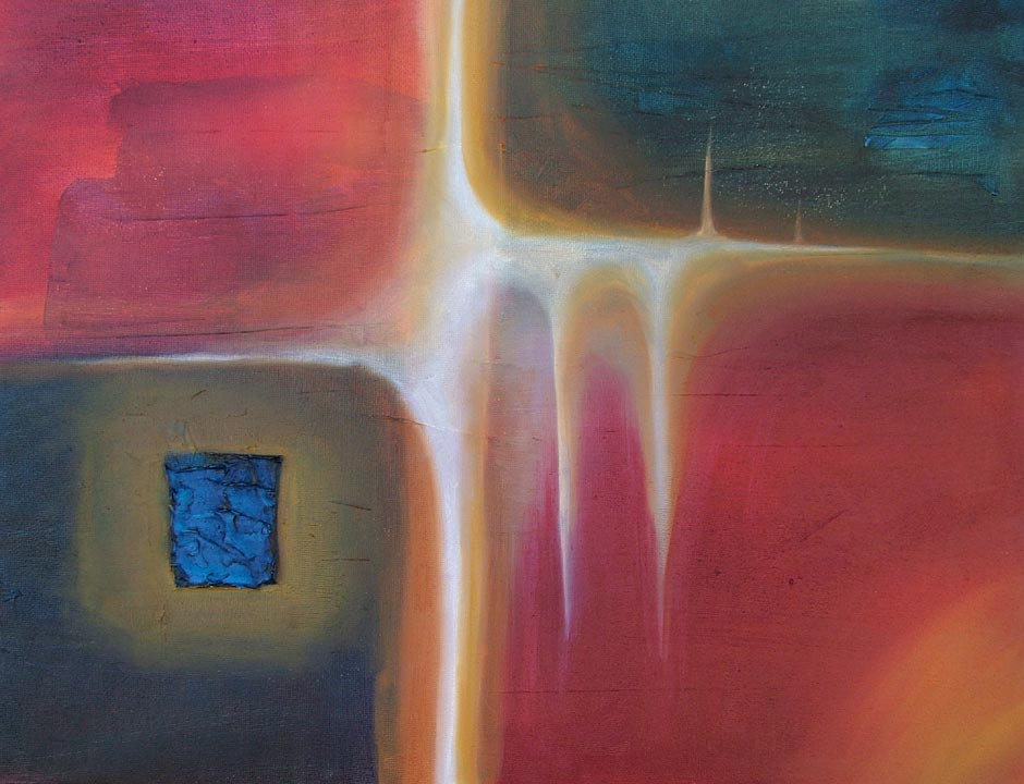
I really like this. For me it represents a window to truth. the blue spot is the easiest path but the other 3 where's nothing else than emptiness (in color) are more difficult but then more giving when you choose one of them. Or all. I don't know how to explain with my poor english.., I hope you get what I mean...; )
👍: 0 ⏩: 1
You did a great job explaining! Your english is very good....what is your first language?
👍: 0 ⏩: 1
My first language is finnish. I've studied english in school but not anymore. I study arts now, photography is my main subject. For once I can say I ENJOY studying, though it's stressing sometimes, but what wouln't be?
👍: 0 ⏩: 0

I'm really drawn to that tiny rectangle of crackly blue. It really stands out among all those muted, light shades. I like the starburst effect in the middle very much.
👍: 0 ⏩: 1
That's also the major spot of texture in the whole painting. The rest has some minimal texture, but nothing that stands out like that little bit of blue.
👍: 0 ⏩: 0

The colours in this are gorgeous. The white looks like it's seeping/dripping through. The little blue square really adds to the overall atmosphere of the painting
👍: 0 ⏩: 1
Thank you very much. I'm glad you like it.
👍: 0 ⏩: 0

beautiful use of light and balance. congrats for selling this! I'm going to take a look at your gallery now
👍: 0 ⏩: 1
Thank you very much. And thanks for checking out my gallery. It's pretty diverse...
👍: 0 ⏩: 0


the yellowish white in between these squares looks like a light shining through. Interesting is the blue little square in the left. Very nice painting
👍: 0 ⏩: 1
That's a really cool observation. I'm glad you pointed that out about the light.
👍: 0 ⏩: 0

love the little blue it balinces the rest of the peace nice ley
👍: 0 ⏩: 1
Thank you. That's also the highest point of texture too.
👍: 0 ⏩: 0

the use of the white is so neat looking... i love it. the royal blue part in the left is such an interesting part of it... it all balances in a really pleasing way...fun to look at... I'm curious how big it is...?
👍: 0 ⏩: 1
Thank you. I'm not sure if you can tell, but the blue is really textured with modeling paste. It sticks out and kind of looks like water/waves. It's 12x16".

👍: 0 ⏩: 0

Woo! I love the colors here, and the blending that gives it a sort of "dirty" look. Very vivid lines (mind, I am half blind, but that white is so beautiful..)
absolutely wonderful!
👍: 0 ⏩: 1
Thank you very much. I'm glad you like it...I like making these ones!
👍: 0 ⏩: 0