HOME | DD
 ArtbySandiJohnson — Inspiration, Point of Flight

Published: 2006-03-09 15:08:18 +0000 UTC; Views: 620; Favourites: 23; Downloads: 100
Redirect to original
Description
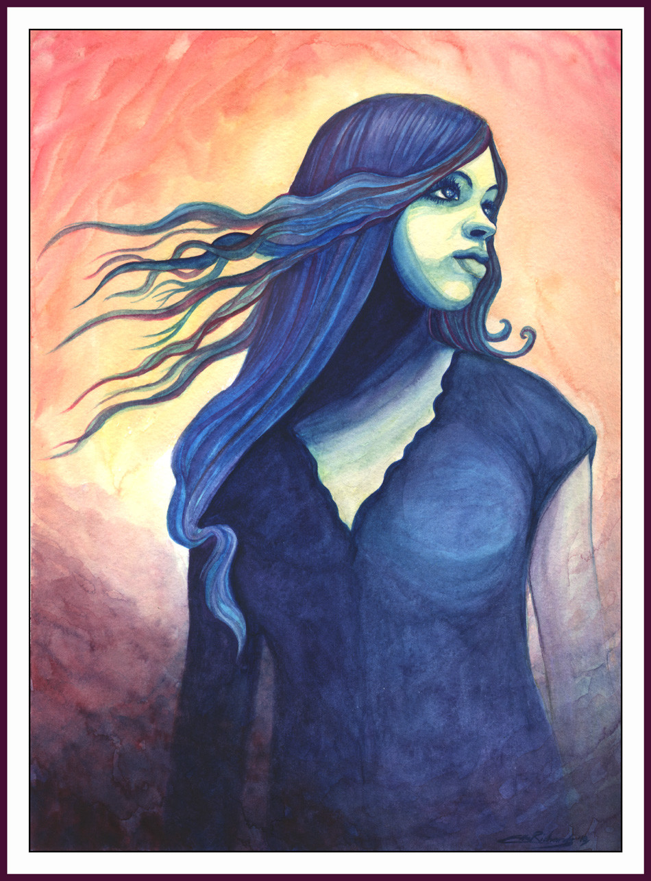
Pastel and colored pencil combined. 12 x 14 inches.I really enjoyed doing this one, but it is rather simple in composition, rather shallow, I would say, more like a study. It is mostly a work in color change and an experimentation in medium. Should it have a leafy hillside behind her, washed out by the hazy light. I wanted to depict that frozen sweet moment when an artist gets that first glimmer of a feeling, an idea. Would a background overpower that? What do you think?
Related content


Comments: 55

I meant shallow in that there is no background. I did mean it to be a color study and an experiment in expression, but when it was done I felt like it was a little lacking. I did one in paint but messed her eye up. If I could get the problem worked out I would really like it better.
👍: 0 ⏩: 1

I think the simplicity in the piece gives it the depth, personally. The colors are deep and cool, and the eye is drawn right to her hair, centering the focus on the figure.
👍: 0 ⏩: 1
you've reassured me
👍: 0 ⏩: 0

hmm...I dunno, I kinda LIKE the simplicity of it...I think sometimes you get caught up too much in the details. The lack of details in the background draws more attention to the subject in the middle, which is a good thing.. I think this achieves what you were going for...and idea
👍: 0 ⏩: 1
I suspect you're probably right. Perhaps a large painting with more of the landscape and her the same size sitting poised just off to the left of center might be nice. It just seemed sort of, well juvenile or something when I got it done.
👍: 0 ⏩: 1

")
👍: 0 ⏩: 1

lovely hair, I absolutely adore how it flows dosn on her shoulder then back - and the way it curls at the neck

👍: 0 ⏩: 1

beautiful mixing of colors. Very stylized.
Very good choice of complementary colors

👍: 0 ⏩: 1
Thanks for the comments.
👍: 0 ⏩: 1

The attitudes, the colors and hair are very beautiful. Sorry I don't see anything to change, it's just superb.

👍: 0 ⏩: 1
Thanks for sharing your opinion no changes or not.
👍: 0 ⏩: 0

To be honest, I like it the way it is. I think having very little in the background focuses the attention on the girl and the wonderful work you've done on her to get the pose, colours and lighting right. I particularly like the hair; it looks so natural and all those shades make the overall colour very rich.
👍: 0 ⏩: 1

👍: 0 ⏩: 0


oh please leave it like this. it looks so clean and thoughtful. she's so still and the background almost has a hint of movement the way you left it hazy, it seems to emphasize the flight of the title
👍: 0 ⏩: 1
Thanks for sharing your thoughts. If I did anything it would be to start a new one on the same theme.
👍: 0 ⏩: 0

I like it the way it is. Though I think the blue of her jeans sort of gets lost in the blue of the background. still the contours of the shapes in this drawing or so sensitive and beautiful. The overall feeling is really intriguing, peaceful. I like this very much.
👍: 0 ⏩: 1
Thanks. I appreciate the comments to think on.
👍: 0 ⏩: 0
Hmmm, 2 thoughts. He did?
And a suspicious thought, does that mean she's doomed to fly too close to the sky in her prideful reach and melt her wings?
👍: 0 ⏩: 1

Naw, it just means, being earthbound, she dreams of flight. Being wiser than Icarus, however, she may choose to slip these earthly chains when the moon waxes full.
👍: 0 ⏩: 2
I googled Icarus (wonder if I should change the spelling for my drawing? Naw.) and found more than one person by that name. The one I remembered was the son of Daedalus. (I wrote it down to be sure of the spelling
👍: 0 ⏩: 0

👍: 0 ⏩: 0

I like it as is. I think a background would take away from the mood that it portrays. And as is, I wonder more what she is looking at off in the distance. The colors are wonderful. It's a beautiful piece!

👍: 0 ⏩: 1
I thought a background might muddy the intent. As it is I feel like, if I couldn't get her to lean more forward that if I had only had the fingertips of her right hand still on the rock instead of her whole hand, she would have looked more liked she was on the point of moving. Thanks for the advice.
👍: 0 ⏩: 0

i have to say that i think this piece is totally beautiful. your work is haunting in its beauty and in its potential...she looks as though she is about to turn and speak...she is so real...
i have no more words to say how amazing this drawing is...
👍: 0 ⏩: 1
Such kind words, haunting and beauty.  (Smile)")
👍: 0 ⏩: 0

I actually find it is beautiful as it is. The fact that there's not much in the background makes what is in the middle and foreground appear all that much closer and clearer. I really like your use of colors.
👍: 0 ⏩: 1
Thanks for sharing your opinion and thoughts.
👍: 0 ⏩: 1
You're welcome and yes color is fun to play with. ^-^
👍: 0 ⏩: 0


I like how you have done the hair and the back ground is really cool to
👍: 0 ⏩: 1
Thank you and thanks for the input
👍: 0 ⏩: 1

The way you mix different colors, adding the orange on the shoulder, etc, really gives it balance and realism. I love it.
👍: 0 ⏩: 1
Thanks for the input.
👍: 0 ⏩: 0


LOL
I missed the rest of my comment.
I adore the hair on this, the red colouring of the hair is just fabulous against the predominently green and blue colour of the rest of the piece. I love the restricted colour use and the lighting study is spot on.

👍: 0 ⏩: 1
👍: 0 ⏩: 0
I think a background would be a mistake on this piece. It would completely take away the focus and emotions displayed.
👍: 0 ⏩: 1
I think that's a strong possibility
👍: 0 ⏩: 0

I ABSOLUTELY love her hair and the color scheme you used. I think a couple of the angles are slightly off on her back--like in the area where her arm connects, but I'm not experienced enough to be able to tell you exactly what's up. Hope it helps in the way of a critique, though.
👍: 0 ⏩: 1
| Next =>