HOME | DD
 Artgerm — Calilber Cover Issue 3

Published: 2008-06-14 11:52:52 +0000 UTC; Views: 152039; Favourites: 2550; Downloads: 0
Redirect to original
Description
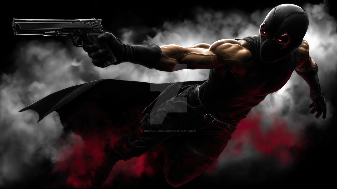
Cover artwork i did for Caliber issue 3. Published by Radical Comics.Personally I really like the color contrast of the image, which shows the duel of 2 very different characters.
Related content


Comments: 245

Nice one, been a while since ive seen new art from you
👍: 0 ⏩: 0


I see u've been promoted into 'senior members'~
congrats
and nice art as always ^^
👍: 0 ⏩: 0

What did you use to complete this amazing piece of artwork? PS?
👍: 0 ⏩: 0

it's really good
Good painting and the shadows are really good
__..__
Tansoman

👍: 0 ⏩: 0


wow! fantastic photo  (Smile)")


👍: 0 ⏩: 0


Yay the scene is well represented in a single "shot" !
Great work with colors and poses too!
")
👍: 0 ⏩: 0


I'm very glad i've picked up the first two issues. The story is compelling, in addition to your crews art, and your amazing covers make it such a treat!
👍: 0 ⏩: 0

hey you made a really really nice cover, ag!!!
impressive illustration.
Bye
👍: 0 ⏩: 0


Ahh I love the use of the cold and warm. Wicked job man!
👍: 0 ⏩: 0

I bought the first issue because the cover was terrific and now I'll probably have to buy this one.
")
👍: 0 ⏩: 0

Wow, I love it! Their expressions are fantastic and the colors are gorgeous.
👍: 0 ⏩: 0


Oh my god
This is awesome :U
I wish I could draw like you some day ;^;
👍: 0 ⏩: 0

The cool and warm tones play well on the surface of the fabrics. Just awesome in general, really.
👍: 0 ⏩: 0


Painted awesome, but is is silly to say that I'm impressed by the detail of the trees?!
👍: 0 ⏩: 0

how many hours did this take you? just give me a ball-park estimate
👍: 0 ⏩: 0


the contrast is incredible~~~!!! and i *SO* love the gun details >w<~~
👍: 0 ⏩: 0


amazing work Artgerm i really like the composition the characters and the contrast betwean the two! keep the good work
👍: 0 ⏩: 0
amazing work Artgerm i really like the composition the characters and the contrast betwean the two! keep the good work
👍: 0 ⏩: 0


very, very good! being sheltered by the DA !!!!!!^^"
👍: 0 ⏩: 0


nice color choice and awesome atmosphere, you did a great job!
👍: 0 ⏩: 0

Nice painting. The Contrast is definitely what I noticed as side from the nice drawings.
👍: 0 ⏩: 0


Beautiful contrast, I really like how you did the ghostly effect with the people in the back :")
👍: 0 ⏩: 0


I love the contrast from blue to red. You're amazing!
👍: 0 ⏩: 0


Contrast is definitely one of the most appealing things in the picture. I love it
👍: 0 ⏩: 0

Great WORK!!!
I like the contrast too. It is not only the two characters but also the contrast between warm and cold, dark and light!
Awesome!!!

👍: 0 ⏩: 0

<= Prev | | Next =>