HOME | DD
 Artgerm — Calilber Cover Issue 3

Published: 2008-06-14 11:52:52 +0000 UTC; Views: 152039; Favourites: 2550; Downloads: 0
Redirect to original
Description
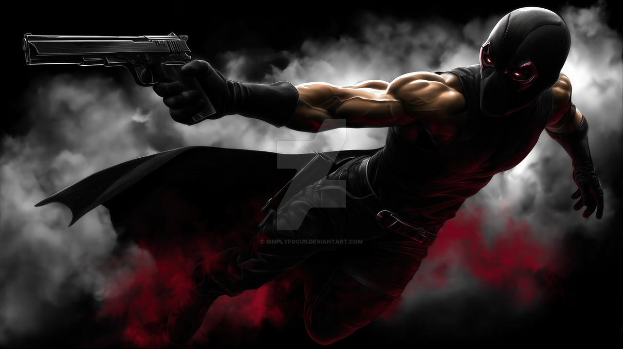
Cover artwork i did for Caliber issue 3. Published by Radical Comics.Personally I really like the color contrast of the image, which shows the duel of 2 very different characters.
Related content


Comments: 245


Whoa! I really liked the shading of the characters! Specially the reddish one, looks so cool! ^^
Great job with the background as well! Loved it!
👍: 0 ⏩: 0


The coloring in this is simply gorgeous! I really love the look of the bottom character too.
👍: 0 ⏩: 0


Amazing. The colour, the facial expression and effects are brilliant.
thnx alot

👍: 0 ⏩: 0

yea you're right, the contrast of two opposite colors, two opposite elements is very astounding. love it ^__^
👍: 0 ⏩: 0

I agree, the color contrast works very well together. amazing piece, as always.
👍: 0 ⏩: 0

Being a Western-set book I have to say it this way, "That's a right purdy cover, ya got thar."
I've been enjoying the book. Picked it up because I knew you were going to have a part in it, and because I like Arthurian retellings. Warm and cool contrasts always look nice, this one is no exception.
👍: 0 ⏩: 0


Wow I agree, I love the contrasting colors, you really captured their personalities well!
👍: 0 ⏩: 0

I work at a comic shop. The art for this title has always been impressive and I look forward to seeing this on issue 3!
👍: 0 ⏩: 0

This is very cool ")
Good job, great cover
👍: 0 ⏩: 0


well. even if i worship ya as one of the finest man who has ever laid feet on earth, i daresay this looks a bit unfinished...just a bit under yer average piece. sorry must be cause i know that you can do better! ^^'
👍: 0 ⏩: 0

 (Wink)")


wow this looks awesome  (Smile)")
looks amazing
👍: 0 ⏩: 0


Damn, that's such an awesome job. The contrast combination of the background obtains an impacting effect to the eyes of the spectator.
Maybe, the only thing what doesn't convince at all is that part of the "fire bear's fur" over the arm of the man, but it isn't too relevant, I think.
Your effort on your jobs is admirable.
👍: 0 ⏩: 0

Man its really!!! i wish a could be like you haha !!!
really its amazing as always
👍: 0 ⏩: 0


Very interesting visual language. I really like how you staged the image.
👍: 0 ⏩: 0

wow exelent very good.
very good details colors and shades. xD
👍: 0 ⏩: 0

Indeed! The contrast looks great and evocative.
Long time without seen your work. This is very nice!
👍: 0 ⏩: 0


really amazing coloring work and yes, great motion as well.
👍: 0 ⏩: 0


Now i'm just going to reitterate what you said, but, the colour contrast really helps make the image stand out. I especially like the facial expressions
👍: 0 ⏩: 0


yeah. hues suggests the personality of each character.

👍: 0 ⏩: 0


Oh god, the colour balances very perfect! Red with blue! The folds are so realistic! In fact the whole composition rocks!
👍: 0 ⏩: 0


this is reallyy gud.. yea i like the contrast between the two characters to show that they use those as weapons and are fightin.. kinda like a ying tang image i think
👍: 0 ⏩: 0


A very good job! I think the bear could still use a little work around his mouth and nose, but a well-composed piece
👍: 0 ⏩: 0

sick dude
im betting on the blue guy with zombie powers
👍: 0 ⏩: 0

wow that is amazing, i love the coloring and poses! the expressions are so cool!! great hun!
👍: 0 ⏩: 0


<= Prev | | Next =>