HOME | DD
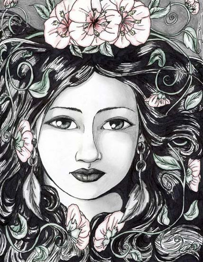
 artofdawn — Spring Frost
Published: 2004-03-02 06:12:09 +0000 UTC; Views: 1476; Favourites: 18; Downloads: 124
Redirect to original
Description
I was going to color this fully, but my boyfriend just loved it in black and white. He said that if I color it to use very, very little color. So I decided that I wanted to have the flowers, vines and leaves to stand out.Medium:
Pencil
Pen
Photoshop
cafeepress shop: [link]
Related content


Comments: 46

i like this one a lot  (Smile)")
👍: 0 ⏩: 0

I know it's a bit useless as I'll just go repeating what was said a hundred times already but - yep, it's beautiful, and yep - the colouring is perfect!
Keep it up, this style is great and yet so rare!
👍: 0 ⏩: 1


This is lovely! Great detail work and beautiful face.
👍: 0 ⏩: 1
")

wow i dont usually look at this stuff on DA , thanks for opening my eyes, i like it !
👍: 0 ⏩: 1

Thanks for checking my stuff out.
👍: 0 ⏩: 0

Thanks, hoping for it to win in a contest that I should be hearing about sometime soon.
👍: 0 ⏩: 1


Thank you for the comment.
👍: 0 ⏩: 0


This is just so beautiful, she melts so great into the detials.
a

👍: 0 ⏩: 1

so pretty, luv the flowers flowing with the hair. *_*
👍: 0 ⏩: 1
Thank you, I made them to be like a crown ontop of her head.
👍: 0 ⏩: 0

oh. and also, I really love those earings! Yay for nature inspired jewelry!
👍: 0 ⏩: 1
Thanks! And the earings were one of my favorite things to think of and draw. I love those kind of earings, completely from nature.
I am a big hippie most of the times.

👍: 0 ⏩: 0
I do like this mostly in black and white. It has a really neat effect. It is very smooth and beautiful. I love the way the hair and flowers surround the face. LOvely!
👍: 0 ⏩: 0


This really is a great illustration. The muted colors you chose work very well with the black and white. They're so subtle that at first glance the viewer may not even notice the colors, but will still be aware of 'something' in the art that seems to give it a visual push.
Speaking of visual push, the idea of not centering the image (at least from what I've read about photography) is it makes the viewer's eye move across the image, rather than getting stuck in the dead-center and losing some of the image that way.
or something like that.

👍: 0 ⏩: 1
thanks for the comments.
And I think I remember being told that in film class. I just know that there were several reasons why. Thanks.
👍: 0 ⏩: 0

Omigosh! I swear I had a dream about this!! So.... BEAUTIFUL!

👍: 0 ⏩: 1


Very elegant indeed. I might formally mark this as a favorite.
👍: 0 ⏩: 0

I love the subtle colours mixed with the black and white contrast you have created in this. The flowers look very art noveau. I love the style you have drawn her face in. Overall this is very beautiful
👍: 0 ⏩: 1

Ooooh, this is beautiful! Such smooth lines and pretty composition! Please draw more pretties!!! O.o
👍: 0 ⏩: 0

Yeah you never can tell, scanners mess with my work too. Do you remember the reason from your class for not putting things in the center? I'm curious as I tend to put all my subjects (well crop them) in the center in portraits. And I should stop doing that if its wrong
TheDuck
 (Wink)")
👍: 0 ⏩: 1
From what I think I remember is that it gives the look of motion and is more pleasing to the eye. It has been about a year since I've taken that class.
👍: 0 ⏩: 0
I agree with the boyfriend!
👍: 0 ⏩: 2
thanks for the friendly critism, though.
👍: 0 ⏩: 0
I took film class and was taught never put the main character or object in the very center of the picture. So I tend to do that too with my artwork.
Pluss it isn't that badly off centered, only slightly, in the original. Once again, my scanner isn't big enough to scan all of the picture, but I accidentally put my signature on the top right corner of the picture, so that's why she's really a lot more to the left of the picture.
👍: 0 ⏩: 0

I like how you left this. The minimal color lets the intricacies of the design stand out more.
👍: 0 ⏩: 0

*jaw drop* Your boyfriend was right...subtle colour for this is just perfect. All I can say is...Gorgeous
👍: 0 ⏩: 0

wow, that's amazing. Incredible detail and line quality. I really like the subtle hints of color in the flowers.
👍: 0 ⏩: 0

")
👍: 0 ⏩: 0