HOME | DD
 Artsammich — Character design with digital paint: workshop
Published: 2016-05-06 03:28:08 +0000 UTC; Views: 10631; Favourites: 267; Downloads: 136
Redirect to original
Description
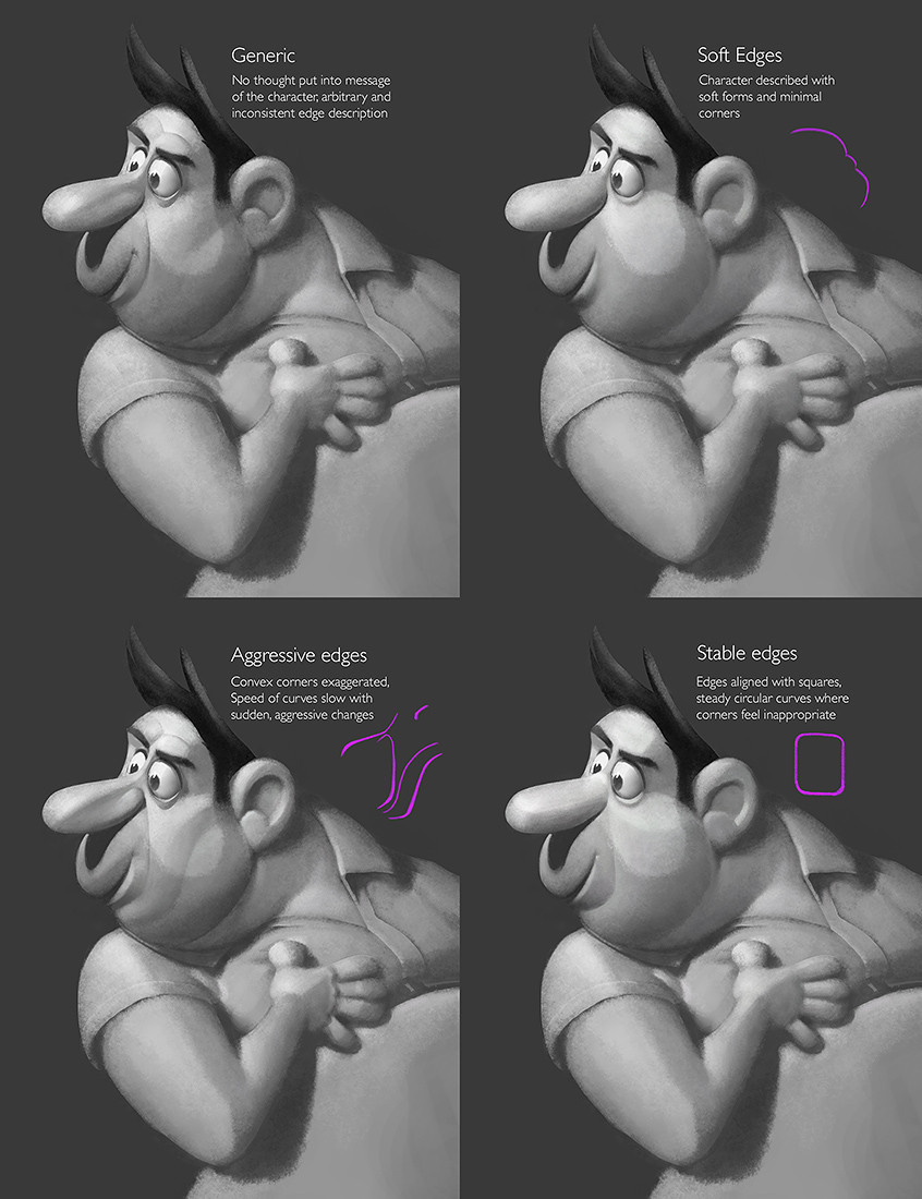
I'm creating lecture slides for the workshop I'm teaching in Rome with the IDEA Academy, and thought I'd share a glimpse of some of the things I'll be teaching. I think there are still seats left if you're interested in attending: www.idea-academy.it/EN/Worksho…Related content


Comments: 59


Yikes I can't even tell what's so bad about the FIRST one. Shows how much of a 2D guy I am I suppose.
👍: 0 ⏩: 1

Bad is probably the wrong work. Careless and unfocused is probably a better description---sometimes you can have careless and unfocused stuff turn out good (but you're gambling in that case, hoping your art director will happen to like it).
👍: 0 ⏩: 1
Arg, "work" should be "word."
👍: 0 ⏩: 0

Soft edges works very nice on butts, mmmhmm dats right. ;D
👍: 0 ⏩: 0

I guess I'm really curious about the conversation this is a part of. "No thought" in the message of the character? That seems awful harsh! (Especially for something you obviously drew intentionally!  (Wink)")
👍: 0 ⏩: 1
That's pretty tame compared to critiques I've gotten on my stuff. My experience is that people who want film or triple-A game quality stuff do not pull their punches.
👍: 0 ⏩: 1
Yes but I assume they also provide some context. I don't buy that you'd get such vague critique unless you were already trained to interpret it! I assume this is what your lecture is about?
👍: 0 ⏩: 1
Depends on the art director. I've worked for dozens and a good number of them wanted me to read their mind half the time. Especially film directors: they don't have time to explain how things work so you have to be quick on your feet. My belief is that any tools you can gather will help you anticipate what they're looking for.
👍: 0 ⏩: 0

Ok, now I have a headache, but it's a good headache
👍: 0 ⏩: 1
Haha, sorry for the good headache. Or you're welcome, whatever is more appropriate.
👍: 0 ⏩: 0

Definitely something I don't pay enough conscious attention to. I tend to not look beyond what instinctively feels right or wrong, this is a really great (but kind of anxiety-inducing) post to get us to think deeper!
👍: 0 ⏩: 1
Instinct can be a pretty good guide. I use this sort of thing as a final check after following my instincts.
👍: 0 ⏩: 0

Maybe I'm not looking hard enough but I'm having trouble seeing the difference between the pictures, or what sort of style/technique they're trying to portray.
👍: 0 ⏩: 1
This is just one slide out of a larger discussion, the workshop is supposed to get people tuned to the emotional effect of small differences. Not an easy thing to learn but essential if you're going to work as a concept artist or modeler at the top levels of the industry.
👍: 0 ⏩: 0

Thanks for sharing. I don't thing much on my edges, but this shows how I can use it to my advantage. Again, thanks!
👍: 0 ⏩: 1

My initial reaction was "oh god something else to panic about while I'm drawing" but when you think about it all it is is not forgetting that rendering helps define a character too.
👍: 0 ⏩: 1
Don't panic, it's just the same old design principles being applied with greater sensitivity and depth. A lot of this sort of thing can be applied in the finishing touches of a painting or drawing.
👍: 0 ⏩: 1

I see the differences but they're frankly all okay to me, even the "Generic" one. I guess that's not my level yet though.
👍: 0 ⏩: 1
The workshop is going to be focused on character design for film and games, so it's not so much a level thing as it is understanding what art directors are looking for and figuring out how to subtly affect the way your audience feels about a character.
👍: 0 ⏩: 1
Oh, alright, I see! Thanks for the precision
 (Smile)")
👍: 0 ⏩: 0

")

well, i spent 10 minutes but i almost figured it out exept for the last one
👍: 0 ⏩: 1
Think of it like the corners on a marshmallow that has been squished in the bag with a bunch of others, squaring it off while still retaining the overall soft feeling.
👍: 0 ⏩: 0

It's so subtle I don't think most people who aren't artists will even notice the difference.
👍: 0 ⏩: 3
The audience "feels" the difference more than anything. This is especially true for animated film, it's like how the faces of different actors affect what you're anticipating from their characters. And of course art directors will definitely notice the difference.
👍: 0 ⏩: 0

Yeah, but they'll feel it. Just like sound design in a movie.
👍: 0 ⏩: 1
Could be wrong but I'm pretty sure this is beyond the realm of even instinctual perception for the average person.
👍: 0 ⏩: 1
Well, it's unconscious. For example, the soft edges resemble a pillow or your plump grandma, haha. With out noticing consciously your more prone to trusting that character. As apposed to the one with the aggressive edges which universally spell danger, harshness or "aggression." Your right, it is really subtle. But, I believe it would be effective. Just look at Pixar or Dreamworks character designs, they also get this subtle with it. Again, the audience may not notice it, but they feel it.
👍: 0 ⏩: 2
I agree with that, but I think this is subtle to the point where regular people don't register it and artists can feel it.
👍: 0 ⏩: 2
although it still slightly depends on the size of the screen and how perceptive the person is, you and artsammich are right.
👍: 0 ⏩: 0
Not when the character's face is 20 feet tall on the big screen. Believe me, people notice stuff at that scale.
👍: 0 ⏩: 2

Sometimes scaling down also helps getting the differences, or feeling the moods or characters.
👍: 0 ⏩: 0
Fair enough, I forgot about the big screen lol
👍: 0 ⏩: 0

I agree, it's like how colours can influence our emotions. We don't think about it, it just happens.
👍: 0 ⏩: 1


Excellent examples of how line definition can change the appearance and personality of a character as well as presenting mood.
👍: 0 ⏩: 1


I love this. And yes, SolarStrings and EchoExe, it took me a bit too to see all the differences. But as I saw one, I saw many and they are mind blowing to think of this detail that goes into art. It is what I love about it.
👍: 0 ⏩: 0

I see the same picture 4 times, maybe I'm just retarded idk. :/
👍: 0 ⏩: 4
It can take a bit of work to become sensitive to this sort of thing, it doesn't mean you're inept or anything.
👍: 0 ⏩: 0

pro tip - look at the faces
👍: 0 ⏩: 0

Wait...I see a difference in....the ears! XD
👍: 0 ⏩: 1
| Next =>