HOME | DD
 ASinglePetal — .: Cover Art - Princess of Protection :.

Published: 2014-05-20 14:18:29 +0000 UTC; Views: 984; Favourites: 80; Downloads: 6
Redirect to original
Description
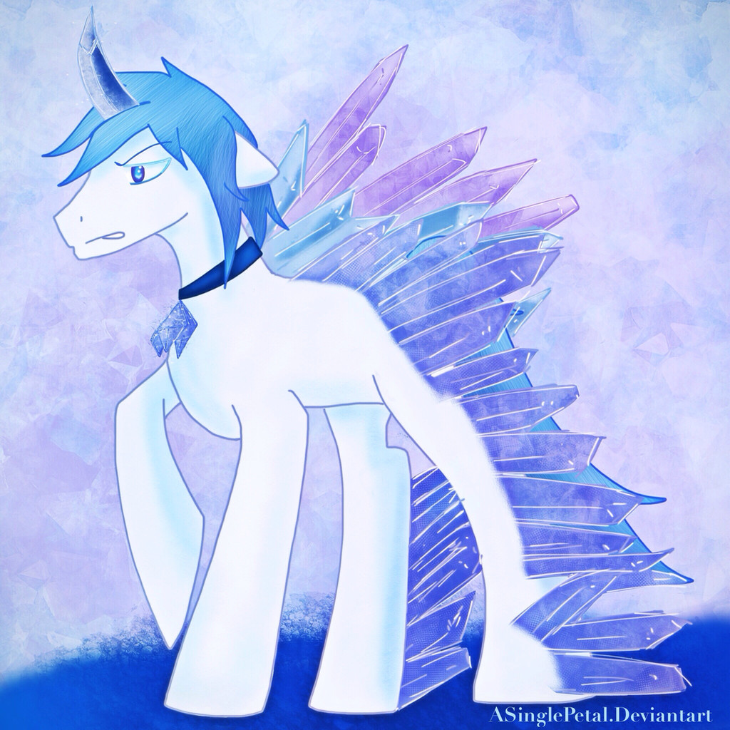
This is another cover art I'm doing for my oc Lila and how when me and my commissioner were both taking about making her a princess of another land.I didnt give give her cutiemark yet because this is early on untill she gets it . I will be upgrading it and redrawing the cutie mark as well.
Art by me
drawn on ipad4 procreate
Related content


Comments: 15


Lovely job, the colors are magnificent, just work a bit on the nose! (3, I love your work on the wings, they are fantastic! The mane and tail is well shaded, and the crystals in the background have lovely detail. The eyes are also quite beautiful. You seem to have a talent with colors and shades. The necklace and boots are a nice touch. I also love what you did with her ears, it works well in this picture. Her horn is also quite nice. Overall it was a lovely picture, keep up the excellent work, I love this picture!
👍: 0 ⏩: 0

")
Okay, looking at this again: Ow my eyes. There is way too much white in this piece, it's hard to see where the lines end at times. The shading on the underside of her mane is nice though.
👍: 0 ⏩: 1

Thank you
she isnt really white in the colour palette she is very light blue
thats a an artist thing
👍: 0 ⏩: 1
Either way, the extremely light colors tend to blend together, and it's hard to actually look at initially, being so bright. A bit of shading, or darkening the picture a bit may help. But I'm not an artist.
If you wish for an example: Her mane and coat colors blend together, to the point I have to squint to pick out the outline of her ear. It isn't too much of an issue, you shaded her in a way that there's some contrast between her mane and coat most of the time, but at places where there's little to no shading it's difficult to distinquish. Also, it's just kind of painful looking at it if your brightness is turned up very much. The bright whites (and near whites) make it kind of weird when your eyes haven't adapted to it, though they do so after a few seconds. Anyway, that's my two cents. I'm no artist, and have a less than perfect grasp on color interactions, so feel free to take or leave my commentary. Still better than anything I could draw, as I absolutely suck at drawing/painting/whahey.
👍: 0 ⏩: 1
I'll have to work on that
sorry about my other reply it was late I needed sleep so it was only a quick reply.
I learned off wiggles ( pony artist on tumblr ) is don't always go for white go for something just outside of white to work with which is what I was going for by doing a princess celestia or rarity because when looking at their colors their whites are just outside white itself rarity is near the white blue area while celestia I sip near the light shade of pink.
👍: 0 ⏩: 1
Fair enough. And that is fine.
Thouggh I will leave a comment: While they both have those colors, not quite white, they also have something to contrast that bright color. Rarity has her purple, and Princess Celestia has her aurora of color. Also, they almost always contrast with the background, which is rarely an off-white color. It helps them stand out. Where this one's mistake is that there is almost no contrast in the character, though her eyes stand out along with her regalia. I noticed this with Lila's human design as well, though it works more easily since she has a skin color to contrast her off-white hair and dress. With ponies, you don't have that so you have to be a whee bit more careful. Anyway, that was this rant (again) and so off I go into the sunset to finish act 1.
👍: 0 ⏩: 1
Yes I do have to re design her at one point for a ref :3 so I try and point lila's mane for a slightly blue colour :3
okies
👍: 0 ⏩: 1
I've had to do that before, though thankfully mine are usually in text form, so it's a bit simplier. Though I have noticed that she has a very blue, almost white color scheme. I'll be honest though, it looks white to me. Though now that you mention it, if you send me a note with what her colors will be I can edit that into the story. Speaking of which, Act 1's done.
👍: 0 ⏩: 1
I will after Ive finshed planning what her redesign looks like
👍: 0 ⏩: 0


I dunno mine is a different to yours completely also I designed her 4 years ago
but at least their both pretty
👍: 0 ⏩: 1