HOME | DD
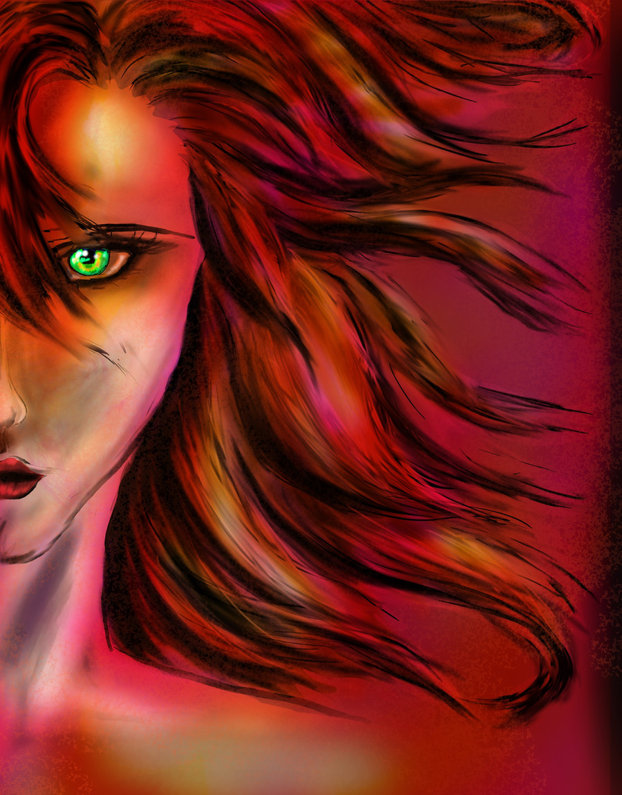
 astarayel — .:Red:.

Published: 2011-05-11 00:10:33 +0000 UTC; Views: 667; Favourites: 16; Downloads: 8
Redirect to original
Description
An old practice piece I found and decided to finish up tonight.Let it be known that this is my first attempt at hair and ears. So, hopefully they look convincing enough
 (Smile)")
As always, critiques and comments are greatly appreciated.
[Added my signature--my first name in Arabic calligraphy--at the bottom, because I really like this piece and figured it needed that finishing touch].
Related content


Comments: 29


that looks good, I like the shading. You cought the lights very well and it looks pretty realistic to me.
The hair looks also grat, especially the red colour in contrast to the green in the background.
👍: 0 ⏩: 1

You gave a powerful attention to light which makes those little details really standout more. It is always a good thing to go the extra mile to make those extra strokes to get something like the hair here to feel more loved. Thumbs up!
👍: 0 ⏩: 1

Thanks! I think this piece really taught me how dramatic lighting can add to the overall mood, it was very instructive. And fun to put all the little freckles in
👍: 0 ⏩: 1
i never mentioned how much i like freckled people. I think they got so much personality. it also interesting to me on how it makes that one person unique apart from others, even other freckled people!
👍: 0 ⏩: 1
I adore freckles. Besides being one of the easiest ways to add character to a portrait, they're just so cute/beautiful/fun!
👍: 0 ⏩: 0

For a first attempt, this is really quite impressive! You've definitely an eye for realism. You have sooo much potential to be an amazing painter it's just plain ridiculous! The ear does a look a little bit flat due to the angle of the piece, but it's something that you just have to practice at. I'd definitely recommend browsing through some of the stock photos on dA for practice references for future paintings. Also, ADORE the contrast! Contrast and play of light is such an important element, and I think you've rendered that beautifully. I'm also especially fond of the character's freckles. It definitely gives the character a more realistic, believable element. And! Your Arabic calligraphy is beautiful, and definitely adds a fantastic finishing touch to the image as a whole. Great job!
👍: 0 ⏩: 1
Your comments totally made my day--thank you!!
The stock photos idea is great--I'd never thought of that before (but I guess that's why people make stock photos, duh)
Thank you for all the compliments, they're so wonderful!! It's so nice to get such kind feedback

👍: 0 ⏩: 1
Aww, you're welcome! Stock photos I think are a god send. I've been brushing up on practicing realism, and it is very handy when you don't have a live model.
👍: 0 ⏩: 1
True, I'm going to go a little stock photo-browsing spree in a minute. Who knows what inspiration might hit?
Thank you again, and for the watch!!

👍: 0 ⏩: 1


I really love the tone you set with the colors and the eyes. There's something very striking about the red that cuts to the chase. Lovely job on the lighting, it's very dramatic and adds to the tone.
The skin tones could use more blending, or else have the picture set to a more zoomed out view. I realize you said this was a practice piece, but it's something to think about for the future. The eyes would also benefit from a mix of blending and zooming out. As it stands, I can tell that you colored the whites of her eyes after the red, or at least around an area where the red would go. If you want to leave the eyes/zoom as is, you could look into making the whites and iris on two separate layers and overlapping the edges. That way there's less of an outline between the two. On a general note, not all shadows need to be gray and black. Think about reflective lighting. (Ex: color of shirt, surroundings)
I won't say too much about the ears, as I still have lots of problems with them, but take your time with the ears and find lots of refs. You don't always need to search for "ear" or portraits with side views. Sometimes I find that searching for earrings or ear cuffs will come up with nice clean shots to learn from. As for the hair - looks great! I can tell you use different sizes, or at least pressure sensitive strokes to make it look fuller. Remember to take your time. If you get tired of hair, go to another part of the picture and come back a little later when you aren't as drained.
All in all, it looks wonderful, especially for something that's "just" practice. I look forward to seeing where you'll go from here.
👍: 0 ⏩: 1
I can really tell you put a lot of thought and time into this comment, thank you very much!!
The blending is rather rough, so I think in the future I'll take more care to finish it up. And I see what you mean by the eyes (why are they so hard to paint??); I think that I'll probably need to do a few "eyes alone" pieces to really get the hang of them.
Thanks for the tips on the lighting/shadows and the ears (ears...also ridiculously hard to paint. I'll be sure to use your search ideas for some better references ")
Again, thanks for all the time you put into this comment! It really means a lot to me--and I know that they'll make a huge difference in my future pieces
👍: 0 ⏩: 0

Thank you very much, and thank you for the favorite as well!!
👍: 0 ⏩: 1

Thank you
I love freckles!!
👍: 0 ⏩: 0

This is very beautiful. I love the contrast between the green and red which are natural complements that work very well together in this painting. The realism of this portrait is quite striking as well. I really like the subtle shine on her lips and her eyes are quite nice as well. The subtle shading on her face is very nice as well detailing the musculature, and I really, really like that you gave her freckles as any sort of minor blemish enhances a portrait's realism ten-fold. A minor critique would be to tighten up some of the detailing around her face and neck at the very edge most towards the light, maybe adding a subtle white highlighting line to enhance the contrast between light and dark even more. Very lovely work.

👍: 0 ⏩: 1
Thank you so much for your comments--they are greatly appreciated
I see what you mean about the highlighting, I was thinking that something was missing!!
Thanks again
👍: 0 ⏩: 0

I think I like the lips the best. The shading on them is very good~ I also like her freckles. The shading is good but it could be smoother. The hair is good but could also be a little more polished. Also The ear could use some work as well (shading and defining the shapes). Other than that very nice.
👍: 0 ⏩: 1
I agree, the hair is a little off from the rest of the painting, and so is the ear. Like I said, my first time with those so they didn't turn out so well
Thanks for your comments, I'll be sure to go back and edit this piece as best I can with them in mind!
 (Wink)")
👍: 0 ⏩: 1

