HOME | DD
 astrofavilla — WWE Logo Fan Redesign - Street

Published: 2010-06-05 19:15:43 +0000 UTC; Views: 5643; Favourites: 11; Downloads: 60
Redirect to original
Description
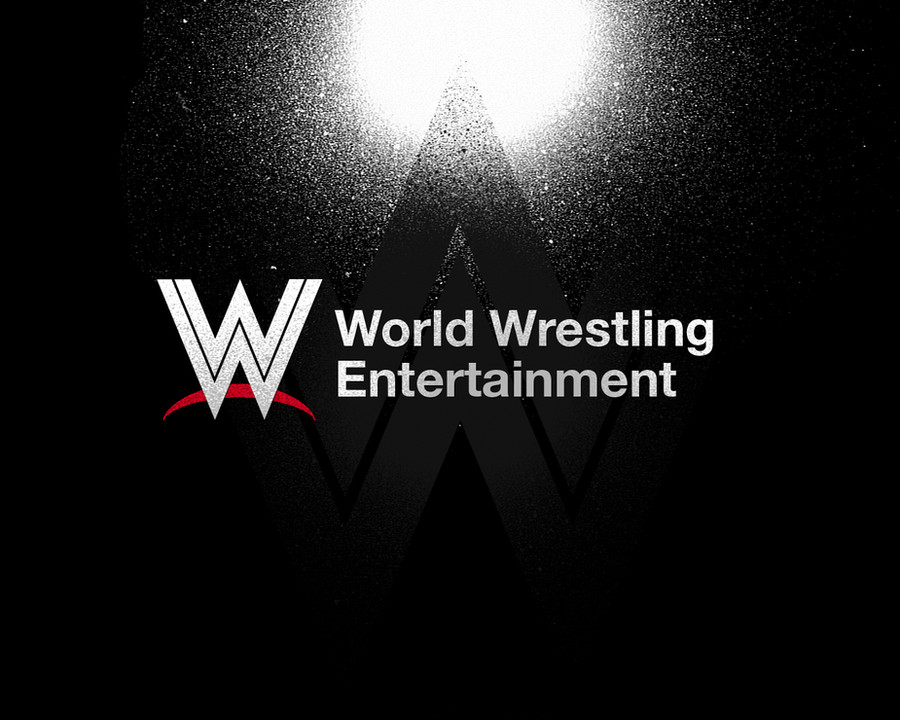
This is a redesign of the WWE logo I made back in March. It has been 14 years since World Wrestling Entertainment last changed their logo (counting both WWF and WWE variants as one) and I feel that they need a new look. So I went into Inkscape and made this beaut. The geometric look is a reference to the classic WWF logo and the bottom crescent is a callback to the "Scratch".This version called "Street" made about tweny minutes ago, would be good for a John Cena Shirt or a PPV poster or would make a good T-shirt. That and to have fun with spray paint brushes.
______________________________
WWE logo © World Wrestling Entertainment Inc.
Related content
Comments: 5

👍: 0 ⏩: 0

This is brilliant! The combo of the two most iconic logos? Genius!
👍: 0 ⏩: 0

Very clean. Love the incorporation of the 80s and 90s logos.
👍: 0 ⏩: 0

That's so cool but how do u know if that's there new logo that can only be there wwe network logo
👍: 0 ⏩: 1

The thing I did, its not their offical logo. It's just something I did since I think that the Scratch logo (in both F and "E" forms) have overstayed its welcome. As for the WWE Network logo, I was indifferent as first, thinking they should do better, but now, since I do want to see the scratch retired, I'm growing more and more open to seeing the WWE Network's logo as the company main logo.
👍: 0 ⏩: 0


