HOME | DD
 Athair-Ryu — *DESIGN: HELP PLEASE*
Published: 2012-06-08 02:06:34 +0000 UTC; Views: 97; Favourites: 0; Downloads: 2
Redirect to original
Description
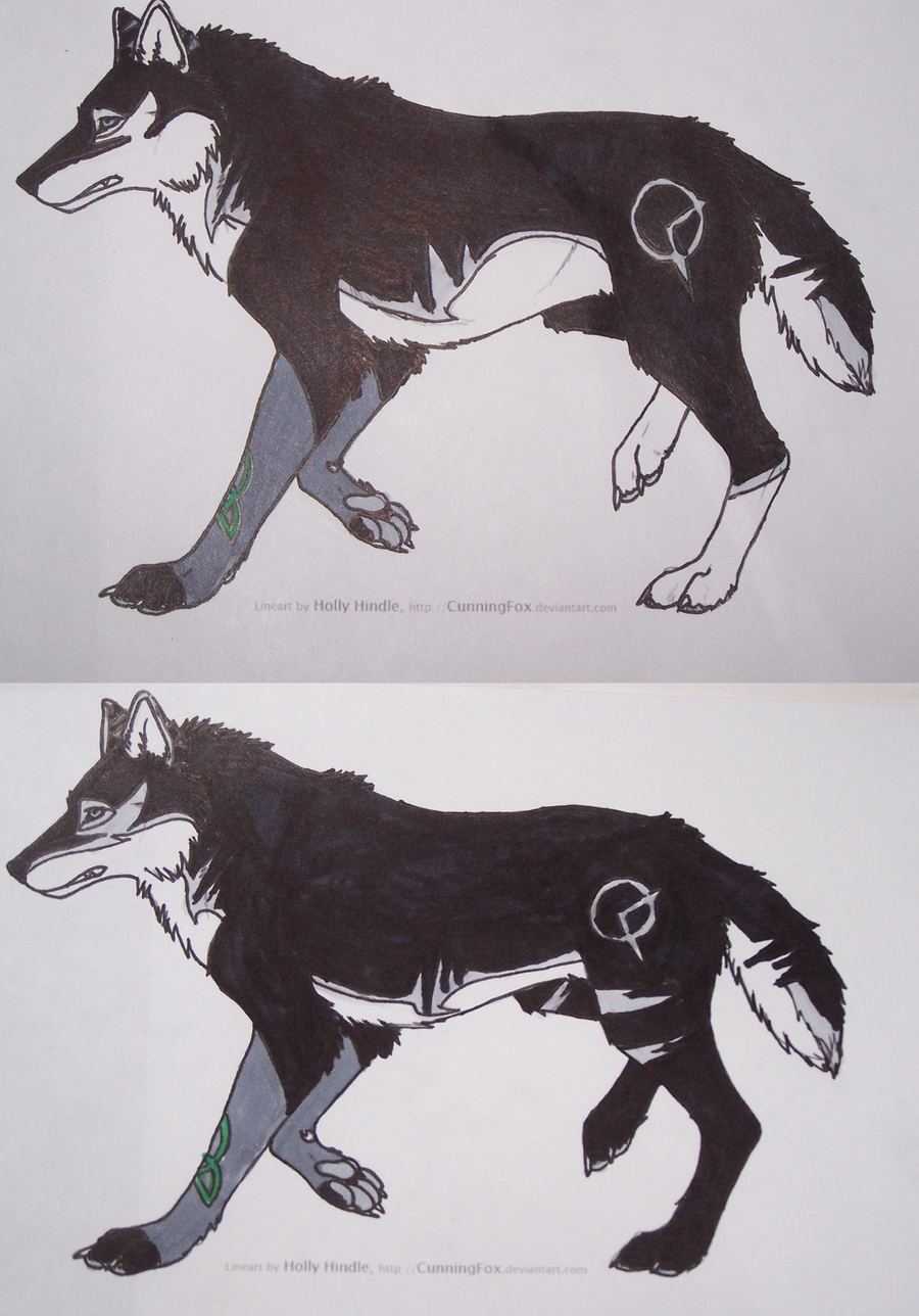
I'D LIKE HELP ON THIS ONEOK, So I want to do a revamp of my 'sona because of her new back story (it makes her old one look like I made it up when i was 5...which is probably true...) But am having a VERY hard time with it!
SO WHICH DO YOU GUYS LIKE BEST? and WHY? IS THERE SOMETHING I COULD DO TO MAKE IT BETTER?
Please note: the only differences are whether or not their is silver on her face, and the markings on her back legs, the rest is suppose to be exactly the same (although I did a better sob of the new body markings on the top one, and a better job on the tail on the bottom one). HOWEVER I WILL MIX AND MATCH THE SILVER ON HER FACE / BACK LEG MARKINGS AS NEEDED
ALSO: note: most of the SILVER markings (not the dark grey, those remain) will not usually show up, the exceptions are: her tail, the ones on her ears, and her back legs (which is why I'm posting this).
I DO NOT OWN THE LINEART (I wish I could draw that well) I tried drawing her like 5 times and got tired of it so I used a lineart for the first time D: But this is one good lineart
 (Smile)")
Lineart (c) and is here: [link]
Kai is (c) and I don't want anyone taking my designs! they're not free
Related content


Comments: 12

I say the first one but with the facial design and the back legs of the second. Really cool
")
👍: 0 ⏩: 0

I'll put my vote in for the first one. Through the design on the seconds back leg looks cool, the part before the cut off would be on the first one. I'm sorry that really made no sense...
👍: 0 ⏩: 1
Sorry, I meant the first one looked cool >.<
👍: 0 ⏩: 0

I think I like the first one too~ The facial design on the second one doesn't really sit with me...
But I like the back leg designs on the second one?
👍: 0 ⏩: 1

I'm mixing-and-matching if I have too so~
Yeah, I kinda started to dislike the facial design the more I looked at it O_o" You know, AFTER I submitted it -_-"
But you like the all black, but 2 silver stripes markings for the back legs instead of the cut off? (just making sure)
👍: 0 ⏩: 1
Yeah the face haha It's fine but I know what you mean
Yep~
👍: 0 ⏩: 0

I like the facial design, side marking placement, and the back legs of the first one. Though i like front paws sleeves of the second ones.
👍: 0 ⏩: 2
*my bad...although your right the first one's socks ARE darker O_o"
👍: 0 ⏩: 0
OK, actually the front sleeves are suppose to be the same XD By bad. And yeah, I think I'm not doing the mask that was on the second one's face O_o"
Thanks for the vote!
👍: 0 ⏩: 1
BTW, the top = clock mark is smaller / the bottom = clock mark is bigger
Of course the clock doesn't always appear so...
👍: 0 ⏩: 0