HOME | DD
 AtixVector — MY deviantART LOGOTYPE
Published: 2008-10-04 02:03:03 +0000 UTC; Views: 36603; Favourites: 440; Downloads: 2778
Redirect to original
Description
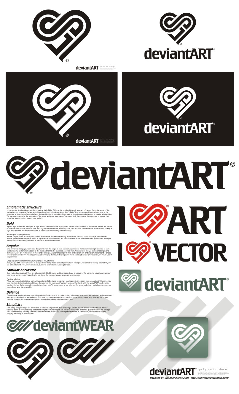
I LOVE DA V1.0::::::::::A C T U A L I Z A C I O N:::::::::
Si quieren ver cómo quedaría este logotipo en el header de DA, veanlo en este video, cortesía de `Norke [link]
I LOVE DA V 2.0 [link]
My deviantART Logotype III [link]
Related content


Comments: 359
 (Smile)")

")

I like the heart shape to it. I think that's really a neat idea.
👍: 0 ⏩: 1


Me encanta tu idea ^^ todos queremos dar amor a DA

👍: 0 ⏩: 1

well this is definitely epic lol.... i'm thinkin' even if it doesnt win, you'll still see it all of dA
👍: 0 ⏩: 1


This is cool!
I hope that you win! <3
👍: 0 ⏩: 1


actually the 1st design that looks better than that arpad's symbol... if this one wins, I'll be happy with the results. congratz mate, great work indeed.
👍: 0 ⏩: 1

Thank you. I appreciate it...
👍: 0 ⏩: 0

at first i was very sad that the DA logo was going away, but this gives me a whole new perspective C:
👍: 0 ⏩: 1


Hey, I think this would make a great logo for deviantART!
👍: 0 ⏩: 1


nice i haven't seen any other logos but this is really good.
👍: 0 ⏩: 1

jesum crow! i really hope this one wins, it's totally tops! i would love to see this be the new logo, it's insanely hip. great job on designing!!
👍: 0 ⏩: 1


Thats a really cool idea- I like that its heart shaped and has nice clean lines.
👍: 0 ⏩: 1

awesome logo, but I don't think it represents the aspect of DeviantArt well. I think of love when I look at this, like a heart. I really don't want a heart at the top of my screen for every page on dA
")
👍: 0 ⏩: 1
I have a second option for those who think like you, without having to give up my original idea ... : D
👍: 0 ⏩: 0

This is the best on I've seen yet, as it fits all the requirements and is still innovative, but it's maybe a bit too sweet. Also, some people might not see any letters jumping out of the logo, and some of the people who do, might read it "cA".
👍: 0 ⏩: 1
Maybe you're right. However, I am working on other alternatives. Thanks for comment.
👍: 0 ⏩: 0

Great job, though I'd see that more for favorites or daily deviations than for the dA logo itself.
👍: 0 ⏩: 1

I looked at all of them and yours came out on top. I love the lines and both the d and the A are easily visible. Plus i love the heart shape. This logo could inspire a lot of great community art as well. Great job. I really hope this wins!
👍: 0 ⏩: 1

I like how yours is different from most of the others
👍: 0 ⏩: 1
<= Prev | | Next =>