HOME | DD
 Pallala — DA Logo design

Published: 2008-10-13 18:12:24 +0000 UTC; Views: 5068; Favourites: 43; Downloads: 585
Redirect to original
Description
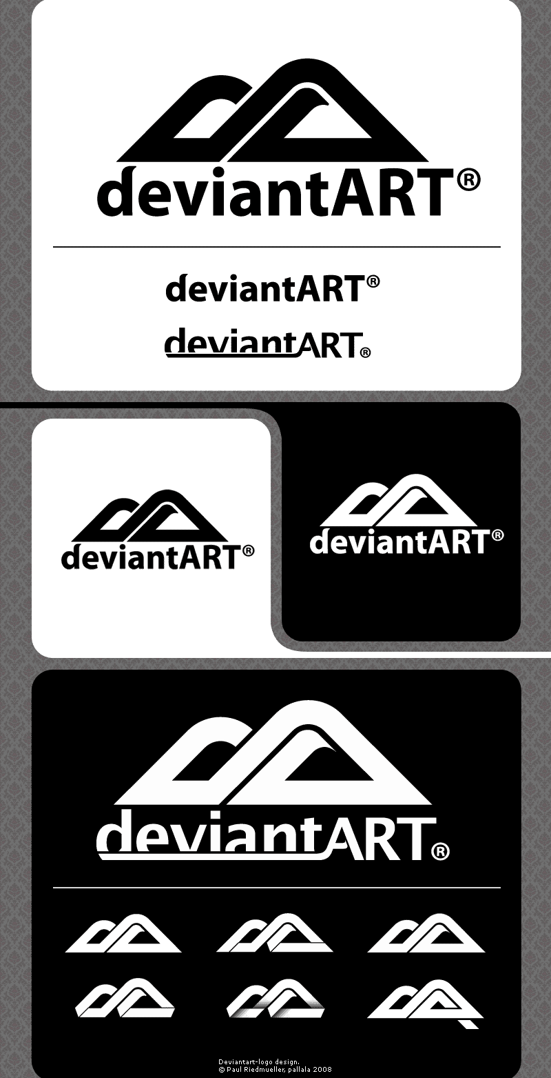
So now I also made a logodesign....I thought it should be more ART in this logo. Landscapes are shown in the most art categories, so I decided to transform the D and the A into hills (or mountains). I think its identifiable and your eyes can enjoy.....
Hope you can belief in.
Related content
Comments: 40

looking cool. like the bottom left version best. good luck
👍: 0 ⏩: 1

Yes its a nice try! may be it will choosen!
👍: 0 ⏩: 0

I think ti has enough familiartiy to it to really work, but it's quite fresh and clear and crisp and clean.
Very nice execution!
👍: 0 ⏩: 1

Thank you dude, nice to hear!
👍: 0 ⏩: 0

jea because of the shadow right?
👍: 0 ⏩: 1

Obviously. It adds dimension as well.
👍: 0 ⏩: 0

hope it too
and thanks for the support
👍: 0 ⏩: 0

killer job on these,, , fly concept, lovin the hills and the presentation.. . . nothing too fancy, just eye pleasing
👍: 0 ⏩: 1

I like it, very slick, and it still is recognizable as the DevArt logo...great work! ^^
👍: 0 ⏩: 1

to be recognizeable is very importent
👍: 0 ⏩: 0

cracked something different but yet similar i like it
👍: 0 ⏩: 0

I don't know. Very nice logo. But I have the feeling it could fit better for a mountain climbing clothing logo.
👍: 0 ⏩: 1

I do like this design because it is close enough to the current design that people can still recognize it. Very good job!
👍: 0 ⏩: 1

Yeap...they should definitely change it to ur design!
👍: 0 ⏩: 1

^^thanks I m confident
👍: 0 ⏩: 0

mir gefällts
auch das ganz links unten is sehr cool
mein kleiner geheimer fav
👍: 0 ⏩: 1


