HOME | DD
 CaPtIne — dA Logo
Published: 2008-10-01 22:43:32 +0000 UTC; Views: 6961; Favourites: 61; Downloads: 200
Redirect to original
Description
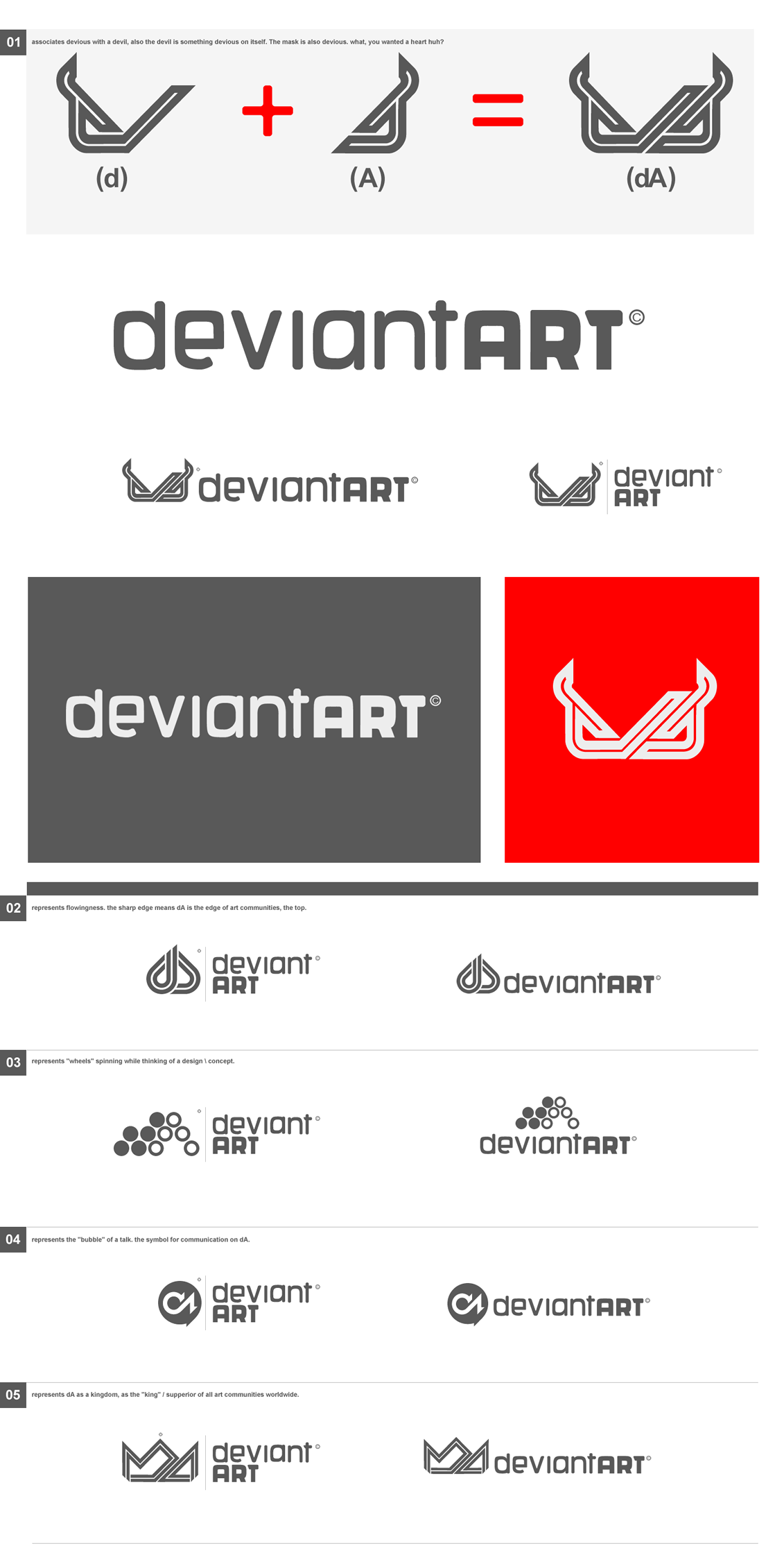
Thought I'd give it a try.I took into consideration what Ryan Ford said about the angular lines, how they convey emotion.
"Angular lines imply motion and excitement, and are reminiscent of the shape people take when they're running (among other things)."
This parallel to the shape of a person running inspired both the angle and tail at the end of each stroke, which I thought suggested movement.
This design is one of many sketches, but alot of them were quite minimalistic and thin. Mainly becuase I felt that thinner lines elongated the logo and helped it appear more corporate;
"...the best logos are the ones that feel official."
..but then...
"A great logo is bold and isn't quiet."
Finally, I really like the new logo that $liquisoft and the team created. BUT. If I was to see it on its own, black on white & had no recognition of what deviantART was, I would probably struggle to depict the 'd' from the 'a' or what it represented. Which is why I chose to capitalise the letter 'A' and not join the center stroke to the 'd', to separate them both a little.
I don't know if anyones noticed, but upside down, it makes absolute mint t/vp logo.
Thank you
Related content


Comments: 45


Hi, can I use this logo concept as an alternative to classic green dA logo in my new dA fix plugin?
👍: 0 ⏩: 0


Nice, certainly much better, and more legible, then the one they came up with.
👍: 0 ⏩: 0

One of the only entries where I can differentiate the d and the A easily. It does look a little sporty, but I like the bold look to it, and the angular feel. I might prefer it if the top of the d didn't stick out much, though. Still... very professional looking.
👍: 0 ⏩: 0

Very, -very- sexy indeed, my friend. 
👍: 0 ⏩: 0

I like everything about this logo except for the top of the A. How the little piece sticks off from the right side, instead of being a pointed/rounded tip.
👍: 0 ⏩: 0

I like this one, though I see what people mean about EA. It also slightly reminds me of Nike (the d), but it's nice! Good luck!
👍: 0 ⏩: 0

nice logo ... it looks fast ... and the things the wanted to say with angural line are that angular lines are authoritative and make a deep impression on a person like a man with alot of power ( best example is nazi symbol for it ... we all know who used it , right ? ) anyway about your logo, it represents speed very very well but laks the impact ... it just speeds off into infinity .... i dont feel it will ever make and impact somewhere, if you understand what i ment :S
👍: 0 ⏩: 0


the best entry so far but the others are awful. However, those pointed tips doesn't feel to be DA, have you seen something sharp and pointed in DA? nope, boxes are rounded and some others are squared.
👍: 0 ⏩: 0

Too much smiliar to Electronic arts logo and type. Far from uniqueness of dA itself.
👍: 0 ⏩: 0

Haha, I like the photoshop.
It's very curvy and spikey. I don't think your text quite fits the brief though, just slightly.
Still pretty good!
👍: 0 ⏩: 0


You nailed the official part. This kinda reminds me of the EA logo, or that of some other video game company. It's sharp and proactive and dammit it's so exciting it's gonna KICK YER ASS!!! That's a logo that gets in yuor face, but in a way that, if you don't know what "dA" is, you'd wanna know.
Awesome job. 
")
👍: 0 ⏩: 0


best entry ...so far ..
however...:
I think the logo is a little bit too bold ...but this is a subliminal "problem" really...
somehow i dont like the pointy thing at the bottom right end of the "d" ...you know what i mean .. :/
Dunno if it would look better without ...but im not satisfied with it somehow..
maybe you could make a "rounded edges only" version too ...only to see what looks better ..
👍: 0 ⏩: 0


not bad ... but it looks sport kind of thingy ... not art related ... some EA sports time ... still nice attempt
👍: 0 ⏩: 0

This one has a very sporty feel to it. I feel like the DA is running. Very clean look, professional feel to it. Good luck!
👍: 0 ⏩: 0


I like yours the best. It looks AWESOME on the site! I hope it wins. I don't like a lot of the others.
👍: 0 ⏩: 0

win.
i love this.. i think its just as good as the one the dA team made. if not better.
good job. keep up the good work..
👍: 0 ⏩: 0

awesome logo!")
👍: 0 ⏩: 0

I noticed there is a smooth flow given to this overall. But where the D meats the A there is a hard corner, also near the top on the right side of the A where the legs meet, there is another hard edge. Maybe smooth them for a better feel?
👍: 0 ⏩: 0

Its good but it reminds me too much of EA sports. I would make it more original.
👍: 0 ⏩: 1


By FAR the best entry so far. I really hope this makes it!
👍: 0 ⏩: 0


It somehow reminds me of EA Sports logo. dA Sports...

👍: 0 ⏩: 1


I like how the three parts, especially the part under the A get smaller until they fade out.  (Smile)")
👍: 0 ⏩: 0

Really NICE! Out of the others submitted so far, I like yours the best. You have a great idea!
👍: 0 ⏩: 0

That's really interesting, I like it!
I think it looks a little heavy on the right though.
👍: 0 ⏩: 0