HOME | DD
 Nikeos — dA devil concept and recent
by-nc-nd
Nikeos — dA devil concept and recent
by-nc-nd
Published: 2008-10-05 19:15:38 +0000 UTC; Views: 9612; Favourites: 121; Downloads: 273
Redirect to original
Description
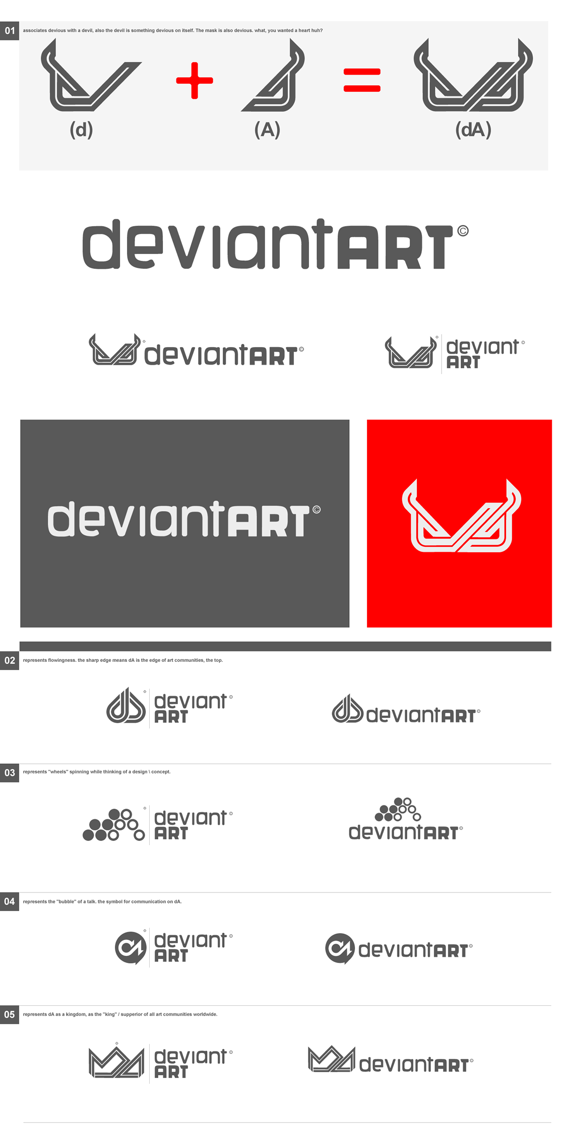
dA devil concept + Catalog #3
I numbered the catalog so when you relate on your comment to a certain concept, I'll know which is it. also, i included small explanations to each concept. Have fun browsing
 (Wink)")
a concept of a devil, like deviant, and relates to the deviant meaning, finally something that i felt relating to deviantArt.
Spoiler: No hearts here!
( because you can love anything, but gotta have something associates with "devious", otherwise it's just a heart with d and A )Please don't start making dA devils, it's a concept i thought of a lot, and i wouldn't wanna see it getting the heart syndrome. Thanks!
 (Smile)")
Related content


Comments: 75


great work, I like the ideas, especially the "bubble" one
👍: 0 ⏩: 0


")

Very creative. This shoud be the new logo! It really has a great idea.
👍: 0 ⏩: 0


these are some of the best i've seen in the whole contest. amazing logos, and such clean, professional lines! I congratulate you! (:
👍: 0 ⏩: 0


3 and 4 are my faves. but mainly I LOVE your typographic solution to this. It is definitely the best of all entries so far. It's similar to liquisoft's and i really like the direction he took but you have really improved on it i think. it's a little bit more welcoming and balanced.
I'm not a fan of the retro lines that everyone is using though. i get the concept of nerdishness and video games which is cool but it just looks crap i reckon. some are looking too harsh as well - more like gothic tattoos and there's nothing wrong with that but i don't think it covers the majority of artists on dA.
anyway, that's my 2 cents. I'd love to see 4 as the new logo!
👍: 0 ⏩: 0

i like very much the first, de devil! looks great men!
Good luck!
👍: 0 ⏩: 0

Love all of these. Hope one of 'em at least wins!
👍: 0 ⏩: 0

I like the speech bubble really. I think that really emphasises the community aspect: forums, comments and chat, exchange of ideas. You could go further I think with this idea.
The devil looks like it's got one eyebrow raised hehe.
👍: 0 ⏩: 0

First of all you did a awesome job and its easy to see how many hours you have used on this. But I personally think that the "devil" concept is too much, aswell with the crown. Its too hard to see which letters it is. Personally I like 3 or 2 the most. But still awesome job mate
👍: 0 ⏩: 0

my favourite concept is the secound ,and i love that font ,what you have made.Good luck !
👍: 0 ⏩: 0

imo as far as this comp goes the only comp is between yourself, and Russ , and Nunso
👍: 0 ⏩: 0


Nice ideas , loved the concept of the kingdom, it's really good
👍: 0 ⏩: 0

all here shown logos are awesome! What a pitty Deviant-Art can only have one logo... the one I like most ist the devil-concept, followed from the crone-one!
Really great!
Keep it up.

👍: 0 ⏩: 0


nr 4, I really like it! The link between the bubble and the community is easy to find!
👍: 0 ⏩: 0


I prefer #03. Maybe it's because I'm a girl, but #01 reminds me of a bra for some reason.
👍: 0 ⏩: 1


i love the contrast between the harsh styles of the logo and then the smoother styles of the typography.
great design ^_^
oh, and it's the small details that count, i love how you put the copyright symbol over the crown, absolutely brilliant!
👍: 0 ⏩: 1

WHOA! LOVE IT!
What do you mean by no hearts here?
👍: 0 ⏩: 2

Because there is a lot of designs trying to show a heart shape.
👍: 0 ⏩: 1

Im hating hearts too, this is nice
I want a tee with this printed on it.
👍: 0 ⏩: 1
| Next =>