HOME | DD
 atmo — Fusion WA3 preview

Published: 2002-07-23 04:36:53 +0000 UTC; Views: 431; Favourites: 3; Downloads: 54
Redirect to original
Description
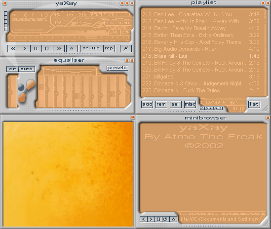
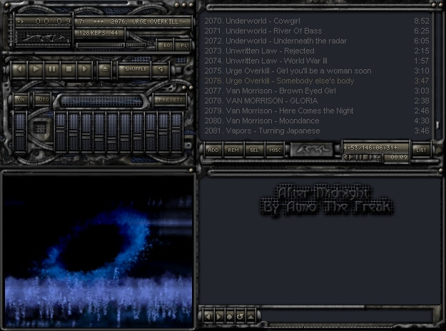
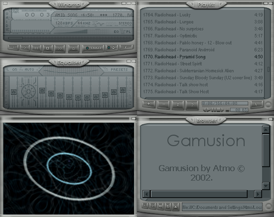
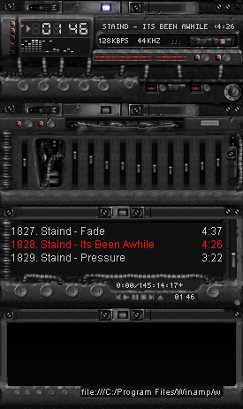
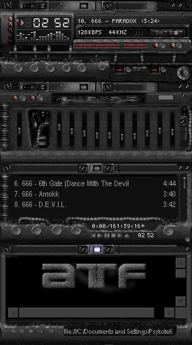
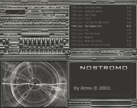
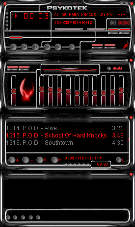
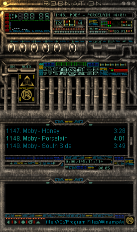
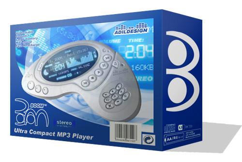
My new WA3 project, still in its early stages of design.Related content


Comments: 10

The sweep in the display looks really good. This thing makes a good highlight. Without it, it would be just a round display.
Very good, such highlights are very important, but some makes too much of them.
👍: 0 ⏩: 0

werd... i cant wait till it is done... i dont use WA3 but i hav it to look at skins... hahhaha
👍: 0 ⏩: 0

excellent work! everything seems to me ok. can't wait to see the final skin!
👍: 0 ⏩: 0

wow! nice skin. i like the display. looks good to me.
👍: 0 ⏩: 0

i agree with foshizzle the text shouldnt be cut off
otherwise good skin
👍: 0 ⏩: 0


Looks really nice so far. I like the elemtn of the open pool-like area in the center surrounded by discman-esque interface elements. The texture on the piece which holds the buttons seems somewhat out of place since the rest is so smooth - it might be better done with the same type of metal sheen used elsewhere (maybe only lighter or darker than the rest if you wanted to seperate it?). But, it looks great thus far as is, so it's your choice. Nice!
👍: 0 ⏩: 0

great typo, i think that you should warp it so it follows the contour of the bubble, but it looks sweet besides taht, nice work
👍: 0 ⏩: 0


that looks preety smooth... just make sure the inside text dont get to blurry... but i like the glass reflection..
👍: 0 ⏩: 0