HOME | DD
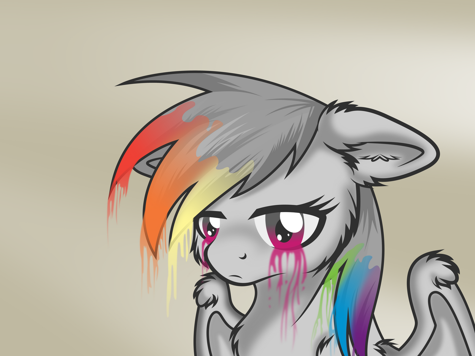
 Atmospark — Colourless Rainbow
by-nc
Atmospark — Colourless Rainbow
by-nc
Published: 2012-12-22 06:33:33 +0000 UTC; Views: 31005; Favourites: 2248; Downloads: 1032
Redirect to original
Description
Original (used with permission): [link] by the very talented *InuHoshi-to-DarkPenWow! Okay. This took much much longer than I expected, but I'm really happy with the outcome. I personally think this may be my best (and most ambitious) vector to date.
I would like to thank a few of the #MLP-VectorClub admins for putting up with my countless revisions and *ahem* polite requests for input. I would also like to thank =flutterguy317 personally because he had to export this one for me as for some reason Inkscape refused to work with me.
Alternate Versions
Wallpapers: 1366x768 , 1920x1080 (let me know if you want another size, I'll try and do it)
Rainbow Dash (no background): [link]
Vector Details
Time Taken: Roughly 12 hours on-and-off
Program: Inkscape
Number of Nodes: 1690
I've made this vector with an as yet unreleased version of =flutterguy317 's Ponyscape. It's a modification of Inkscape 0.49 which I am beta testing. There are certain features of it that I've used which you won't be able to see in the current versions of either Inkscape or Ponyscape, so if you do want to be able to play around with the SVG, you'll need to go here and download Ponyscape V0.2. or just +Watch =flutterguy317 because he's told me he will be releasing future updates through deviantART
 (Wink)")
SVG: [link]
Edit (23/12/12): Featured on Equestria Daily's Drawfriend #662 [link]
Related content


Comments: 131


Vision
Technique

Her folorn expression fits perfectly with the colours draining from her, it really gives a sense of being alone. You can see the feeling in her eyes and the posture is just right, well done.
Maybe to capture her full emotions, have the wings droop slightly? But you've still done an amazing job, this is really good, I wish there were more pices like this on Deviantart art that display a completely different side of a character, it works as its the complete opposite of how she usually is and again well done. I envy you. Going on kmy favourites.
👍: 0 ⏩: 0

Wow, this is beautiful. I love the bleeding colors and it feels like its a good representation of depression.
👍: 0 ⏩: 1


")


*Gasp* Don't tell me she got Discorded again!

👍: 0 ⏩: 0


Not familiar with the character or the software, but I'm impressed. Nice work!
👍: 0 ⏩: 0


its very creative i usually like colorful drawings but this one taps in to my likes so keep up the good work!
")
👍: 0 ⏩: 0


this is actually amazing, i havent seen this done before and you should be proud of yourself lel (sorry im not good at talking all technical like a critic)
👍: 0 ⏩: 0

Quite the striking picture. Great job capturing the raw emotion that Dashie is going through,.
👍: 0 ⏩: 0

Yes. It is amazing! :3 I found this on Google when I searched "Kitty057" (me). This picture came up! Love it. :3 Is this anything to do with the Rainbow Factory o no? :3
👍: 0 ⏩: 0


")


Congras You MAde it in EQD And My top ten Best RD Arts
👍: 0 ⏩: 0

This is one of those pieces where even if your not into what it was made for, Its still a wonderful work.
👍: 0 ⏩: 0


Beautiful work, beautiful banana. Well done good sir.
👍: 0 ⏩: 0

OMG SO FREACKIN PERFECT! can i use your idea? ("cry" the colors)
👍: 0 ⏩: 0

This looks absolutely beautiful!! Just.. everything about it looks amazing!
Would you mind if I used this is a wallpaper?
👍: 0 ⏩: 0

IDONT CARE (even if its art)!!
I LOVE LOVE LOVE LO0VE IT!!!!
👍: 0 ⏩: 0

Using for FaceBook account. I will credit if I can.
👍: 0 ⏩: 0

Quick someone form a band and sing a song about love to get her colors back!
👍: 0 ⏩: 0

Just... wow. You did an awesome job with vectoring this. Would have thought it's an actual drawing if i hadn't found it in a vector group
And holy buck at that SVG oO Took almost a minute to load in Ponyscape, how the heck did you work on this without perma-disabled filters?
Oh, and: do you like bananners? xD

👍: 0 ⏩: 0


No I don't, sorry. I just don't have the time or motivation to do requests anymore.
👍: 0 ⏩: 0


well, guess i should have written something to this three weeks ago... x)
anyway, suffice to say: smeggin' brillant
no really, the way you implemented the shading is neat, to say the least. even though that one shape on the lower part of her mane is imho slightly confusing, because it could be a shadow cast by the ear, which would make it look like an unblurred shadow, but i guess it's part of the mane decoration and is as such totally fine... maybe it's the position of it or whatnot, but it's the only thing i found not fitting 100% percent here ( and that means ignoring the inconsistent stroke width, but that's to be expected if vectoring some pixel arts.... i mean seriously, those eye lids(?) are friggin' huge! and look rather awesome 
also, i like the effect of the color draining from the eyes (not because it's bad for ponies, but because it's (if i can still see straight) a little deviation from the original for the better), it seems like the blur there is heavier than on the other colors, which makes it almost look like smoke rather than a liquid and helps to establish the idea, that something is very very wrong here (i mean come on! ponies aren't supposed to lose their colors, that's just... well, wrong :< )
anyway, point is, great job on this one... that's the kind of vector people will remember
👍: 0 ⏩: 1
Hehe thanks for the feedback!
(You could totally have left it as a critique though ")
👍: 0 ⏩: 1
nah.... i'm thinking about writing a proper critique though. but for that, i need to watch the episode about VALUE first
👍: 0 ⏩: 1
>wasn't in it
how could you leave rp and flutterguy alone with that rambler and his favourite topic? xD
👍: 0 ⏩: 0

| Next =>