HOME | DD
 atobgraphics — SlicedAB : Typographics

Published: 2006-03-25 19:45:22 +0000 UTC; Views: 9337; Favourites: 211; Downloads: 1036
Redirect to original
Description
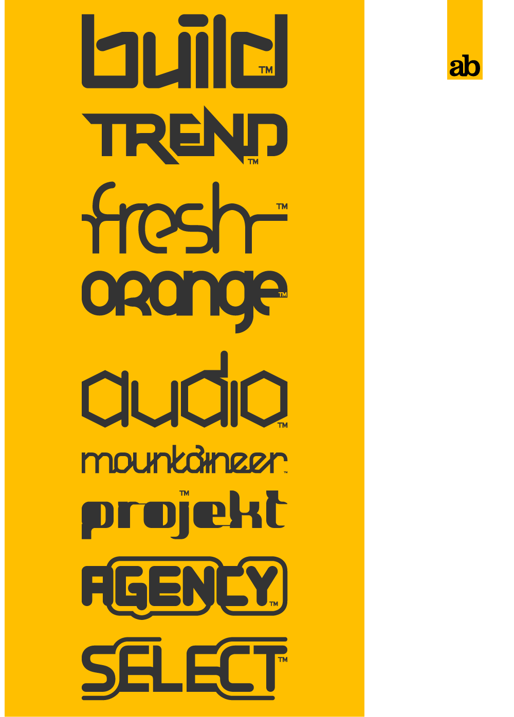
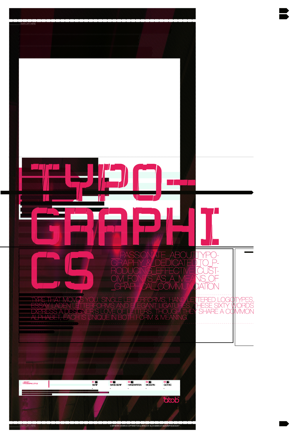
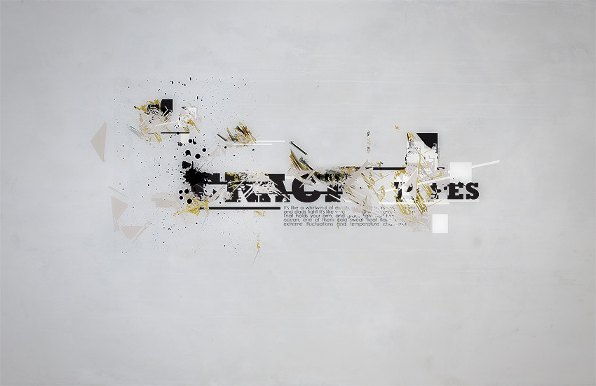
A new typeface ive been workin on called Sliced.NOW AVAILABLE FOR DOWNLOAD. CHECK MY GALLERY !
Comments Welcomed
Thank You
 (Smile)")
Related content


Comments: 65


Looks great!
Don't like much of the '7'... Maybe you should take that line in the middle. Just a thought!
Anyway, looks really nice!
👍: 0 ⏩: 0

The crispness of the font elements doesn't really match the low quality of the blown up image it's placed on, but the font itself looks alright.
👍: 0 ⏩: 0


looks sweet! id deffinatly use it as a typeface! got a comtempory yet industrial feel! v.nice!
")
👍: 0 ⏩: 0


that is wicked mate, font looks kool but i really like the industrial scratchy yellow.
👍: 0 ⏩: 0

waw, is this all digital art?? it looks so reel, so rough.. cool
👍: 0 ⏩: 0
spritek [2006-03-25 20:06:11 +0000 UTC]
Very nice, just the "N" looks strange ")
👍: 0 ⏩: 1

I agree... the N and M seem to have a serif going on, which irks me.
Other than that, awesome. I dig.
👍: 0 ⏩: 2

is it grungy? i expect a grunge version of it!!!!! (word!)
👍: 0 ⏩: 0
loose the serif like in "w" and that'll be ok (very ok). good job! when it'll be available? I WANT IT! (I'm a font lover)
👍: 0 ⏩: 0


<= Prev |