HOME | DD
 atobgraphics — Typo-

Published: 2006-01-02 16:59:40 +0000 UTC; Views: 6678; Favourites: 38; Downloads: 566
Redirect to original
Description
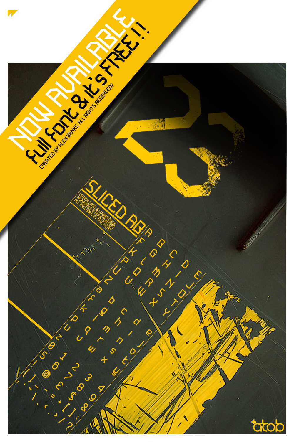
My first submission for 2006.Ive wanted a purely typographic poster for my room for ages now and finally got round to producing one.
Not the ideal colour choice but it looked so cool like this.
On small view the image looks blurry, on large looks fine though. How odd :s
Available for purchase up to 24"x36"
Related content


Comments: 37


i quite like the pink - it stands out alot - if only i could buy the print lol! very trendy fonts aswell - helvectica? dont have that on me pc...
")
👍: 0 ⏩: 1

The main title font was self produced, the other text font was helvetica neue
 (Smile)")
👍: 0 ⏩: 1
ye thats wot i was sayin i dont have any helvecticas. but its nice - did u try other colours?
👍: 0 ⏩: 1
tried a few but the vivid pink stood out the best, orange was ok and lime green just didnt work as the background.
👍: 0 ⏩: 1
ye i was thinkin of those colours - but pinks striking
👍: 0 ⏩: 0


 (Wink)")

Very interesting vector.
i like the colours, and the use of text in art..something which is sometimes lacking
👍: 0 ⏩: 0

REALLY like it. Looks like it could be a page from 'Grafik' magazine
👍: 0 ⏩: 1
Thank you, appreciate your comment

👍: 0 ⏩: 0

Cheers mate, and happy new year
Good to have you back after you got banned lol

👍: 0 ⏩: 1

haha happy new year to ya and thanks
👍: 0 ⏩: 0

Pieces like this makes my wanna get into typography so badly!!
Too bad I nearly got the time to sleep aside from school and my job ")
Sick piece man!
👍: 0 ⏩: 0

Agreed. Type & fonts are great. A few years ago I wouldn't believe that I'd love the way a nicely set page looks as much as I do. So I know where you're coming from.... ('cept I cant make a font for beans).
BTW, I downloaded your font 'fonce' - and have used it for print work already. Very balanced font. Good work.
👍: 0 ⏩: 1
Dont think 'Fonce' its one of mine, but would love to see it. Do you have a link to it ?
👍: 0 ⏩: 1
My mistake, it was done by .
Here's the link: [link]
👍: 0 ⏩: 0

Another sweet design, I have to say. I wish I had your fonts -- they're so trendy and neat. But I don't have that sorta thing on my PC.
👍: 0 ⏩: 0

very cool. are all those light beams and intense light 'spots' from a photo or did u jsut make them from scratch. either way they work very well adn are really interesting... so cool that u print ur pieces... maybei should start. might inspire me to do soemthing new.
👍: 0 ⏩: 0


Glaaaarg. Brilliant as always. I don't think it needs a graphical focal point - that would just undermine the typography, which is clearly the star of the show here.
👍: 0 ⏩: 0

Beautiful, just beautiful. I admire the way the text is intigrated beautifuly with the, really cool, background. Very nice, yet another

👍: 0 ⏩: 0


cool.
that is weird how the thumbnail is blurry like that...
👍: 0 ⏩: 0


Really nice man, i bet it looks awesome in your room. Nice one!
👍: 0 ⏩: 0

the style somehow reminds me of testpilotcollective.com
great composition and choice of typeface.
👍: 0 ⏩: 0

Love the typographics font (I didn't want to say typography twice)...
The underscores are a little too thick for my taste...
Love the picture background...
Overall I like it.
Sry for blandness of comments.
👍: 0 ⏩: 0

liked what you did in the background. is it a photo?
👍: 0 ⏩: 1
Yeah, was one I took years ago in a car park.
👍: 0 ⏩: 0
