HOME | DD
 atobgraphics — Modern.Deco.Typography
by-nc-nd
atobgraphics — Modern.Deco.Typography
by-nc-nd
Published: 2008-03-12 23:11:55 +0000 UTC; Views: 14023; Favourites: 127; Downloads: 0
Redirect to original
Description
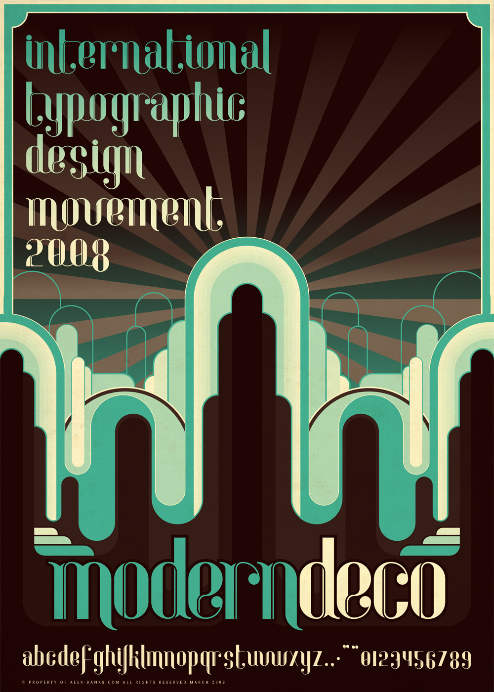
Typography_ModernDecoNew typeface called 'Modern Deco'
It's my take on a new age updated art deco typeface.
Poster design will probably be updated soon.. still not 100% sure on the feel of it.
Comments please.
PS: font isnt available for purchase just yet. am busy creating online shop for my font collection. hopefully be completed shortly. watch this space
Related content


Comments: 33

Thanks for the kind words everyone
The font got put on hold for the time being until the Uppercase set has been completely worked out.
Will post updates on that asap
👍: 0 ⏩: 0

 (Smile)")


I love the font a lot, and the colors in this poster are perfect. good job!
👍: 0 ⏩: 0


damn,its awesome!!!!I like the design , and the font! GREAT!
👍: 0 ⏩: 0


")

Is it your job to design posters?
If not I suggest you should, this has to be one of the best layed out posters I've ever seen. It's eye catching and clear. Great work.
👍: 0 ⏩: 0


I like the colors and type at the bottom but the type at the top is too big i think.
👍: 0 ⏩: 0


I'd enjoy the whole work more if it would be less vector art and more about the very font. The font itself is Amazing, trully pro work. +fav
👍: 0 ⏩: 0

really beautifull. perfect symbiosis of art deco and modernism
👍: 0 ⏩: 0

super tight. love it.
somehow this reminds me of bioshock.

👍: 0 ⏩: 0


like the way the characters flow and the colours used suit the idea very much -- later days
👍: 0 ⏩: 0

I,m really imprest with your font.
The curves and counters looks really good!
And what you say is looks very old with a new modern touch. Like that!
And ik enjoy how the letters connect
For the poster part, i,m not feeling it really.
It's to much vector in my opinion
Maby you can simplify it a bit more,
And less vector, and more about the type.
gr
👍: 0 ⏩: 0


its real nice i like it a lot man good stuff
👍: 0 ⏩: 0
