HOME | DD

ATouchOfConcept β€” Creature Design 1 More Shading

Published: 2014-05-23 09:03:23 +0000 UTC; Views: 1437; Favourites: 72; Downloads: 0
Redirect to original
Description 
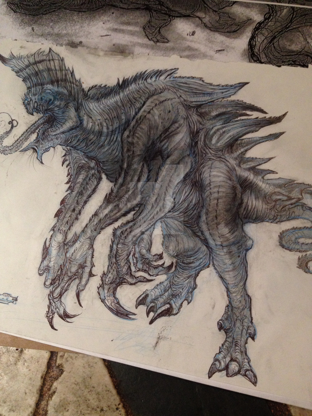
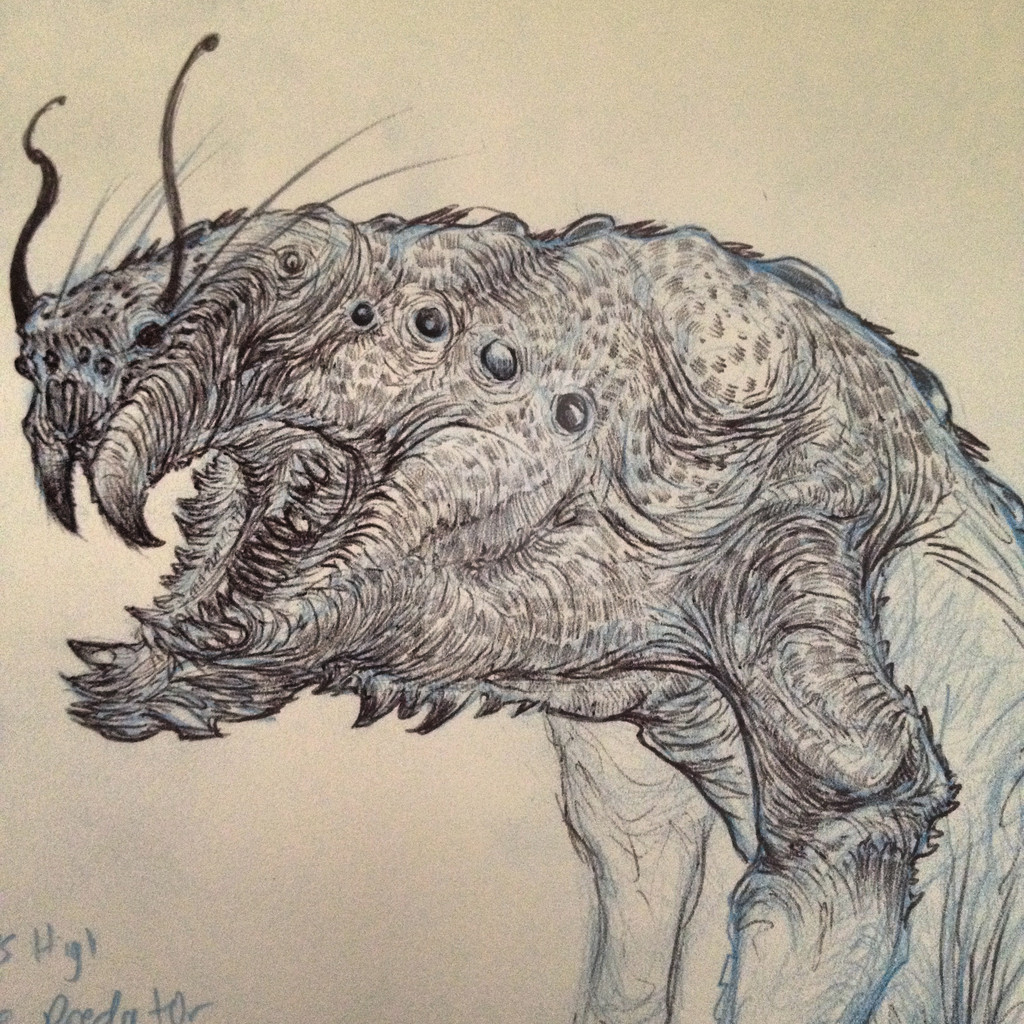
Here's another progression shot of creature 1. Our creature guy has done quite a bit more detail since last time you guys saw this one. Hope you enjoy!
Related content
Comments: 23

kcamachowasnothere [2014-06-20 15:30:11 +0000 UTC]

love it

πŸ‘: 0 ⏩: 1

ATouchOfConcept In reply to kcamachowasnothere [2014-06-21 17:42:33 +0000 UTC]

Thank you!

πŸ‘: 0 ⏩: 0

ShepherdoftheWest [2014-06-01 01:17:23 +0000 UTC]

No way! That's a Kaijun! And todayΒ we're canceling the apocalypse!!!

πŸ‘: 0 ⏩: 1

ATouchOfConcept In reply to ShepherdoftheWest [2014-06-01 01:27:28 +0000 UTC]

Hahaha!

πŸ‘: 0 ⏩: 0

tagakain [2014-05-28 11:45:41 +0000 UTC]

awesome work!

πŸ‘: 0 ⏩: 2

ATouchOfConcept In reply to tagakain [2014-05-28 18:19:26 +0000 UTC]

Thank you!

πŸ‘: 0 ⏩: 1

tagakain In reply to ATouchOfConcept [2014-05-29 12:13:41 +0000 UTC]

no problem and your welcome!

πŸ‘: 0 ⏩: 0

ATouchOfConcept In reply to tagakain [2014-05-28 18:19:07 +0000 UTC]

Thank you!

πŸ‘: 0 ⏩: 0

NeonMonsterBytes [2014-05-28 10:05:31 +0000 UTC]

This is really cool!
Love all the details, especially the detail in his face.

πŸ‘: 0 ⏩: 1

ATouchOfConcept In reply to NeonMonsterBytes [2014-05-28 18:20:14 +0000 UTC]

Thank you!

πŸ‘: 0 ⏩: 1

NeonMonsterBytes In reply to ATouchOfConcept [2014-05-28 18:42:36 +0000 UTC]

No problem!

πŸ‘: 0 ⏩: 0

WakingPhoenixz [2014-05-28 06:26:51 +0000 UTC]

the amount of detail in this is incredible!!! you're very talented

πŸ‘: 0 ⏩: 1

ATouchOfConcept In reply to WakingPhoenixz [2014-05-28 06:31:40 +0000 UTC]

Thank you!

πŸ‘: 0 ⏩: 0

RukaAnne [2014-05-28 03:02:27 +0000 UTC]

interesting.

πŸ‘: 0 ⏩: 1

ATouchOfConcept In reply to RukaAnne [2014-05-28 05:25:16 +0000 UTC]

Thank you! I think...

πŸ‘: 0 ⏩: 1

RukaAnne In reply to ATouchOfConcept [2014-05-28 05:28:37 +0000 UTC]

I really like the line art also I like the way the shading and line art work together. These facts are well done. Also well done is the concept and the way it is displayed. The reason I went with interesting is that it is creepy looking. I should not wish to gaze at it for beauty for it creeps me out in a highly well done manner. Nice job.

πŸ‘: 0 ⏩: 1

ATouchOfConcept In reply to RukaAnne [2014-05-28 06:33:02 +0000 UTC]

Oh wow. Thank you for the very kind compliment!

πŸ‘: 0 ⏩: 1

RukaAnne In reply to ATouchOfConcept [2014-05-28 17:43:29 +0000 UTC]

your welcome

πŸ‘: 0 ⏩: 0

cayrat [2014-05-23 19:14:17 +0000 UTC]

Get CG some coffee! Can't wait to see this baby finished!

πŸ‘: 0 ⏩: 1

ATouchOfConcept In reply to cayrat [2014-05-23 19:49:23 +0000 UTC]

Hahaha. Will do! It'll be finished within the next couple days.

πŸ‘: 0 ⏩: 0

Gabe-TKE [2014-05-23 12:04:50 +0000 UTC]

A very noticeable difference here. This revised version is more crisp and sharp. Especially the added details I find great.

πŸ‘: 0 ⏩: 1

ATouchOfConcept In reply to Gabe-TKE [2014-05-23 16:39:48 +0000 UTC]

Thank you very much! Cg worked hard on this one!

πŸ‘: 0 ⏩: 1

Gabe-TKE In reply to ATouchOfConcept [2014-05-23 19:34:25 +0000 UTC]

Not a problem and his efforts definitely show.

πŸ‘: 0 ⏩: 0