HOME | DD
 Autaux — 2004Nov28MinotaurColour

Published: 2004-11-28 08:48:24 +0000 UTC; Views: 6809; Favourites: 60; Downloads: 517
Redirect to original
Description
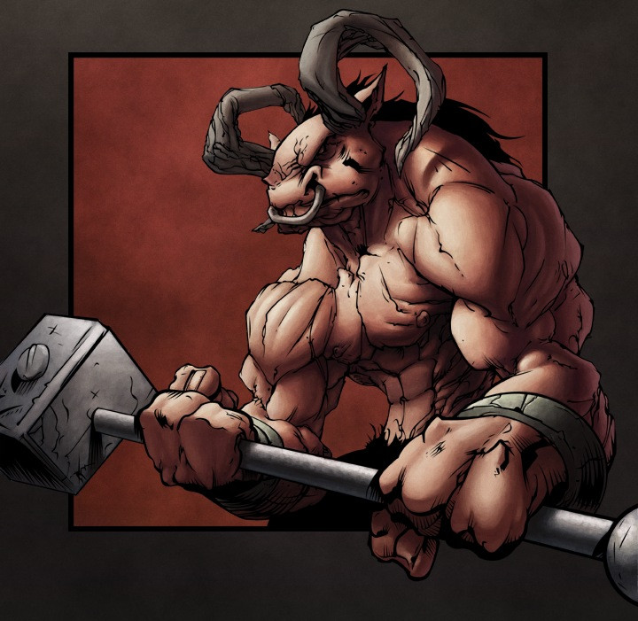
Just something I coloured for the SateliteSoda ([link] ) website of an image drawn by [link]Tried to colour it in a very brightly mythological fantasy look. I think Ive done enough fantasy images for a while so my next Ill try and do something new and different.
comments and suggestions welcome
Related content


Comments: 71

yo i'm lovin this piece
the hammer head looks alittle off but i'm lovin the piece
👍: 0 ⏩: 0

sick!! i saw this on Satellite soda... that is mind blowingly badass
awesome coloring job!
👍: 0 ⏩: 1

ahaha good old SS, somehting I havnt thought about in ages... since been banned hahahahahaha ;D
thanx for the laugh and the comment... oh and can ya do us a favor, next time ya post something, be it a comment or image or whatever... add at the bottom "autaux was here" hahaha ;D itll be good for a laugh at least
👍: 0 ⏩: 0

this is tight!
yeah, you have a definite style to your colors...and you are FEARLESS! you aren't afraid to take on different subject matters in order to grow artistically.
MORE than impressed..

👍: 0 ⏩: 0

Hey man, this is awesome...but i was wondering if you could critique me. I need alot of work. and i was wondering if you could help me?
👍: 0 ⏩: 1
sure, anything in particular youd like me to crit? i could browse yer gallery but any comments id give would be pretty general unless youve got a certain piece or two in mind?
from what ive seen thus far youve got some of the basics down patt, and youre developing a nice fluid style... only crits ive got are;
1 keep a close eye on preportions and anatomy.... (this ones hard and even i find it impossible)
2 work on focus in your art, where youre drawing the viewers eye in your images... by ues of composition, linework (thickness, hatch, detail etc etc)
3 make sure your style doesnt look flat. simple outlines bring out depth in yer art alot and try to avoid cartoon flatness even if thats what youre aiming at... check out the likes of scottie young and sean galloway (cheeks-74.deviantart.com) are good examples of REALLY simple art with tremendous depth and effect
4 draw from real life... perhaps the most over said thing in the art crit world... always refer to reference... youl learn REALLY quickl... this is something im just realising myself (seriously) its easy to know but hard to do
i hope these arent too broad but as i said, let us know if ya want me to crit any direct pieces... and keep practicing ;D cheers dude,
adam aka autaux
👍: 0 ⏩: 1
yeah, i here use ref alot
but there are alot of things in the comic world that you can't really use a ref to. Like in fantasy the villages and castles. or even in a sci fi. HOw do you do it with those types of genres. See what i am saying.
Can you help me on that?
thanks man
TaD the monkey
👍: 0 ⏩: 1
well all the fantasy and sci fi is all based on real life... those castles most likely exsist in europe or scotland or someplace... it depends on what youre doing... i dont think there is anything you cant find reference for...
👍: 0 ⏩: 1
yeah i guess....i just don't how. Lol. wow, an artist unable to see soemthing. HOw often do you here that.
Thanks.
IS it okay to go to you if i have any other questions
👍: 0 ⏩: 1
hey if it wasnt ok i wouldnt be on DA hehe ;D sure its ok...thats what DA is all bout
👍: 0 ⏩: 1
thanks man. Do you have IM that you care to share? IF not i completely understand. So i can get help and all that cool stuff
👍: 0 ⏩: 1
id prefer ya just message me thru DA cos thats alot easier... i do use msn but if everyone adds me i wont be able to do any at all... i like keeping my list size down.
👍: 0 ⏩: 1

haha thanx ;D more new art coming soon (hopefully) sorry bout the wait
👍: 0 ⏩: 0

Wow, that glowing effect on his arm looks fuckin rad dude! Nice job on the hammer too!
👍: 0 ⏩: 1
thanx if only the original images hammer was in the shot better, it wouldve framed better buh ah well ;D more art coming soon ;O
👍: 0 ⏩: 0

wow
great stuff
the red lighting in there really add a lot to this
👍: 0 ⏩: 1
thanx dude, im still not so sure about the red, and i would change it only i figure whats the use in redoing images... ill learn and move on ;D thanx for the comment/s dude
👍: 0 ⏩: 0

i just wanna say that minotaur looks bad-ass, but the coloring job is fucking tight. VERY COOL!
👍: 0 ⏩: 1
thanx, tell my brother that haha he doesnt seem to like it... ah well, everyone else does, myself included haha ;D so majority rules hehe
👍: 0 ⏩: 0

Well that is a nice pic indeed. I love the white highlights ... they really bring out the characters broad musculinity. I don't much like the redish glow around him, but i can understand why you have put it there, perhaps a more interesting effect could work better there. I think the firy highlights come across a bit strong ... coz the fire/sky/cloud or whatever is seems to be far away. I like the use of the spattering texture ... i think it works well, and suits your poster like style of yours. The clouds and the sky in the background are really well done, i like those .. especially the blue-green in front of his face. Heaps better than i could do.
👍: 0 ⏩: 1
thanx for the constructive crit, i totally agree with the sky and saturation... i noticed that after id uploaded the second time... if i change anything else ill cut down the redish orange saturation and perhaps fix the sky to be a tad brighter/closer...
much apreicato mucharcho ;D
👍: 0 ⏩: 1
ahh ur welcome ... it's an awesome colouring job but there is always room for improvement ... maybe not so much in ur case but for me improvement is easy hehehe
")
👍: 0 ⏩: 1
pfft i got lightyears more to go yet ;D improvement is a straight line... some just move faster along it haha ;D
👍: 0 ⏩: 0

the bulk adds to the scare factor to me. I think I don't want to see dude in the street at night. I love the lighting too.
👍: 0 ⏩: 2
oh my goodness! that scared me even more LOL

👍: 0 ⏩: 0
hehe yeah youd hate to accidently step on HIS tail haha ;D
👍: 0 ⏩: 0

That looks a little bit strange for some of the anatomy. Soo much.. bulk/Muscle. XD Scary. Anyways, on the positive side, the colour and lighting looks awesome. Fantastic job
Till Later
Der-Richter
👍: 0 ⏩: 1
Yeah the anatomys all over the shop but I tried to do my best with what was on the plate ;D thanx
👍: 0 ⏩: 1
No problem  (Smile)")
Till Later
Der-Richter
👍: 0 ⏩: 0

Nice coloring here, specially the orange lighting, the Minotaur character design looks dynamic and monstrous, superb job overall
👍: 0 ⏩: 1
thanx, yeah the lighting was kinda tricky but fun ;D
👍: 0 ⏩: 1

thanx, funny how noones yet mentioned that he himself has almost no colour tone, its all reflected light hahahah ;D funny ah well i guess the cats out of the bag with that now ;D
👍: 0 ⏩: 0

thanx dude, i think im slowly improving still, give me another 25 images and ill be right hahha ;D
👍: 0 ⏩: 1
thanx ;D i love my new wacom alot
👍: 0 ⏩: 1

Yer welcome and wacoms are the best! ^___^ *hugs her own wacom tablet*
👍: 0 ⏩: 1
hehe totally ;O i upgraded from a graphire to an intuos3 and im loving it...
👍: 0 ⏩: 1
lol that's what I have, a graphire! Right now it's the only thing I can afford unfortunatly, but the Intuos do looks awesome to use.
👍: 0 ⏩: 1
look into the intuos3 4x5, i had a 6x8 graphire3 and realised the two cost about the same... so when i broek my pen thru drumming with it (haha) i decided to upgrade...i realised i didnt need the size i had and a small intuos would be a good option if upgrading
👍: 0 ⏩: 1
really? the same price? Ya sure? I've looked into them a few times before and they are usually around the 400 dollar mark, or more. o.O
👍: 0 ⏩: 1
theyre the same price for small intuos' compared to larger graphires. im australian and here i paid 280 for my new tablet and my old one was relativly comparative... but alot bigger
👍: 0 ⏩: 1
hrmmmm... well I'm in Canada, and evverywhere I go it seems the intuos ones are a lot priceyer...so I guess I'll have to wait! ^____^
👍: 0 ⏩: 1
canada ey? where exactly? my parents are obsessed with canada... had a holiday there a few yers back and they keep saying how much they want to move there ;O
👍: 0 ⏩: 1
lol I'm on the west coast of Canada, in a city by the name of Vancouver.
👍: 0 ⏩: 1
| Next =>