HOME | DD
 AutomaticGiraffe — Butterfly

Published: 2009-08-21 11:54:53 +0000 UTC; Views: 1102; Favourites: 37; Downloads: 9
Redirect to original
Description
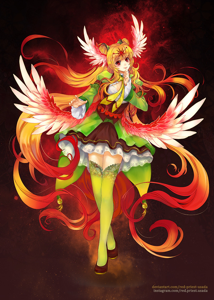
For 's 'Organized Chaos' contest.I derived the idea from the Butterfly Effect.
When I first read about about the topic for the competition (organized chaos), I thought about Chaos Theory. In a nutshell, Chaos theory is the study of patterns and behavior of seemingly random data. I'm not exactly an expert on the topic, so excuse me if I'm wrong.
The idea that a small change in initial conditions and spawn radically different outcomes down the line is referred to as the Butterfly Effect. Thus the butterfly brings order from chaos.
Yes, how very deep of me.... haha...
Related content


Comments: 36


Why thank you.
👍: 0 ⏩: 1

Really beautiful job on the wings 
Also, the character's expression is nicely done <3
👍: 0 ⏩: 1
Thanks, though it's pretty old so I can't quite remember what I was thinking.
👍: 0 ⏩: 0


The wings are absolutely beautiful!
Very well drawn picture
👍: 0 ⏩: 1
Thanks for the comment!
👍: 0 ⏩: 0

Thanks for looking.
👍: 0 ⏩: 0

wow i love the butterfly wings
they are so fine and detailed. love it
you are talented :3

👍: 0 ⏩: 1
Why thank you, you're very good at coloring too.
👍: 0 ⏩: 0

PoV is great! The background gradients really compliments the girl and her butterfly wings!
Nice!
👍: 0 ⏩: 1
Thank you, I'm looking for a way to make a more gradual gradient. I'm assuming it's going to involve a lot more time and a lot more, smaller strokes.
👍: 0 ⏩: 1
More colors makes gradients easier, I find 👍: 0 ⏩: 1
Copics are best for gradients, because they'll blend together when you intertwine them, but it looks messier intertwining them then if you did it by laying them down next to each other. (Did that make any sense?) I tried do a gradient on one of my pictures and it turned out messier then I wanted it to. 
Small strokes are usually best unless you're going for texture :3 I try- but then impatience comes into play an I start swinging my markers every which way XP
Of course a gradient would take more colors. It's practically a definition there. The biggest problem I have with the copic is the drying time. I generally like to have even colors, but when I'm working with large open spaces, I feel like I need to cover it first, leaving uneven colors.
I guess I just need more practice and foresight.
👍: 0 ⏩: 0

very nice! I like the lines through the sky, it adds to the movement of your butterfly  (Smile)")
👍: 0 ⏩: 0

love the colors you used! and the wings are aamzing!
awesome job!
👍: 0 ⏩: 1


")

That's very beautiful. I love the choice of colors.

👍: 0 ⏩: 1
Thanks, I was scared of the liberal use of colors. I could feel my markers drying out.
👍: 0 ⏩: 0

Thanks for the kind words~
👍: 0 ⏩: 1