HOME | DD
 AutumnEmbers — Color Study

Published: 2012-10-03 05:10:33 +0000 UTC; Views: 1604; Favourites: 23; Downloads: 10
Redirect to original
Description
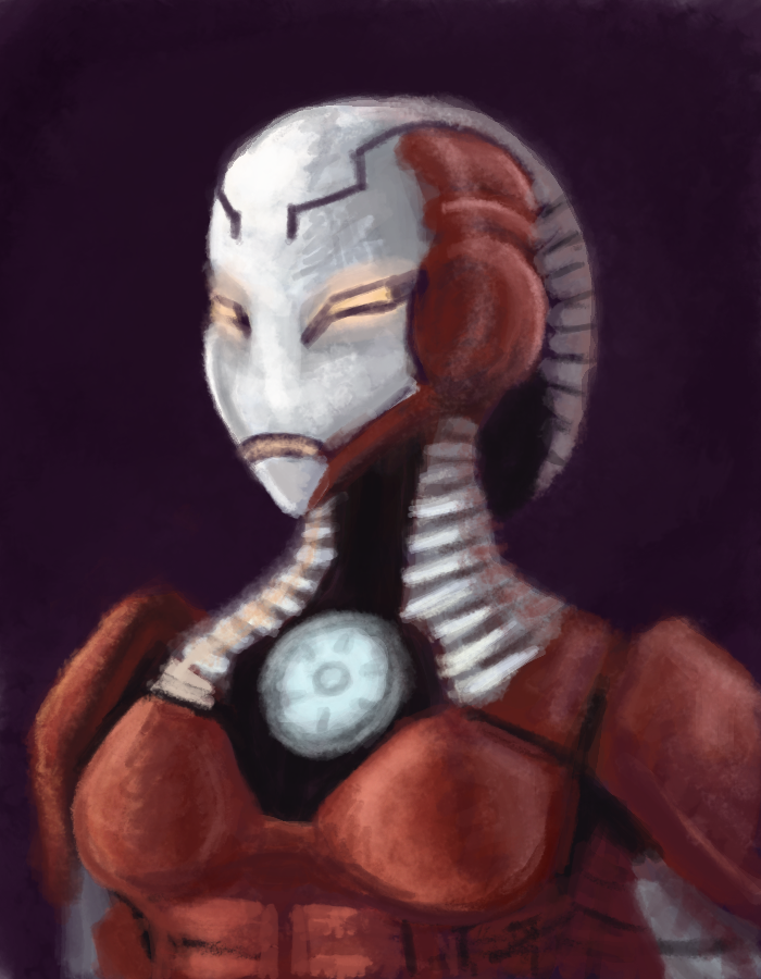
This started out as a greyscale study and I decided to paint it using a few tutorials that I found, since I really like the technique of turning a greyscale image into colour.I used the stock photo here for reference: [link]
The walkthrough is also on my blog if you're curious to see: [link]
You can click on the image to see it better too.
 (Smile)")
Facebook:
[link]
Twitter:
[link]
Related content


Comments: 11

This is fantastic. The texture of the fur on the coat looks extremely realistic, as does the hair. I can't even imagine how long this took you, it's so detailed...
👍: 0 ⏩: 1

Thanks. It actually took a few hours over a couple of days, since I had to rework the face but the whole process didn't take that long. I'd say 15 hours total. The greyscale is what is most important to build up so once I did that, the rest was pretty easy.
I'm not sure I like the greyscale to colour approach because, even though I have accurate values, when I colour over it the image looks too saturated like some weird filter.
The brushes I've used I have in my favourites if you want to try them. He made a fur brush and a hair one. They're pretty useful.
👍: 0 ⏩: 0
Thank you.
👍: 0 ⏩: 1

Does adjusting the opacity leave it too washed out?
👍: 0 ⏩: 1
Yeah, when I adjust the colour layer it looks faded. I don't want it to look like a photo filter or something like that.
👍: 0 ⏩: 1
Hmm... Have you tried messing with some of the color blending modes? That and blurring the colors together is the only advice I can give without watching you paint or knowing more about your technique.
👍: 0 ⏩: 1
Well what I did is I filled the first layer (on color mode) over the greyscale. Then the eyes, skin, hair and fur were on their own separate layers on Overlay. Then on top of that I another Fur layer on Soft Light, another layer for Hair on Overlay to get a more intense colour and then the last three layers were Normal.
I could screencap it if that'd help.
👍: 0 ⏩: 1
[link]
I hope that helps. Everything is at 100% except for the Color layer.
👍: 0 ⏩: 1
I'll reply in the comments on the screencap.
👍: 0 ⏩: 0