HOME | DD
 AverrisVis — Drake

Published: 2016-01-17 22:22:38 +0000 UTC; Views: 12495; Favourites: 573; Downloads: 156
Redirect to original
Description
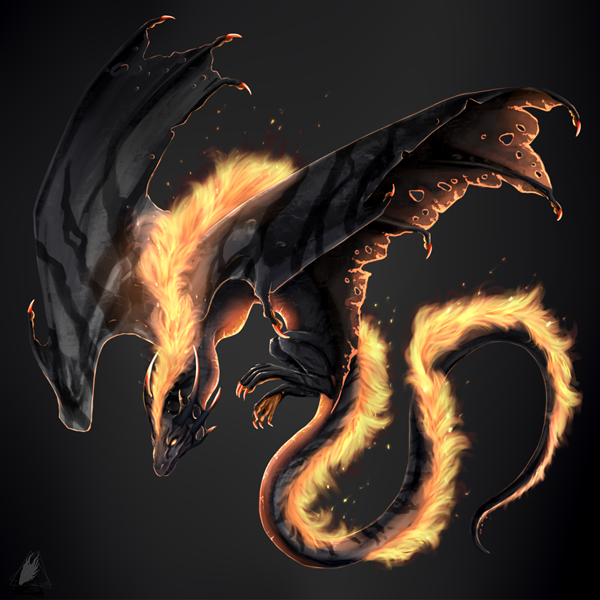
Commission forIt was a gift for SA1B0T Drake Ref
I really enjoyed drawing this guy and I'm glad I could make someone happy c:
Related content


Comments: 33

So awesome! I really like how you did the scales, they are so detailed and nicely shaded. The colours are lovely too. I love the glowing fiery effect
👍: 0 ⏩: 0


What a nice character, he just looks so awesome in your style! All the fire effects, simply wow!
Just dunno what else to write *_* He looks wonderful, the pose is great.
👍: 0 ⏩: 1

Aż się cieplej zrobiło patrząc na niego  (Smile)")
👍: 0 ⏩: 1

Words alone can not describe how much I love this picture!! I'm still in awe over it!!
I love the way the scales and gradients look there's so much amazing detail!! I adore the wings so much..
And the fire effects look gorgeous too, He actually looks like he would Burn omg... Your art is so quality....
Thank you so much again I'm still smiling like a fool!!!<333
👍: 0 ⏩: 1

I'm happy that you like it
I love the design. It's simple but amazing!
👍: 0 ⏩: 0

The chromatic aberration effect was unnecessary; the picture would have looked better without it.
👍: 0 ⏩: 1
Trust me, it looks better with the effect. And it's just a matter of taste
👍: 0 ⏩: 1
Honestly, I haven't seen a single picture that looks better with this effect. In most cases it hurts my eyes to look at it because of the split focus.
My theory is that while painting the artist gets tired of seeing the regular image and the added effect makes it look fresh again, hence the bias.
Of course, you may disagree. Just sharing my thoughts.
👍: 0 ⏩: 1
I see only a small difference between the original picture and the picture with this effect.
There is almost no difference if I look at this at full resolution. It hurts my eyes too when I zoom in. I will fix it
👍: 0 ⏩: 0

")
nie jestem z tego w 100% zadowolona
👍: 0 ⏩: 1

Dobra, dobra, weź wyjdź x4
👍: 0 ⏩: 0

Your art is so perfect and detailed! I love all you dragons and the way you drae them! This one is sooo shiny and dark in the same way!
👍: 0 ⏩: 1

Woow, a really perfect drawing <33
i love how all these dark colours fit so well with the fire *-*
Love it!
👍: 0 ⏩: 1
Thanks c:
I noticed there's something wrong with the colours (Wings were more detailed.I hate my pc) but I'm too lazy to fix it xD
👍: 0 ⏩: 1
You're welcome!
I still think it looks great xD
Just call it artistic freedom ^^ Characters always look a bit different when others draw them <3
👍: 0 ⏩: 0


No kurde nie wolno się raz w życiu postarać z obrazkiem bo wychodzić każą... no jak to tak :c
👍: 0 ⏩: 1

wyjdź bardzo. :V Idź być zajebista gdzieś indziej xD
A tak serio to zostań .__.
👍: 0 ⏩: 1
skoro wszyscy tak mnie proszą o wyjście to chyba jednak pójdę xD
👍: 0 ⏩: 0