HOME | DD
 awesomepaste — lurking

Published: 2009-07-24 21:40:23 +0000 UTC; Views: 149; Favourites: 3; Downloads: 0
Redirect to original
Description
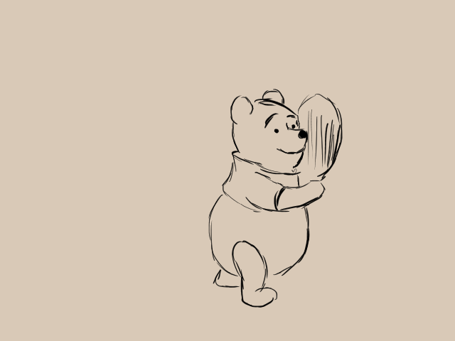
Jerry shadow.I don't like the font. The "L" in lurking looks too much like an "f" and it's easy to misread then... Oh well.
Related content


Comments: 3
")

thank you thank you thank you!!!!!
👍: 0 ⏩: 1

no problem ^^ I like your cartoons so ill watch you too ^^
👍: 0 ⏩: 0