HOME | DD
 Axeraider70 — Project Hud Site Design

Published: 2009-06-19 03:42:19 +0000 UTC; Views: 3197; Favourites: 17; Downloads: 136
Redirect to original
Description
I'd like some feedback on the design, please (Smile)")
Let me know what you like / don't like.
Related content


Comments: 25


Vision
Originality

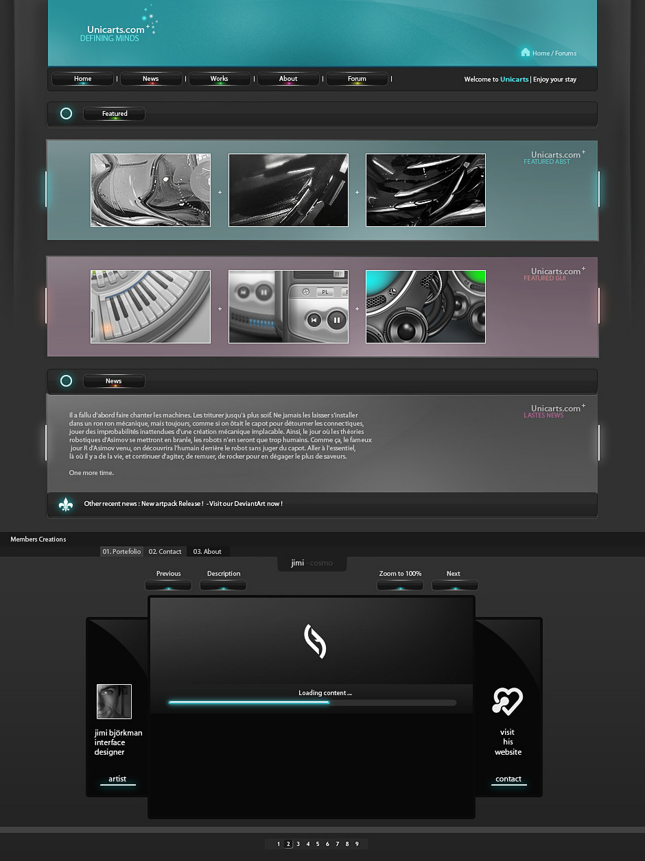
Ah, so this is the fabled P HUD.
The logo is definitely a high point. It's appearance and color scheme suit the rest of the page well.
I'm biased towards the color scheme in general, actually. The almost teal heading and buttons have smooth gradients and lighting effects, and go well with the logo. I see it's slightly coincidental that the other two graphics are the same color scheme (since I assume the graphic for the news will change after the next update, and of course the same for the latest update graphic), so for now I'll stick to the main layout. The black gradient for the main background also gives out good depth, and goes great with the white and light blue text.
The positioning is common, which is exactly what it needs to be. The ad is on top, so it won't be distracting if you scroll down to the beginning of the news section, and the links are spaced out nicely.
Buttons and links are very straightforward, there's no guessing what any of them will lead you to. Home is home, brushes is brushes, etc, and even if that loses some people, there are pictures on the buttons as well; an instant plus for people who speak other languages. All links have different text color or are underlined, and assuming that the graphic on the right is clickable, that would be a plus as well.
I'm sorry that I have a lot of praise to give, but little advice. I simply wouldn't change a thing with the way it currently appears, but that doesn't mean I won't encourage upgrades later on. Web page layouts are the type of things where being original can hurt you (I based my star rating on the logo for that), so good job keeping this straightforward and user friendly.
👍: 0 ⏩: 0

I love how professional this looks. The look and feel of this page draws me in right away, and it makes me want to see even more. I love the simplicity of it, and how advanced it looks all at the same time. Everything on the page just looks like it belongs there. I love the buttons and the main logo a lot. It's not cluttered with a bunch of nonsense and that is a major plus. I like the idea of the update as well. I have no issues with this page at all. I want to find something I don't like, but it's just not there. Wonderful job!
👍: 0 ⏩: 1

Okay, maybe im not being fair here, but i think its not too good.
It looks like one of my early designs. There is just too much going on, solid colors are way more efficient or you could do light gradients. The whole thing is in gradients and thats not too good. I would recommend
using some patterns and maybe some grungi elements but thats not vital. Use little dividers for each section. 1px lines will do.
The coding of this site would be miserable since youd have to make atleast 3 divs for every fade. Spend a little more time on this, watch some pros do theyr work(not me!!!Im a beginner at this, 4 years is not enough!). Watch sites like, psdtuts and nettuts, smashingmagazine and abduzeedo. Also watch some of the sites here in deviant and try to seek what makes them special.
Mikk
👍: 0 ⏩: 2

Hey Mikk,
Thanks for your comment- i really do appreciate the criticism. I also think it could use less gradients and make use of solid colors. I plan on tweaking the design as I go along, though. The final design will be posted in my gallery following the launch of the website.
X
👍: 0 ⏩: 0
The buttons are awesome BTW!
👍: 0 ⏩: 0


Looks really cool, waiting for the full version
")
👍: 0 ⏩: 0


yeah, i'm not liking the gradient border so much either, but it does look very professional and easy to use.
also, interesting choice of dummy text xD
👍: 0 ⏩: 0

yee,i like that
👍: 0 ⏩: 0

the gradient of the header is not sooo good. rest is awesome
👍: 0 ⏩: 0


Awesome I love it!
👍: 0 ⏩: 0

Great design for the website, I like the logo too gives it a more professional look, also the way you set things in the website seems easy to get to, so I guess it's awesome!
👍: 0 ⏩: 0


Nice. It's very easy on the eyes, it has a nice color scheme and is very legible.
I think there's almost, if not, an overabundance of gradients going on... even in the border of the advertisement section! I would say tone it down a little. The body content and the table right of it seems to be off in alignment of the ad space on the right side. Somehow... the strip on the top bothers me... I don't know what it is but I think it may be the color of it or the black strip in it or something; I really don't know.
I do think there could be a little more elements added in this, such as a thin border to the body content, a subtle drop shadow to the strip at the top or ad section, etc.
👍: 0 ⏩: 1
it's true, i love gradients. lol. thanks for the crits.
👍: 0 ⏩: 0

Ooh! Very nice! I feel like there's a lot of text on this layout surrounded by lots of black space though. Maybe you could bold/set aside the main part of the paragraph (like a header) and add one of your "light" brushes/art pieces to a corner of the bg or something...'Course, I'm inexperienced so you don't have to take this critique seriously if you don't want to. 
👍: 0 ⏩: 0

I really like this.
The only thing I would really want to see is how it looks in action - I'm a nut for stuff that looks great and passes through the w3 validator... If you want some help with that (unless you got it all together), then lemme know and I will see what I can do~!
Out of curiosity, are you doing this in Dreamweaver or somethin'?
The entire thing looks nice, though, so it doesn't look like you'll have to worry much about borders or CSS ickiness... X3 Good job!
👍: 0 ⏩: 0

Dont think there is enough detail. What I noticed with web design, is that you gotta pay attention the borders alot, if they dont look right, it will throw the whole website off.
👍: 0 ⏩: 1
I'm not sure what you mean?
👍: 0 ⏩: 1
you use solid color/gradient thick borders. the menu buttons look awesome though
👍: 0 ⏩: 0

I think it fits your style perfectly  (Wink)")
👍: 0 ⏩: 0