HOME | DD
 Axertion — Ink Design - Logo
by-nc-nd
Axertion — Ink Design - Logo
by-nc-nd
Published: 2009-09-25 04:22:48 +0000 UTC; Views: 20784; Favourites: 147; Downloads: 1167
Redirect to original
Description
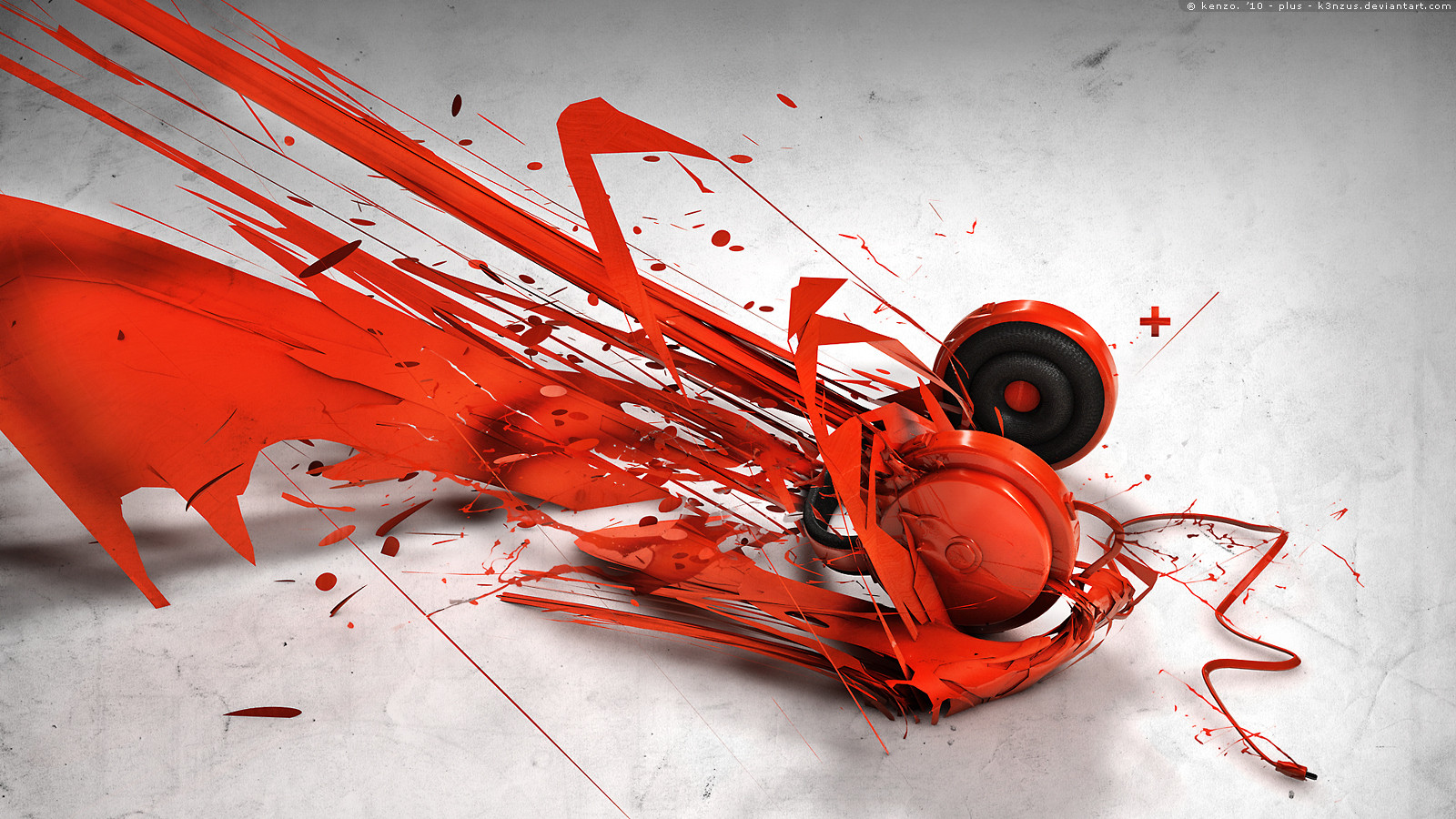
Lots of work went into this one (Smile)")
2D and 3D logos done for a client. The environment was created as a request from the client.
Tools:
 Adobe Photoshop CS4
Time: Approx. 3 weeks (initial design to finalized render)
Related content


Comments: 50


Seus trabalhos são muito bons... parabéns.
preciso de um logo para : 4x4 & Importados.
voce desenvolve e qual preço... mande para meu e-mail cadastgrado
👍: 0 ⏩: 0


 (Wink)")


whoo, this is dam cool! I don't know what wlse to say..
👍: 0 ⏩: 0


Can you make tut for 2D effects ?
Brilliant logo man... I'm stunned
👍: 0 ⏩: 0

Great job, love your logo designs, and the 3D effect! I've tried recreating it, but i allways get stuck at the shiny edges and surface. What method are you using to make them? I tried using the pen tool, following the edge where i wanted the shine, and then using a brush with pressure sensitivity, but it doesn't quite work the way i want..
👍: 0 ⏩: 1

another method is rendering a lens flare on a black surface. Setting it to color dodge and transforming it to the edge. That usually gets good results if you do it correctly
👍: 0 ⏩: 1


very nice, but you need to recolor the logo, because its colors doesn't match
👍: 0 ⏩: 0


Just a quick question, hope you don't mind:
How'd you make the logo? Not the 3D one but the normal one.
Did you use the pen tool or something?
Anyways great design but the Cracks don't look that good.
👍: 0 ⏩: 1
yes, I use the pen tool and use vector masks. I also bound the effects with vector masks which are applied to the groups
Thanks
👍: 0 ⏩: 1
Thank you very much ")
👍: 0 ⏩: 0

this logo is nice..but de black fill @ the 3d effekt isnt so god...you dont see the depth
👍: 0 ⏩: 0


I dont like the background.
But the Logo... Ultimate.. xD
Realy nice work.
👍: 0 ⏩: 0

The cracks are a bit blurry and unrealistic.
But the logo is pure sex
👍: 0 ⏩: 1
I purposely made them blurry in the back. Its kinda like a camera focusing on the object rather than the scene if that makes sense. Thanks for the comment
👍: 0 ⏩: 1


this logo ist veeeery NICE ! .. but i dont like the underground ")
👍: 0 ⏩: 0

That's definitely one of your best logo works ever, Axe. Awesome job.
👍: 0 ⏩: 0


WOW HOLY CRAP NICE! LOVE IT BRO...Keep up the great work!
👍: 0 ⏩: 0


👍: 0 ⏩: 0