HOME | DD
 Axertion — axertion.com v3
by-nc-nd
Axertion — axertion.com v3
by-nc-nd

Published: 2009-09-01 04:25:07 +0000 UTC; Views: 12167; Favourites: 78; Downloads: 315
Redirect to original
Description
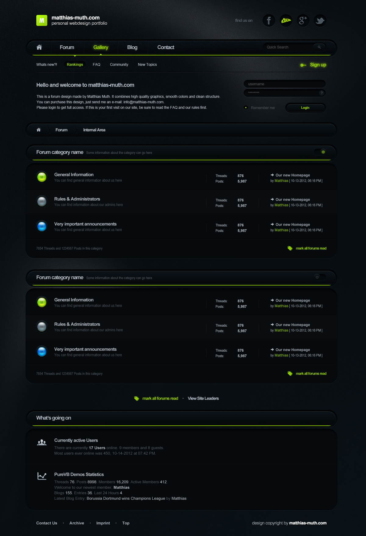
 Finally! I present to you new and very much improved axertion.com
 I've been working on this off and on during holidays and in between client work. For more details read the release article .
 View the site live: axertion.com
 As always, comments, suggestions, faves are all welcome and appreciated
 (Smile)")
Related content


Comments: 63


thank you for the nice comment
👍: 0 ⏩: 1

")


Very impressive, inspiring. So i have to design my own WP layout now, thanks
")
👍: 0 ⏩: 0

man this is dope! you designed this site yourself along with tutorials? do you have one of that fury template? thumbz up award!
👍: 0 ⏩: 0


not really, but I do watch his stuff. Hes a good buddy of mine and a great inspiration.
thanks for the comments
👍: 0 ⏩: 1

In any case I like your design ^^
👍: 0 ⏩: 0


This is the single most perfect wordpress theme i have ever encountered. It's.. beautiful.. *sniff*
I wish i could ever make anything like this, or even had anything like this on my own blog ")
I can't believe why none of the available templates are not even remotely as nice as this.. Even with tweaking and redesigning
👍: 0 ⏩: 1
wow thanks, that means a lot to me
👍: 0 ⏩: 0

good work, good job, good...äh...good axertion xD
👍: 0 ⏩: 0

newclearfuzzy [2009-09-03 08:28:21 +0000 UTC]
yep yep. Very cool, only thing i dont like is the BIG rounded edges, where most things are clean cut. Nice work tho!
👍: 0 ⏩: 0


Very Neat, but not enough shiny, but I guess every thing can't be shiny

👍: 0 ⏩: 0


Those social media icons seem to disturb the color balance of the site a little.
But that really is the one 'bad' thing I see at the moment, you did a great job on this!
👍: 0 ⏩: 0

Yep, this is a really good design! Two thumbs up! The colors, fonts, design itself.. Everything fits each other perfectly!
👍: 0 ⏩: 0


Looks great, i am looking forward to explore this site
👍: 0 ⏩: 0


you should work the details... the sharpness of the lines is not worked ...
👍: 0 ⏩: 0


Excellent work, you made a good color balance and the way you connect the white are with the dark are outside is just great. The only thing I would tweak are the top right community icons, i would make the strokes darker to get less contrast against the dark background.
👍: 0 ⏩: 0


 (Wink)")


This is a portfolio site.
If I were looking for someone to hire, would I want your services after seeing this site? Yes, I would.
The header is my favorite.
👍: 0 ⏩: 1
| Next =>