HOME | DD
 axis000 — Digital-Dimorphism

Published: 2002-01-15 06:21:39 +0000 UTC; Views: 1539; Favourites: 7; Downloads: 344
Redirect to original
Description
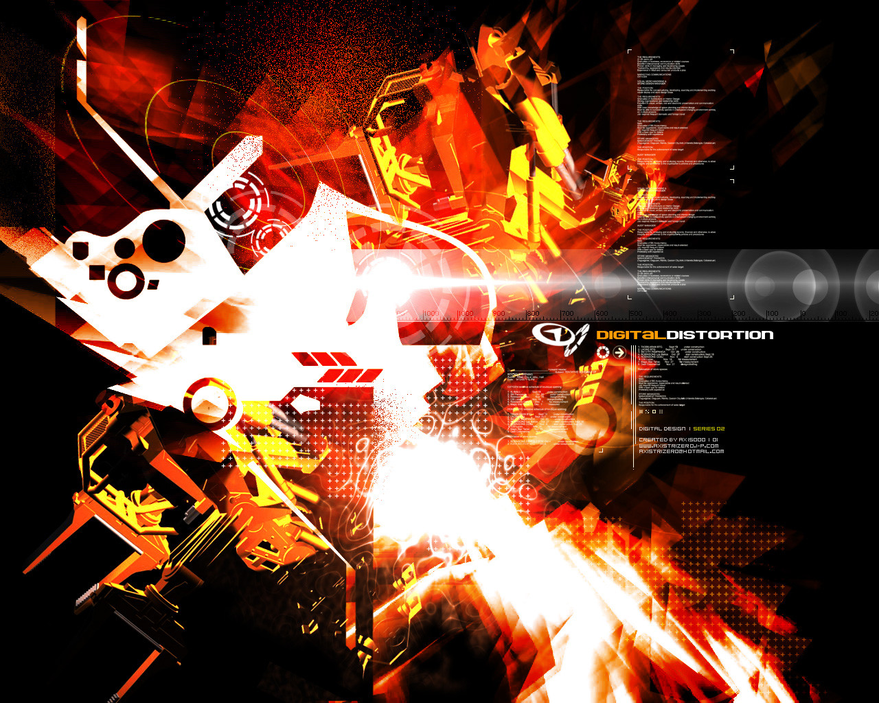
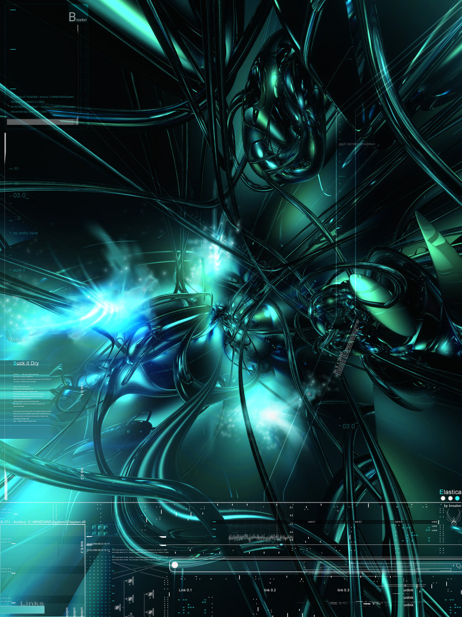
Part of the Digital Series for my personal website portfolio. Hope you'll like it and give comments.Tools used: Photoshop 6.0, FreeHand 10.0 and Flash 5.0
Related content


Comments: 19

nothi'n else to say except for that i love this kind of art and this picture
👍: 0 ⏩: 0

Whoa, that is intense. I think there are way too many arrows, but still, great stuff overall.
👍: 0 ⏩: 0

amazing... can't touch it... really great work, don't know why i haven't heard of you before...
wooah.
Gallery:
https://recklesswalker.deviantart.com/gal lery
DevPacks:
https://www.deviantart.com/packs/view.php ?id=1127 Floyd
https://www.deviantart.com/packs/view.php ?id=1120 Bermuda
https://www.deviantart.com/packs/view.php ?id=1133 Tyler
👍: 0 ⏩: 0

Pix, wala pang improvement ngayon ang Exordium. Gusto kasi naming baguhin ang web design nya at gawing Intense Exposure. Kaya lang, kailangan namin ng magaling na mag-design sa website. How is Flux? May Flux 3 pa bang susunod? Sali nyo naman yung works ko please.
jeezus and remix, sorry guys but I intend to make it look like that. (a collision of colors contrasting the surrounding darkness of space) The center and the anti-aliasing is made to break the boredom of blurred emptiness of the piece. I appreciate your comments tho.
Axis000
-http://www.axistrizero.i-p.com
👍: 0 ⏩: 0

sweet, i love trendy stuff. mostly because i have difficulty doing it, jeezus is right though, the color scheme doesnt work at all... nice effort though
A Different Place
http://polaris.katami.com
also try https://remix.deviantart.com
👍: 0 ⏩: 0

well, this had the trendy view in mind, but the colors don't really work.
and you need some aliasing work
-jc
+-----------------------------------+
Cosby: What do you want to be when you grow up?
Kid: A lot.
[kids say the darndest things]
👍: 0 ⏩: 0
pixelcatalyst [2002-01-15 10:16:19 +0000 UTC]
Galing...
musta na nga pala ang exordium?
http://pixelcatalyst.plastiqueweb.com
👍: 0 ⏩: 0

Nice looking man!
+._______________________________
..B.WELL
👍: 0 ⏩: 0

WOW! very nice...Very good color choices. It has a very "techno" feel to it...well to me anyway. You have a great technique and keep up the good work. I will keep my eye on you
👍: 0 ⏩: 0


nice work, the white (airplanes?) contrast perhaps a bit much with the blue, this was the only possible flaw. otherwise its very catchy and modern looking. good job
👍: 0 ⏩: 0

Awesome! I think the white electro-zot's a little too bold, though.
-aardvarko
webmaster at aardvarko dot com
http://aardvarko.com
👍: 0 ⏩: 0

sweet. i like the cutouts and the dots.
-----------
1 ) Wasting time is an important part of life.
2 ) It is a miracle that curiosity, creativity, and imagination survive formal education.
http://brandonland.tk
Quoth the ravern, nevermore
👍: 0 ⏩: 0


Wow this is too cool to be real! Love the colors but I don't necessarily agree with the white stuff. Those ray-like things. Gonna use it for my new wp.
where dreams meet reality
👍: 0 ⏩: 0

Trends are fine by me, walls are meant to be used, and there's definitely a user base for trendy stuff. This one pulls all the stops.
Love the gradations from cyan to blue-green to blue and everything in between.
[death is the first dance eternal]
👍: 0 ⏩: 0

omg i love it
that's real sweet
--------------------
ex0dus (exodus@free.acid.org)
Come join my forums... http://www.demented.org/forums
Want free bannerless php/sql/mail hosting? http://www.demented.org
👍: 0 ⏩: 0

Typical trendy stuff I'd say but you've got the technique nailed down alright.
you dont need eyes to see
you need vision
👍: 0 ⏩: 0