HOME | DD
 Axxonu — It Never Happened
Published: 2013-01-04 20:47:50 +0000 UTC; Views: 6790; Favourites: 56; Downloads: 4
Redirect to original
Description
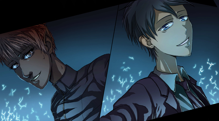
A scene from the Artemis Fowl series, The Lost Colony, as Artemis and Holly are preparing to return from Hybras. I edited it a bit in 2013 to remove the bits of ash from their faces, they were a little distracting and not very well rendered.Related content


Comments: 7

Very nice! love the lighting. Interesting how Holly looks much older than Artemis in this one I guess she is..
I'm not quite sure what the strange marks on their faces/clothes are though o3o
Which dialogue were you going to have?

👍: 0 ⏩: 1

Thanks! C: Yeah, I say definitely no romance going on until next book. XD (Fourteen year old Artemis/physically twenty-something year old Holly...don't think that should happen without some special circumstances ;J ) Hehe, that's the ash and soot from Hybras. (Apparently they were very dirty when they got back. Wasn't sure how to draw it though...)
"I remember. You saved me."
"It never happened."
:'D
👍: 0 ⏩: 1
haha, true. 
ah ic. I'm not sure how to draw it either since I've never tried myself. But I suggest that you avoid making it a tan/peachy color?? idk. There are darker parts underneath, so it kinda looks like the soot is floating off of their skin. 
I dunno. Just suggestions. Hopefully that helps. ")
I figured. ;~;

👍: 0 ⏩: 1
Uhh, let's see, the eyedropper is saying the ash is a gray (slightly blue) color, but I didn't notice how it's proximity to the blue I added to the skin because of the magic made it look tan. X3 (The coloring on their skin, clothes, and hair was originally radically different, and I changed it near the end to better create a sense of atmosphere in the scene, so that the magic kind of cast a blue-ish glow over everything, and even the colors that weren't blue were more subdued. Before, the colors were more bright and there wasn't such a blue cast over everything.)
I was fairly happy with the way the ash turned out on Holly's face, but I couldn't seem to get it right on Artemis. (I tried several different arrangements, making some of the bits larger and smaller, erasing a lot of it, then putting more back in, deleting it entirely and starting from scratch, but it never looked quite natural. And I looked up ash on google, but the image wasn't helpful either, especially since there didn't seem to be a lot of 'people covered in ash' pictures that fit what I had in mind. Yeah, I do think ash can often be a darker color, but when I think 'ash,' I usually think of a whitish-gray color, so that's how I would tend to color it. I disregarded the 'soot' part, since I couldn't get that to look right in conjunction with the ash. X3) Normally, when I have that kind of problem with an image, I just set the image aside for a few months and hope I'll have a brainwave, but this was kind of a shorter project, so I just decided to let it go this time. X3
I added the black smudges beneath the gray parts because the white wasn't showing up on Artemis's skin at all (and looked very flat). I tried adding in the shading by hand to see if that looked better, (rather than using a blurring technique on darker, slightly moved layer identical to the white one, which is what you see now) but it was looking worse, so I stayed with this technique. I think maybe if I added a little more dark to the edges underneath the white, and maybe added another gray layer that goes over both the dark and white in a thin line, the two might feel more connected, and be less obvious the dark underneath the white is 'underneath'...?
Yeah, that pattern-y look is so hard to avoid, isn't it? XD!! (It's like, sometimes it's almost harder to make something look random and chaotic than to make it look deliberate/organized. Which is kind of ironic, when you think about it.)
I should probably go back and rework this image a little sometime (since I was never happy with the ash, and it's something I can work out without having to change the entire thing), but I've been too lazy. X3 For these things, I usually just wait for the mood to happen to strike me...
But anyway, thanks for the tips!! :3
👍: 0 ⏩: 0
