HOME | DD
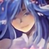
 Azurelly — Is this the right thing I do?

#castle #cecil #dark #fan #fantasy #final #finalfantasy4 #finalfantasyiv #harvey #iv #knight #night #redraw #young #finalfantasyivcecil #4 #art #cecilharvey #finalfantasy4iv
Published: 2016-12-19 21:14:41 +0000 UTC; Views: 1249; Favourites: 61; Downloads: 0
Redirect to original
Description
Finally something I wanted to finish it on this year!EDIT: Slight little edits on the lights and shades I forgot to fix them!
After seeing this lovely picture ~> finalfantasy.wikia.com/wiki/Fi…
I wanted to make a redraw out of it (sure the original one looks really adorable
 )
)I dunno why. But I saw on the picture a kind of the younger Dark Knight Cecil (probably around 15 or 16 years old) because of the seemingly shorter hair than he usually has.
Probably questioning if it was right to do the training as Dark Knight.
And on the original picture I saw that extremely cute bunny plush! I needed to draw it, too!
So then, a redraw with a more atmospheric scene!
--- ---- ---
Created with GIMP 2.6.11
Final Fantasy IV (C) Square Enix
Art (C) Azurelly
Related content


Comments: 17

Hey there! I'm from to give you critique on your use of colors.
First off, your transitions between colors are too soft and overblurred.
In a scene where light shines from window during a night, several areas would be straight up black or nearly black, such as wall on which the window is at. Same is true for the side of the bed facing the viewer, which should be nearly black, including a similar size area of the shadow on the ground where the character's legs are, while area under the bed should be black entirely. Neither the original image nor yours have a large enough shadow coming from character and going in your direction - just continue the shadow from bed where the character's sitting until the lower center edge of the picture, taking into account the character's proportions.
Also, your light-dark areas for the face are exactly the opposite than in the original image (where they are correct.) Make most of the face opposite to window much heavier shaded than anywhere now, and make only the edges of neck and chin facing window bright. Those are the only areas this direct light reaches. Same for armor - most of the character, aside the sides and behind illuminated by the light from window, should be heavily shaded. So no illumination on middle of chest, middle of kneepads, middle of headband, middle of thighs or top of the helmet.
Same for the side of the pillow facing the viewer - the lower half of that pillowside should be dark like the white bedsheets right below it.
Hope any of this helps!
👍: 0 ⏩: 1

I still need to figure out how I can use the play between the rays of light and rays of darkness correctly. I'm aware to make stronger shades because it seems to look still too dark for me
Hmm, you recommend to make it darker which it isn't that bad. My problem is that I hardly use black 
But I know what you mean. Seems that I didn't use the shadings on the correct places.
I see where I need to work on. Many thanks for the insight
 (Smile)")
👍: 0 ⏩: 1
No problem. You don't always need to use complete black, just at the spots where light does not venture into at all, whereas for the rest of the shading, a layer of black at a certain % opacity, which will give you gray of your desire as you slide the opacity bar, will feel more natural than blue or green hue, unless the specific light source present is of blue or green hue.
Also, you should not be afraid to make the difference between shaded vs illuminated areas more crisp for contrast. I see that in all of your drawings, you smudge the difference between lighter and darker areas but in reality, especially when sharp corners are involved, the shaded and illuminated areas are divided quite precisely.
👍: 0 ⏩: 0


Yeah, that's one of my little specialties! ")
👍: 0 ⏩: 1


Thank you very much!
👍: 0 ⏩: 0

Oh wow, I honestly can't get over how emotional and atmospheric you drew this particular scene!
Beautiful work with the image, Azu!~

👍: 0 ⏩: 1
Glad that you like it fellow! Thank you!
👍: 0 ⏩: 1
Heheh, you're very welcome too!~

👍: 0 ⏩: 0
