HOME | DD
 b0se — XPMC RC3
Published: 2005-07-23 21:39:48 +0000 UTC; Views: 352190; Favourites: 439; Downloads: 148464
Redirect to original
Description
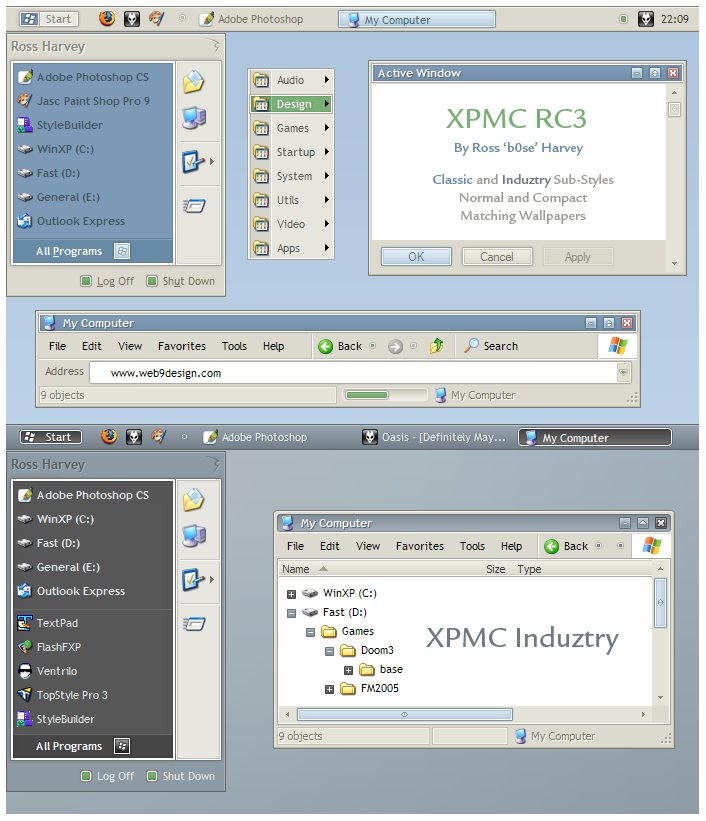
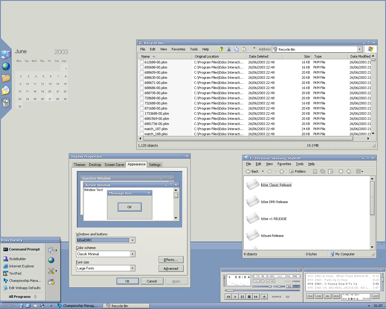
A professional theme made for developers and XP users who are at their PC for long periods.Added a totally new sub-style:
XPMC Induztry.
A dark theme with black widgets, but not too dark. Most dark themes before too much over time; XPMC Induztry has purposely been left with light elements (such as the main window and all 3D area's). A perfect mix!
- Normal and compact versions.
- Matching wallpaper for each.
- Simple and elegant shellstyles.
See the readme for more info.
And more importantly: I hope you enjoy using this theme!
 (Smile)")
(Note: XPMC final will be released within the next month. It will have colour variations of both XPMC and XPMC Industry, along with matching Winamp and Trillian skins).
* I highly recommend using ClearType.
Related content


Comments: 165

love your all theme. the latest one is very simple and feel clean. but if your can make contrast between text and background color little higher, that would be better for looking.
👍: 0 ⏩: 0

I've been using this skin since RC1 and have only just found out that you'd updated it
I love it, it's perfect to work with and being a developer myself, I find it easy to work all day without the distraction of bright colors or unnecessary eye-candy
I'm adding you to my watch list so I don't miss the next update
")

👍: 0 ⏩: 0

great theme.
two things:
1. Will you consider making a msn skin as well?
2. do you have a suggestion for icons to go along this theme?
Wessel
👍: 0 ⏩: 0

great work!
could you pls help out for an heavy Excel user - sheet name font is qute big, is it possible to reduce it? thx
👍: 0 ⏩: 0

I can't wait for the final build with induztry and winamp skins. Really, I'm looking forward to this
Keep up your work, it's pretty much the best looking stuff that I've come across.
👍: 0 ⏩: 0


Awesome VS man, i've been using it for two weeks, i have yet to find something else that i like this much!
👍: 0 ⏩: 0

I think this theme is great, but there are two things that I think need changing because I interpret their meaning incorrectly.
The first is that the button with focus is blue whilst with mouse hover it's grey. It's strange to have something bright go dull when you're about to click on it. I would expect the focus image to be grey and the hover image to be blue.
The second is much the same issue with the taskbar, but isn't as big of deal. The active application has so much contrast that when I started using this theme it frequently drew my focus to the task bar because I thought an application required my attention. With XPMC apps that require your attention have less contrast than the active application which seems to be wrong way around.
👍: 0 ⏩: 1
Sorry, I'm refering specifically to the Induztry colour scheme.
👍: 0 ⏩: 0


This theme is extremely well made all round, which makes a change from some of the other concept themes which don't deliver overall.. I ADORE things like the tasks or quicklaunch icons in the startbar (the green colour, the rollovers), the way that they're rounded and the icon sits on the bottom left. I also like the title bars.
I agree with most of the posters' comments.. I think that some of the colours should be darker. Thing is with using VS for a long time is your eyes become tired and a reason why they get tired is that they have to strain to read things.
Some things that might benefit from a bit of darkening IMO include:
- the right-hand-side of the Start Menu
- the clock
- the titlebar icons (minimize, maximise etc)
- generally making things BIGGER, or having a different larger style.
I haven't noticed any magic pink or anything yet but if I do I'll report it
👍: 0 ⏩: 0

That is the most beautiful msstyle I have ever seen. It shows not just in aesthetics, but also ergonomics.
👍: 0 ⏩: 0

I loved it ! Waiting for the color schemes...
Is there any chance of a version without the text "Start" on the start button ? Just the logo (maybe a little bigger) ?
👍: 0 ⏩: 0

oh hell yes! I got my uxtheme.dll altered!
BOO YAH!
👍: 0 ⏩: 0


AWESOME VS...!!! 
been using it since rc2...
love it..!!

👍: 0 ⏩: 0

Looking good. Would it be possible to add a little padding around the outer edge of taskbar items? That would be great. Also, larger minimize / maximize / close buttons would be good.
The plain Jane tan color around most style items looks good. You might want to consider making these items a normal gray color on the induztry theme.
👍: 0 ⏩: 0


It's a really nice looking skin, but do you know what really bugs me about pretty much every skin I've come across? The fact that the minimise/restore/close buttons are always smaller than the default ones. Doing this means you have to be a lot more accurate with your mouse click and you can't just swing the mouse to the top right and click, like you can with a default windows window.
👍: 0 ⏩: 0

Lovely theme, been using it since RC1
I'm using "Induztry" now, but I had one request...could you do something about the clock's fontcolor? Because it's hard to read at times, maybe lighten the color so it contrasts the bgcolor?
Just a little feedback...
👍: 0 ⏩: 0
I seem to be unable to use this VS through style xp! Any idea what's up?
(Awesome VS btw, looks absolutely smashing)
👍: 0 ⏩: 0

wow! one of the best vs's I've seen. in the world. ever.
👍: 0 ⏩: 0


I like your skin a lot. Could you please add the "button" effect on the tak bar items rather than just keeping it flat? It will really make it so great looking. If you don't release it that would be ok but could you please, please make it for me? If you could, I will provide you my email address so that you can sent it. I will never have to look at another VS again - seriously. For you this would take a minute or so. I am not familiar with making VS so asking you for a favor. Thanks.

👍: 0 ⏩: 0


perfec simple super brilliant clear work.. 

👍: 0 ⏩: 0
perfec simple super brilliant clear work..
👍: 0 ⏩: 0

Fantastic theme - very easy on the eyes. My only suggestion would be to make the minimise/maximise/close buttons a bit bigger. I'm running 1280x1024, and they're really small.
Other than that, awesome work.
👍: 0 ⏩: 0


been using XPMC since RC1 ... Love it gonna use it till i bored ")
BTW, thanks for the goodies..they are realy nice
👍: 0 ⏩: 0

Fantastic, you're the king of classic in XP, a 
👍: 0 ⏩: 0

excellent stuff b0se, not that we'd expect anything less from you. lovin' induztry

👍: 0 ⏩: 0

I'm loving the Induztry style, can't wait for the final release
👍: 0 ⏩: 0

 (Wink)")

Thanks for the feedback
Preview: Thats not a VS bug, its an edit bug - I had to extend the width of the window so the Classic preview matched the width of the Induztry preview. Thanks, will fix it!
Help glyph: Will most likely change this
👍: 0 ⏩: 0


I've been using XPMC at work since the release of the first version here, has lot of eye candy but it's very nice when using it for a long period of time. I guess from now on I'll be using Induztry, I have a thing for dark themes.
Can't wait to see the winamp skin
👍: 0 ⏩: 1

you can now get the winamp skins here: [link]
👍: 0 ⏩: 0


Wow its nice to see how this style its improving with each release.
For those that dont notice it, choosing Large Fonts instead of Normal font size will give you Tahoma instead of Trebuchet :yes:
I love the Induztry theme, my only complain is that it should have square window frame like the normal one. I think "square" looks more industrial but hey its just a word I guess. Maybe both sub-styles should have same window frame or offer both rounded / square frames for Standard and Industry.
Some things I still not completely like:
- Some of the text color are a bit too dim, a little bit more of contrast would improve readability. For instance on the right part of start menu, a different tint of the grey share of the left part could look good maybe...
- The caption buttons are great now small but still clear. I think only the question mark on the help title bar button remains too small. Maybe a different glyph instead of a question mark (too detailed to fit inside of that small button) would work better.
- I dont see the point in putting the start button flag on a button instead of a normal arrow or some other thing in the "All Programs" in the Star Panel.
👍: 0 ⏩: 0


It seems this deviation is being downloaded quite a lot, it'd be convenient if there were a backup link since I keep getting an error message when reloading and attempting to download, hopefully someone else might be able to host it.
👍: 0 ⏩: 0

this is turning out fantastic b0se. i really dig the direction that you are taking this minimalistic skin!
👍: 0 ⏩: 0

these are coming along really nicely! loving RC2, and looking forward to the final release! yay! matching trillian skin!
found marvilla's pastel icons to work nicely with the orig. colour scheme too
👍: 0 ⏩: 0

lol u have a bug on the address bar of your preview! roffles, just noticed that...ohh yeah nice theme!
👍: 0 ⏩: 0

<= Prev | | Next =>