HOME | DD
 b0soderlund — e equals appr. mc square
Published: 2007-11-04 14:34:25 +0000 UTC; Views: 1034; Favourites: 16; Downloads: 16
Redirect to original
Related content


Comments: 32


Ok, so here I am...
First of all, I like the picture because of the details - I feel I could soak into them for weeks ")
But, great work, I'm impressed
👍: 0 ⏩: 1

The lightning-issue is a matter of bad photography though
👍: 0 ⏩: 1
Well... than your work is just perfect :]
👍: 0 ⏩: 1
 (Wink)")

I like this, I love the detail and complexity in this piece. Your highlights could be brighter I suppose, but that is the only thing I truly see that could be improved, and I'm just knit-picking there.
Very nice and well done.


👍: 0 ⏩: 1
Hehu, please notice it's a photography of the drawing, so the light is a bit fucked up. It's really hard to get a nice photo of a graphite drawing, the graphite tends to shimmer no matter what you do.
👍: 0 ⏩: 1
I wasn't meaning to sound rude, if that is how it came out
👍: 0 ⏩: 1
No no don't apologize! I asked for it you know
AND I'm delighted to see some sparks flying amongst my comments as well!
👍: 0 ⏩: 1
Hooray, for that then!

👍: 0 ⏩: 1


looks good but I think alot of the faces are unpoportional but maybe it's suppose to be that way since it is a abtract/psychedelic piece idk besides that looks great
👍: 0 ⏩: 0

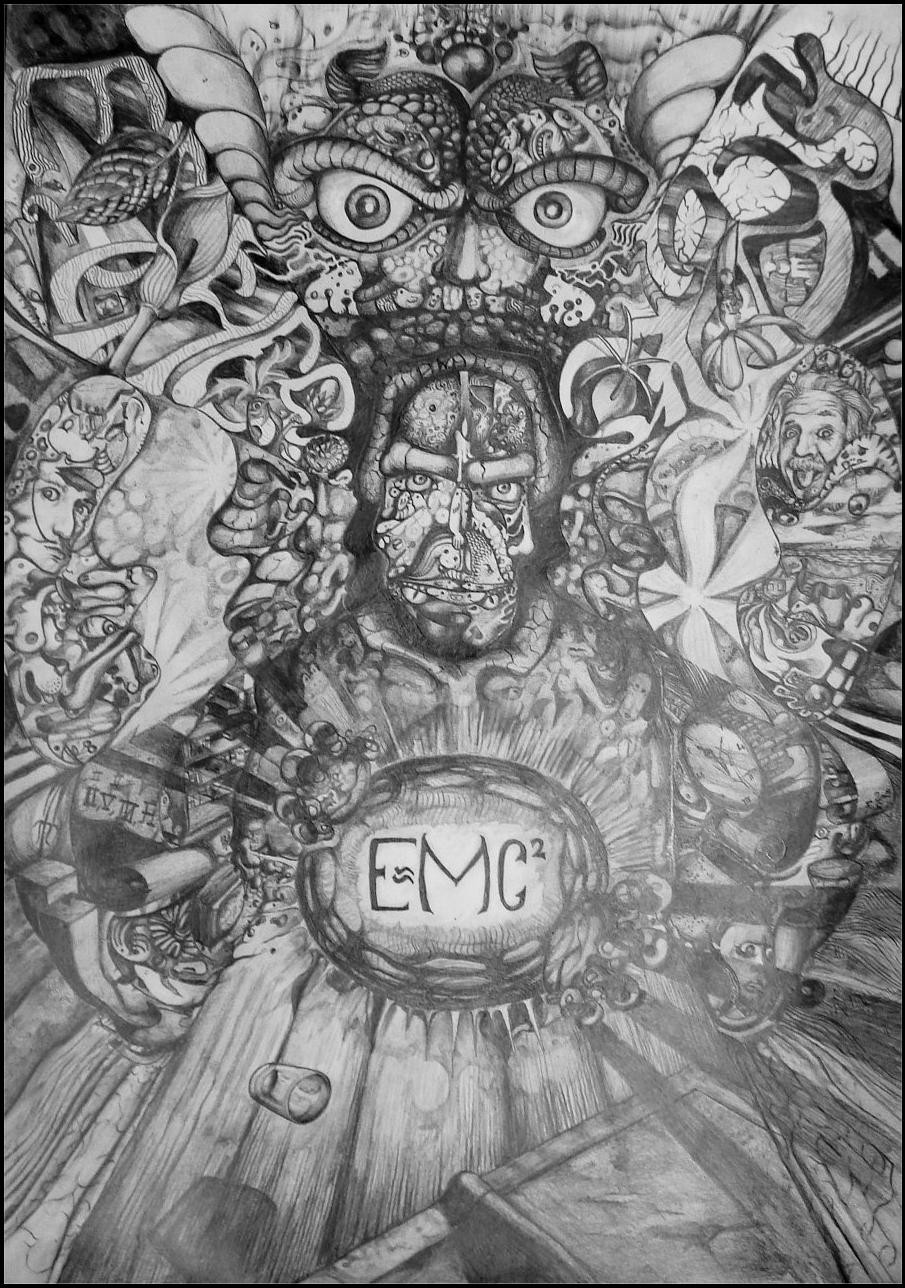
wow! this is amazing. i love all of the detail u put into it. i'll start from the top and head on down lol as i said i love the detial. great shading. awesome scary eyes at the top. i think one is a bit bigger than the other tho. i like how the things forming his mouth are just random. WHAT INSPIRED U? cool little letters onthe side. maybe next time make them a bit more readable, u know? lov how they're all little doodles. i caught little funny-faced einstein in the mix. 
👍: 0 ⏩: 1
Oh thanks  (Smile)")
And I'll keep the letters in mind as well. The text to the left says "Escher" (as in M.C. Escher, who made work such as this one: [link] ) and the text to the right, which is mirrored, says "Yerka" (as in Yerka Jacek, who make pictures like this one: [link] ).
Thanks for the comment!
👍: 0 ⏩: 1
ohh! see, u got so lost in ur creativity u confused URSELF! XDD but that's what i love about this peice.
ohhh now i see what it says!
no problem. ^^
👍: 0 ⏩: 1

Well, I cannot say that this isn't just super awesome, but it's practically a slop. The pencil seems to make it much to messy, adding that it's a little too swervy. So, don't redo it in pen or anything, but try going over it with a mechanical pencil or so. The whole peice seems somewhat dulled, you agree? Just my two cents. Great job.
👍: 0 ⏩: 1
Yes, now the dullness of this one might partially be caused by the not-so-good photography (it's really damn hard to take photos of a graphite drawing without getting a unwanted luster in it, when you have a regular cheap digital camera), but it is a slop. I agree. I like doing slops though
👍: 0 ⏩: 0

that looks incredible.. it would have taken you ages to make this one
favd
👍: 0 ⏩: 1
More like a fortnight. Thanks
👍: 0 ⏩: 0

that's pretty intense. Looks like you put a lot of work into it
👍: 0 ⏩: 1

I love the textures, how long did this take you?
👍: 0 ⏩: 1
I can't remember, I worked on it for periods of 1-3 hours a little now an then for about 1½ week I think. Thanks for commenting
👍: 0 ⏩: 0

Awesome, its one of the best graphite pieces i've seen
👍: 0 ⏩: 1
Why, I'm honored. Thanks, and cheers!
👍: 0 ⏩: 0


great piece, I love scientific psychedelic artwork
👍: 0 ⏩: 0
