HOME | DD
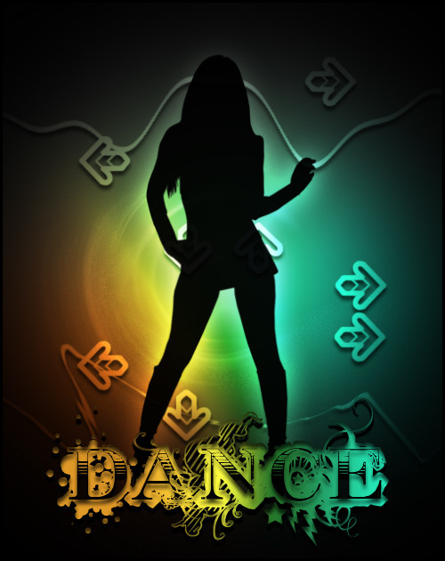
 B2A — Definitely Not Wimpy Pink

Published: 2003-10-14 19:04:00 +0000 UTC; Views: 400; Favourites: 2; Downloads: 147
Redirect to original
Description
Finished this earlier than expected. I wanted to do some more work on it but was afraid I might ruin it if it got too busy. This is one of the few pieces where the outcome was purely accidental. I didn't set out to do a symmetrical thing - started out with that pink circle in the middle then doodled the curls around it and well, yeah you can see what it soon turned into. So if it isnt really vishnu or any hindu god, that is because it isnt supposed to be.Wholly done on illustrator.
The file itself is pretty big so it might take a while to load but please full view.
Related content


Comments: 22
 (Smile)")

That sucks.
just kidding
getting in touch with your kaling roots eh... lol
👍: 0 ⏩: 1

wtf. k ling roots? gettin in touch with all the shah rukh khans of the world lol
")
👍: 0 ⏩: 0

Being a minimalistic/functionalistic person the sort of kitshy hindu-art is a bit too much for me. But this makes me change my mind a bit!
👍: 0 ⏩: 0


wow i really love this
i was thinking of doing the same thing ;]
👍: 0 ⏩: 0

This would make a cool rug, or probably better as a scarf. The detail on this is amazing, the preview view does no justice to this beautiful image.
👍: 0 ⏩: 0

THIS reminded me why I love vector art... It's so perfectly detailed, and I love how everything blends together so well with the common color theme. You hit this one right on the button, the whole concept is great and so well executed... just excellent stuff, that's all I can say
👍: 0 ⏩: 0

The attention to detail is great, very impressive. I've dabbled with the 'hindu' theme before in my work - the details and design, but it's quite hard to do. You've done a great job here.
I understand the pink scheme as a 'style' kinda thing, but my honest opinion is that the figures should stand out MORE - more impact. I think there should be more contrast. At the moment it kinda feels like a background tile or something like that, and there's so much more to it!
All up this is some amazing work. I think this is my favorite of yours so far
👍: 0 ⏩: 0

the detail in that piece is great, some good stuff there
👍: 0 ⏩: 0

Amazing indeed. You have talent to be envious about. Tis Awesome ^^
👍: 0 ⏩: 0

DAAAAAAM, the detail is insane on this this. everything is so well done
👍: 0 ⏩: 0
DAAAAAAM, the detail is insane on this this. everything is so well dont
👍: 0 ⏩: 0


very very very very CCOOOOOOOOOOOOOOOL!!! nice colour and design!
I DIG!
")
👍: 0 ⏩: 0
