HOME | DD
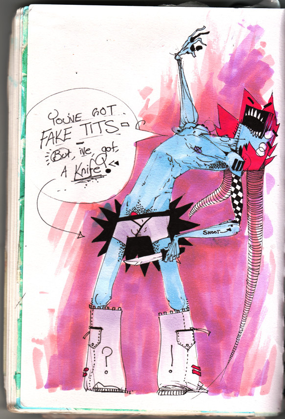
 b33lz3bub — an august portrait

Published: 2007-08-15 13:47:03 +0000 UTC; Views: 3178; Favourites: 109; Downloads: 51
Redirect to original
Description
an accident that continues to grow~b

Related content


Comments: 22


 (Wink)")

It's a great accident that continues to grow (this may have been said a few times before, there are too many comments to read through, lol).
👍: 0 ⏩: 0

the shading / colour is soooo right, has a real nice texture and pop to it.
👍: 0 ⏩: 0


i love the word chomp. it's so funny sounding out loud. love the colors...and nosepicking
👍: 0 ⏩: 1


Sweet, I love it ")

👍: 0 ⏩: 1

thanks for your comments linzi n_n

👍: 0 ⏩: 0

Hey, this could be a nice cover for a music album!
👍: 0 ⏩: 0


I love the non-arm. and the use of the colour is hella-good. keep up the good work.
👍: 0 ⏩: 0

Love the teal in this one. YAY FOR COLORS RIGHT?
And classy, picking one's nose with the most useless finger on the hand. <3 Class XD
One thing I think I love most about your style I have to say, is the lack of linework in places. Like on the arms a lot of times and the heads. It just gives the idea of "You know it's there, shut up <3" And that's really nice how you work that
haha nice shirt. and also, love the hips and neck areas D:
")
👍: 0 ⏩: 1
thank you =] im glad you like that about it haha, i just find it helps the aesthetic of my works to draw them the way i do
👍: 0 ⏩: 0


I've always loved your work mate. When i first saw i though "ah grainy" But it worked as i scrolled down. Love the colours. Think the grainy effect could be added to the text to keep the contrast even.
Great work dude
👍: 0 ⏩: 0

I really like the craziness of your linework, not to mention your characters.
👍: 0 ⏩: 0

Wow. That's really nicely done. A lot of emotion comes through and I like it.
 (Smile)")
👍: 0 ⏩: 0