HOME | DD
 BackAlleyScrapper — Anole Colors
Published: 2008-10-05 15:38:22 +0000 UTC; Views: 4085; Favourites: 56; Downloads: 183
Redirect to original
Description
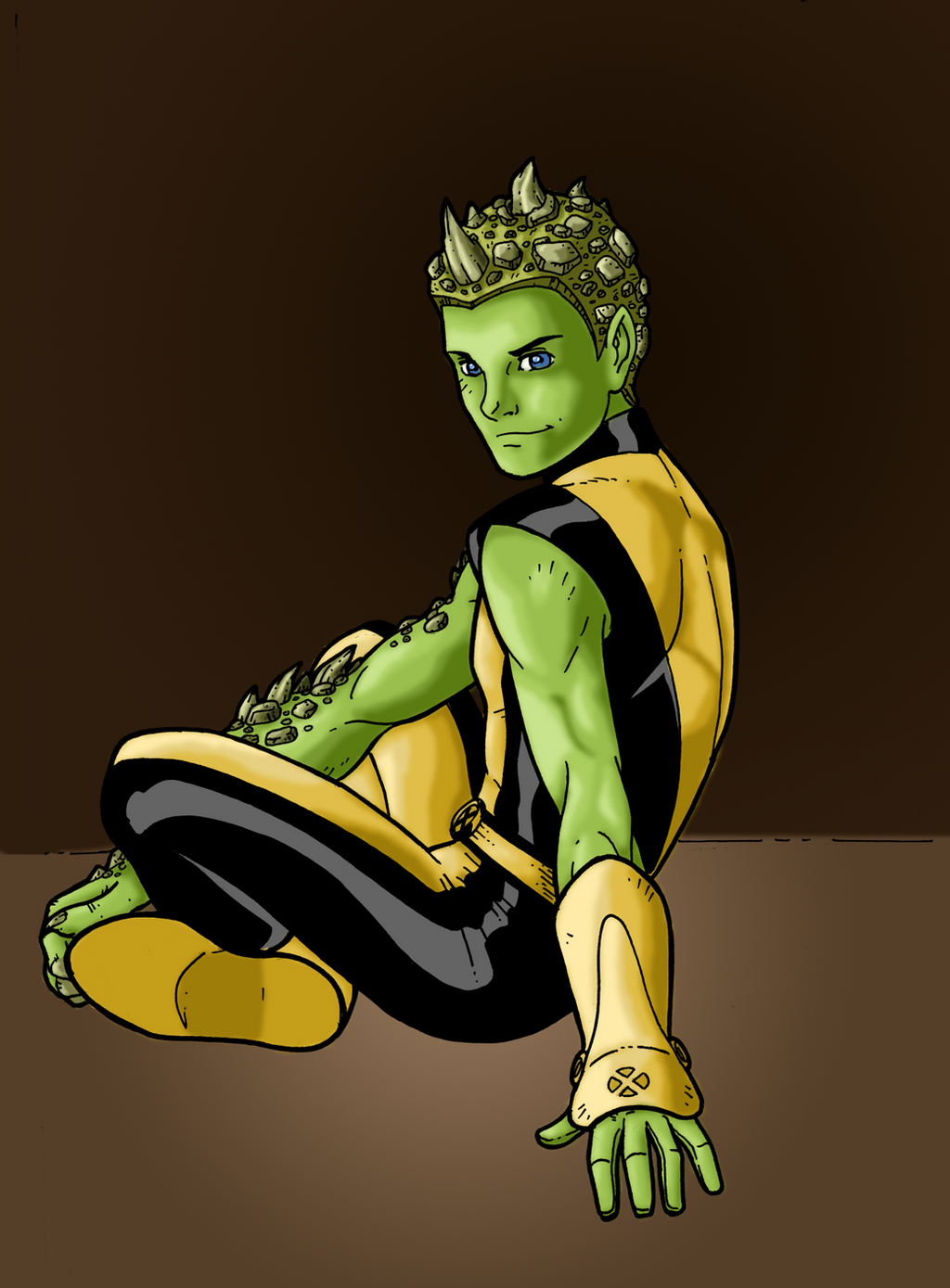
Original inks byI got permission to color this piece by WindRiderx23, so I took a shot at it.
This is Anole from New X-Men.
")
Anole and New X-Men (C) Marvel Comics
Original Inks (C) WindRiderx23
Related content


Comments: 23

Good job on the coloring, love it. I like the shading as well...although...I thought his eyes were green.
👍: 0 ⏩: 0


Thanks a lot!
👍: 0 ⏩: 0

cool stuff, my friend!! i agree with what says. you should try going in and making some adjustments on it. have fun with it. after looking through your gallery you can see a definite progression in your work!!
👍: 0 ⏩: 1
Thanks for your kind words, I really appreciate them coming from someone as talented as you  (Smile)")
👍: 0 ⏩: 1
cool let me know when its done!
👍: 0 ⏩: 0

hey hey! that is lookin pretty good sir. i like where ur headed. it seems u've got the basic idea of where shadows fall and that's a great place to start. the cool thing about that guy's art is that he leaves a lot of open space to place ur colors so u can put your light source just about anywhere. one important tip that my high school art teacher taught me was to not be afraid to make the dark spots really dark and the light spots really light. sometimes, when u do it right, it adds just that much depth to the finished piece.
r u getting more comfortable with photoshop?
👍: 0 ⏩: 1
Thanks a lot
Yeah I'm getting a lot more comfortable with photoshop, even if it is my crapped-out Elements 3 version 
")
👍: 0 ⏩: 0

I like what your doing with the colors. keep at it
👍: 0 ⏩: 1

You are getting SO much better! I took a break from watching things for a while and the difference between this and the last thing I saw from you is amazing. Don't be afraid of the white highlights! You've got talent, keep up the good work!
👍: 0 ⏩: 1
Thanks very much, Sun! It really means a lot, I always deeply appreciate your kind words
👍: 0 ⏩: 1
Just don't forget me when you're a famous colorist
 (Wink)")
👍: 0 ⏩: 1
Lol, of course not
👍: 0 ⏩: 0


Oh man, this is really amazing. You've come so far on your color work, it's incredible.
Sharpness and softness of shading is important for the texture you're coloring, so a sharper deliniation on the more metallic or shiny surfaces, versus a soft, consistant gradiation on 'natural' skin or cloth would change this a little bit.
I love it, though. Really great work!
👍: 0 ⏩: 1
Thanks! Yeah, thats a good point.. The uniform should probably have more striking highlights.. I'll keep that in mind for the next time
👍: 0 ⏩: 0

Good coloring. One thing I've noticed in your coloring is you tend to make highlights and shades by taking the base color and adding white or black. While this isn't necessarily bad, imo your color work can come more alive if you pick an actual darker hue of whatever color. Like if you wanted a darker shade of red, you would literally paint a darker red--rather than adding a low-opacity black "shade" layer over the base red layer.
Just some advice. Keep up the work. I'm always interested to see you progress. :]
👍: 0 ⏩: 1
Thanks for the advice
👍: 0 ⏩: 0
