HOME | DD

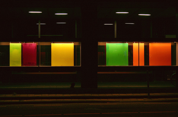
BadTrash — Direction

Published: 2005-06-08 08:52:36 +0000 UTC; Views: 707; Favourites: 19; Downloads: 76
Redirect to original
Description sorry it's dirty =/
Related content
Comments: 34

fortunecookie289 [2005-11-04 01:09:53 +0000 UTC]

I think the dirt adds to the composition. If it wasn't there, I probably would have thought it was computer generated (the colors are so vibrant!)

👍: 0 ⏩: 1

BadTrash In reply to fortunecookie289 [2005-11-05 08:45:43 +0000 UTC]

thank you :}

👍: 0 ⏩: 0

djairin [2005-10-26 16:09:41 +0000 UTC]

Awesome shot

👍: 0 ⏩: 1

BadTrash In reply to djairin [2005-10-27 08:02:22 +0000 UTC]

thanks

👍: 0 ⏩: 0

ErzebethBathory [2005-08-17 00:33:30 +0000 UTC]

love the cropping and tones... nice composition

👍: 0 ⏩: 1

BadTrash In reply to ErzebethBathory [2005-08-17 16:20:43 +0000 UTC]

thank you

👍: 0 ⏩: 0

wwjd [2005-08-15 16:04:32 +0000 UTC]

Ooh I really like the colora and all the shapes and stuff YEAH.

👍: 0 ⏩: 1

BadTrash In reply to wwjd [2005-08-15 17:05:40 +0000 UTC]

thanks

👍: 0 ⏩: 1

wwjd In reply to BadTrash [2005-08-15 17:53:44 +0000 UTC]

Your welcome.

👍: 0 ⏩: 0

rubberman542 [2005-07-03 12:40:29 +0000 UTC]

Simple and wonderful, I love it!

Great shot!

👍: 0 ⏩: 1

BadTrash In reply to rubberman542 [2005-07-03 13:04:33 +0000 UTC]

thank you

👍: 0 ⏩: 0

lydiahudgens [2005-06-11 15:58:31 +0000 UTC]

Dirty is as dirty does.

Lovely, as always.

👍: 0 ⏩: 1

BadTrash In reply to lydiahudgens [2005-06-11 17:48:06 +0000 UTC]


thanks

👍: 0 ⏩: 0

anagoge [2005-06-09 01:07:44 +0000 UTC]

The dirt adds something to it.

👍: 0 ⏩: 1

BadTrash In reply to anagoge [2005-06-09 11:12:24 +0000 UTC]

👍: 0 ⏩: 0

bosniak [2005-06-08 21:52:19 +0000 UTC]

excellent concept !

👍: 0 ⏩: 1

BadTrash In reply to bosniak [2005-06-08 22:39:59 +0000 UTC]

thanks =]

👍: 0 ⏩: 0

justpolly [2005-06-08 20:14:22 +0000 UTC]

tis as neat a sign as iv ever seen

👍: 0 ⏩: 1

BadTrash In reply to justpolly [2005-06-08 22:41:58 +0000 UTC]

hehe

👍: 0 ⏩: 0

lukeroberts [2005-06-08 16:16:05 +0000 UTC]

I really like this. It reminds me a bit of a Mondrian painting with the black lines and use of primary colours. It's like a dirty, rounded, urban, Mondrian photo... Anyway, i really like it

👍: 0 ⏩: 1

BadTrash In reply to lukeroberts [2005-06-08 16:18:51 +0000 UTC]

hehe thank you

👍: 0 ⏩: 0

bupo [2005-06-08 15:07:29 +0000 UTC]

maybe it's so nice also cause it's dirty

👍: 0 ⏩: 1

BadTrash In reply to bupo [2005-06-08 15:54:50 +0000 UTC]


👍: 0 ⏩: 0

lllariaPiX [2005-06-08 14:10:10 +0000 UTC]

lovely crop and choice of shot!! the dirt adds lot of interest in contrast with pure colors...

👍: 0 ⏩: 1

BadTrash In reply to lllariaPiX [2005-06-08 15:53:10 +0000 UTC]

ye i'm glad you all like the dirtnyness ^^

thank you

👍: 0 ⏩: 0

crono3 [2005-06-08 13:41:18 +0000 UTC]

the dirt is one of the best parts, it adds some interest and contrast to the otherwise smooth, bright colors. nice composition... you got some cool negative space going on here like it!

👍: 0 ⏩: 1

BadTrash In reply to crono3 [2005-06-08 15:52:35 +0000 UTC]

thank you

👍: 0 ⏩: 0

Sekabin [2005-06-08 11:16:15 +0000 UTC]

When I was at school, it was the 'thing to do' to take (sometimes) abandoned road signs and stick them on your wall. I had a huge sign that said 'This Way Only'.

I love this deviation; I think the dirt adds to it. What is the point of having a sterile sign? Signs are used let's show their usedness

👍: 0 ⏩: 2

strawby In reply to Sekabin [2005-06-08 19:31:57 +0000 UTC]

i have a no smoking sign i stole from school in my bedroom...

and this is cool! i would have preferred it cropped a bit...not sure

👍: 0 ⏩: 0

BadTrash In reply to Sekabin [2005-06-08 15:47:21 +0000 UTC]

hehe thanks, glad you like the dirtiness

👍: 0 ⏩: 0

scaber [2005-06-08 10:54:46 +0000 UTC]

A great abstract shot. Congratulations on spotting and capturing it so well.

👍: 0 ⏩: 1

BadTrash In reply to scaber [2005-06-08 15:45:50 +0000 UTC]

thank you sir

👍: 0 ⏩: 0

bashcorpo [2005-06-08 09:47:26 +0000 UTC]

dirrty..

those are just killer colors! reminds me a little of sweden there, hehe ^^
i like the black lines from the sign itself, mixing in with your added borders... great shot once again honey!

👍: 0 ⏩: 1

BadTrash In reply to bashcorpo [2005-06-08 15:44:46 +0000 UTC]

hehehe thank you ^^

👍: 0 ⏩: 0