HOME | DD

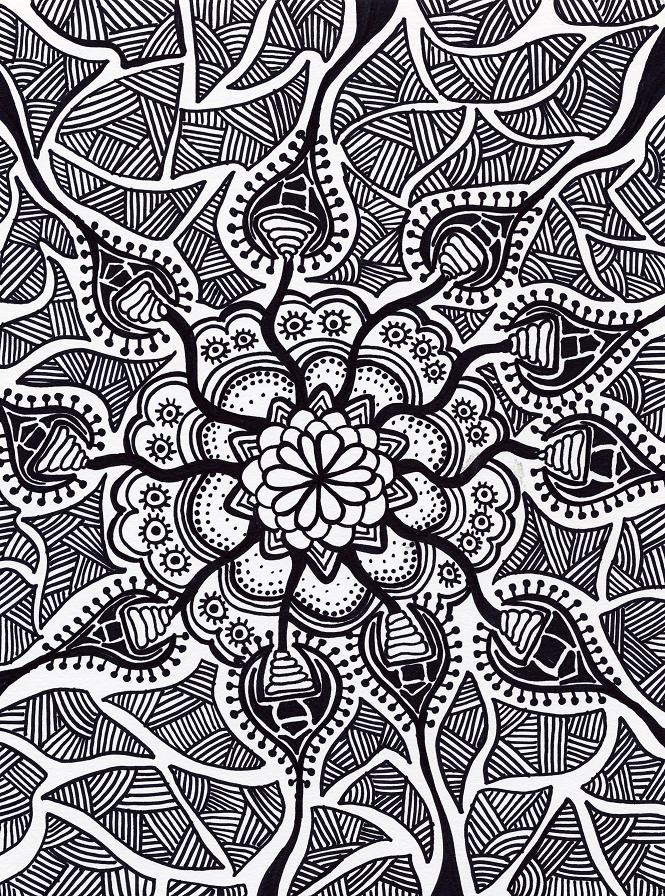
ballofplasma — Ascent inverted

Published: 2007-08-23 14:23:39 +0000 UTC; Views: 1104; Favourites: 17; Downloads: 36
Redirect to original
Description I think I might actually like the inverted version better. Opinion?
Related content
Comments: 22

hypomicro [2008-09-29 03:07:44 +0000 UTC]

great work!

👍: 0 ⏩: 1

ballofplasma In reply to hypomicro [2008-09-29 12:42:42 +0000 UTC]

thanks so much! and i appreciate the fav

👍: 0 ⏩: 0

scottfacon [2008-04-27 16:59:17 +0000 UTC]

I agree, It's wonderful! It reminds me of a scratch drawing this way. Very nice.

👍: 0 ⏩: 0

EvilTHelL [2007-12-31 09:23:20 +0000 UTC]

Yeah, I like the inverted one more I usually like to split these kinds of things though, so you get half/part inverted, and part normal - so you can expereince both.

- THL

👍: 0 ⏩: 1

ballofplasma In reply to EvilTHelL [2007-12-31 17:25:55 +0000 UTC]

interesting, i will check it out. thanks for looking

👍: 0 ⏩: 0

stone-sky [2007-09-23 10:17:15 +0000 UTC]

i want her to suck me in

👍: 0 ⏩: 1

ballofplasma In reply to stone-sky [2007-09-23 16:49:19 +0000 UTC]

haha...thank you, i guess?

👍: 0 ⏩: 0

marcoed-com [2007-09-22 05:56:17 +0000 UTC]

Wow! Very striking design. The details are abundant and greatly precise. Certainly, is another font of inspiration for me.

Marco

👍: 0 ⏩: 1

ballofplasma In reply to marcoed-com [2007-09-23 16:49:50 +0000 UTC]

thanks, i appreciate it! i worked very hard on this one.

👍: 0 ⏩: 0

sprat [2007-09-11 01:30:45 +0000 UTC]

I like it better inverted, although why choose one? I think you ought to post another deviation with both of them side by side. instant favorite.

👍: 0 ⏩: 1

ballofplasma In reply to sprat [2007-09-11 11:55:00 +0000 UTC]

haha, thank you! no real reason for a choice...i mean, the original will always be white. One of my friends wanted a print for a gift and I really liked the inverted, so I was just trying to gauge the overall response.

👍: 0 ⏩: 0

ChrisOneill [2007-09-04 04:58:08 +0000 UTC]

I don't even know what one I like better, both are amazing,

👍: 0 ⏩: 0

LindenRose [2007-08-25 01:52:21 +0000 UTC]

Excellent work of art! This is my favourite version of this picture.

👍: 0 ⏩: 0

cityofthemolepeople [2007-08-24 01:05:51 +0000 UTC]

awesome, reminds me of Alex Gray

👍: 0 ⏩: 1

ballofplasma In reply to cityofthemolepeople [2007-08-24 03:48:36 +0000 UTC]

there's no higher compliment, so thank you!

👍: 0 ⏩: 1

cityofthemolepeople In reply to ballofplasma [2007-08-24 22:15:01 +0000 UTC]

hah, quite welcome, he truly is the master...

👍: 0 ⏩: 0

Nekosxe [2007-08-23 14:31:51 +0000 UTC]

it looks sweet!

👍: 0 ⏩: 1

ballofplasma In reply to Nekosxe [2007-08-23 14:39:47 +0000 UTC]

thanks, much appreciated!

👍: 0 ⏩: 0

yibinna [2007-08-23 14:24:40 +0000 UTC]

great detail! the border thing is well thought-out

👍: 0 ⏩: 1

ballofplasma In reply to yibinna [2007-08-23 14:26:07 +0000 UTC]

haha wow! way to comment within seconds of posting. I appreciate you looking!

👍: 0 ⏩: 0

AshtreeJ [2007-08-23 14:24:28 +0000 UTC]

I like this. It looks awesome. Great job. ^^

~A.J.

👍: 0 ⏩: 1

ballofplasma In reply to AshtreeJ [2007-08-23 14:26:28 +0000 UTC]

thanks!

👍: 0 ⏩: 0