HOME | DD
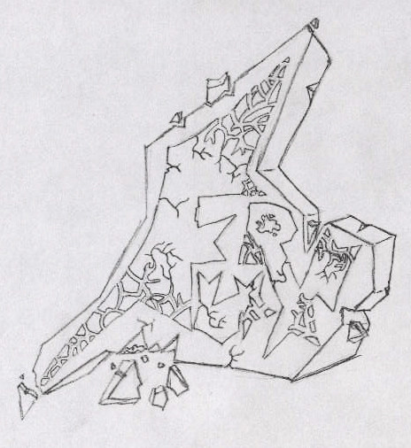
 bamjamble — Quink - Dice

Published: 2004-12-12 02:59:43 +0000 UTC; Views: 102; Favourites: 1; Downloads: 26
Redirect to original
Description
alright to start off, this was somewhat an experiment... i was combining technological 2d styles with graffiti, im not sure if this turned out good.... or bad. secondly i chose to leave it in black and white becasue of 2 reasons, i was feelin impatient, and i couldnt get a good color theme-a-majig... and lastly the handstyle next to this is shit, for some reason i couldnt get it right...please tell me how to improve this!!
Related content


Comments: 8

I'm pretty lost where this is concerned... the concpet is good, but... I dunno, man. I wish I could say something that makes sense, but I honestly can't right now... sorry, dude.
👍: 0 ⏩: 0

whoa that is crazy, man! as you know im not an expert on Graffiti...but I like this one...Exellent work
👍: 0 ⏩: 0

the mix of 2D and 3D work in this, so don't beat yourself up totally over it. Honestly, I have to say I like it. The complication is cool cause we all know you can do the basic shit. Not bad altogether!
👍: 0 ⏩: 1

this looks a bit complicated. well i guess still a good tried. keep it up.
")
👍: 0 ⏩: 0

start with simple letter forms first... the details come later
👍: 0 ⏩: 1

yea i know what im doin... i just decided to try sumthin crazy..
👍: 0 ⏩: 0
man ..... i just found like 10 screw ups in this....
👍: 0 ⏩: 0