HOME | DD
 Baro — Signals
Published: 2006-04-17 10:14:23 +0000 UTC; Views: 11027; Favourites: 255; Downloads: 832
Redirect to original
Description
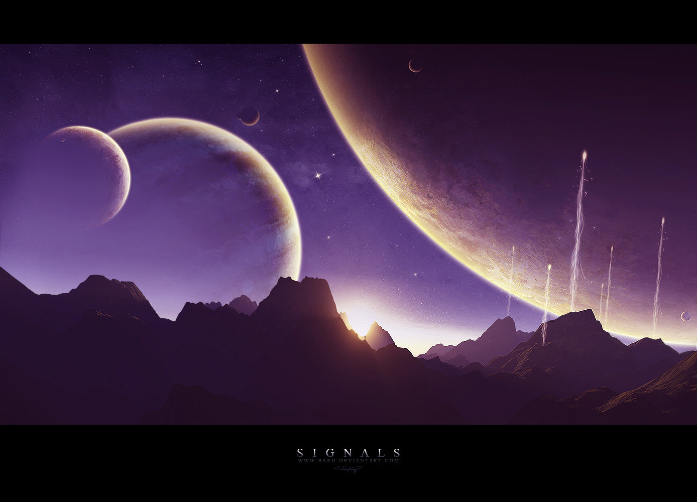
What can i tell you about this one? It's purple") .
.I worked on it for three days on and off. A lot of the time just staring at my monitor, trying to figure out what i could improve or what would make the picture more interesting...
(and I'm not talking about the signal lights). And even after I had almost finished, it still took me about two hours to get it looking like this.
Nevertheless I enjoyed working on it a lot and I am very satisfied with the result.
Please don't give me any comments about stuff like: thats not realistic...
and yes, i do know that the landscape is not horizontal...
Layers: 200+
Programs: terragen (original render size 4000x1600)
+ photoshop cs (original size 2000x1600)
comments and
 's are very appreciated.
enjoy.
Related content


Comments: 106


 (Smile)")
Awsome work done here bro!
👍: 0 ⏩: 0

I really like this one.
The lights on the two larger planets to the left IMO should probably have been on the bottom right of the planet towards the sun, though.
👍: 0 ⏩: 1

yeah the lighting isn't that correct... but glad you like it anyway
👍: 0 ⏩: 0


Very nice and cleam design.. the planets are very nice texturized..finially some good space art
👍: 0 ⏩: 1
👍: 0 ⏩: 0


Actually, the non-horizontal terrain gives the render a feeling like it's actually been photographed by a handheld camera because it's nearly impossible to take a level picture unless you have an expensive tripod.
👍: 0 ⏩: 1
that wasn't actually my aim, but i guess it could be seen like that. thank you for you're comment.
👍: 0 ⏩: 0

Beautiful attention to detail. This imagery is so vivid it makes me think of the U2 song "Even Better Than The Real Thing". Great piece
👍: 0 ⏩: 1

i must say going through your gallery and then seeing where you have progressed is definatly nifty.
i like the purple.
cool beans yo.
👍: 0 ⏩: 1
thanks a lot. glad to hear that
👍: 0 ⏩: 0

The purple's awesome!!!111oneoneoneeleveone
Great picture!
👍: 0 ⏩: 1

WOW, this is amazing. I'm looking at your gallery and I'm stunned...
👍: 0 ⏩: 1
thank you for looking then ^^
👍: 0 ⏩: 0


You've just motivated me to get crackin' on more spacescenes.
Thanks Baro.
👍: 0 ⏩: 1
^^ glad i could help you with that.
👍: 0 ⏩: 0

great work, the planet textures are amazing, i happen to like the horizontal texture on the middle planet. lighting is great and the light star field in the background is perfect too.
only thing that stands out to me is the lighting on the left planets, seems to be on the wrong parts of the planets. but what do i know?
anyway,
keep up the great work.
👍: 0 ⏩: 1
glad you like it. yeah the lightning is not 100% mathematical correct, but i guess it would look something like this...
thx for xou're comment.
👍: 0 ⏩: 1
not a problem.
regardless of the extremely minor flaws, this piece is top notch.
👍: 0 ⏩: 0

Incredibly well done all around.
👍: 0 ⏩: 1


Good choices made on those signal flares - although they look a bit like they were taken from an abstract art tutorial (you know, the tiwrly bits) i think you used them well. The diagonal direction works nicely.
THe only thing that puts me off is the kinda confused lighting on the planets...
👍: 0 ⏩: 1
thx for you're comment. very glad you like this even though you have at least double the skill. is it bad that they look like they came from a tutorial? (they didn't btw
in my defence about the lighting: i didn't want the scene to look to dark, so i put a little more light in there than what would be accurate. I agree though that it doesn't look very naturalistic or realistic.
👍: 0 ⏩: 1
Well 1. Yeah those flares look like they have that kinda tutorial look to em, abstract-ey tutorial. 2. In my experience, although I don't usually consider realism TOO much, keeping all the planets lit from the same source/sources is cruicial.
👍: 0 ⏩: 1
well i tried to make it look like the light comes from the sun in the middle. did i make some horrible mistakes ")
👍: 0 ⏩: 2
Yeha the two left planets seem like they are being lit from somewhere towards the top of the piece. This contrasts ALOT to the small moons lighting set ups.
👍: 0 ⏩: 0
okay now i see what you mean a little more...
👍: 0 ⏩: 0

Wow, this is absolutely stunning. The detail on the planets is so realistic. I'm going to take your advice and try making a planet with 50 layers, see if it turns out better than what I've been trying. 
And for the sake of constructive critisism: I thought the little tree on the mountainside was a nice touch, but something about it is a little awkward. Maybe because there's no other trees, or it just seems over-large? It's kinda cool though, I like it a lot. xD
But anyway, great job. The planets, the stars, the landscape -- everything in this amounts to a beautiful piece.

👍: 0 ⏩: 1
okay. i allready made an attempt to write an answer to this, but i did not succeed oO.
for starters: thx for this comment. I'm glad you like it.
to say something about the textures: I usually build my textures with the clone tool. Of course you will allways have a few layers that are overlay or soft light etc. but i personally don't think you can create a planet texture as a whole just by combining different textures and switching the blend modes. mostly i have a "base texture" which shows the main characteristics of the texture. but you allways will need a lot of extra layers to bring the planet texture to perfection. just create a new layer for everything you want to change about the texture. try varyations in color, lightning, or try and highlight specific areas of the bas texture. I also think it's important to expreiment with the night-side and day-side of the planet. maybe the texture is not just darker on the night side, but shows parts of the texture in a different way than the day-side. or some parts of the landscape are more visible in the shadow than others. just try everything that comes to mind and you will easily have a 20-30 layer planet and 3 different variations of the final planet you will want to decide between.
I hope i was able to help you a little. if you have more specific questions just send me a note or add me to you're msn...
cya
👍: 0 ⏩: 1
Thank you, this is very helpful. ^^
👍: 0 ⏩: 0

The landscape isn't horizontal and its not realistic AT ALL!
Seriouosly, I'm TOTALLY digging that starscape.
I just went and had another look and something jumped out at me. The margin between the terrain on the left and the sky... there's a bright line! By the look it has something to do with the blending. a little work eith the eraser should fix it right up
Diggin' it, though. Totally.
👍: 0 ⏩: 1
thx a lot. this too is a helpfull and pleasing comment.
i didn't notice that line, so thanks for helping me out there.
glad you like it otherwise. ^^
👍: 0 ⏩: 0

When I see art like this, I sometimes wish mankind was colonizing space already.
The edges of the mountains on the left and right seem more jagged than those in the center, while the center seems to have an unnatural sort of blur. Maybe you can use a tool like Blur or Smudge to get rid of those jagged edges a bit. Furthermore, the signals don't look very random...judging from the sparks falling off of them, they are all the same. My suggestion would be to put a little bit of variation in them, even if it's just very subtle.
I really like the way you have put the planets, the sun and the signals in it. The large planets and the thought of a reason for the signals being fired give a slight feeling of discomfort, while the sun, the sky and the tranquility of the landscape would really make one feel at ease.
I have been wondering how you create such beautiful planetary bodies in Photoshop (I myself use the GIMP  (Wink)")
Once more, a very nice job.
👍: 0 ⏩: 1
thx a lot for the tips and you're opinion. these cinds of comments are exactly what i need.
in my defense
about the signals lights: they are all the same (shame on me), but i changed a view things on every single one to try and get them to look more individual. obviously this didn't work as much as i had hoped X). it just took me so long to create the first of them that i was too lazy to go through all that five moe times... (i guess i need to learn to be more patient)
i am glad you faved this after all. thx for that aswell.
and to say something about photoshop. it's all about trying not to use some standart procedure, which never varies at all. each piece of art has to be created and treated seperately. but to get a little concret. the thing i personally had to learn about and put work into to improve is the texturing and lighning of a planet. every planet i make has to apply to different rules concerning atmosphere texture and enviroment. Don't be scared to make a planet that has 50 layers. I think i completely removed the actual big planet that i originally used just in the process of getting it right for the image as a whole.
i don't know if that helped in any way. if you have specific questions just send me a note or add me to msn and we can talk...
(please don't think i consider myself to be the guru of space art. i just tried to reflect on how i get my spaceart the way it is...).
thx again for the comment dude, cu around...
👍: 0 ⏩: 1
You're welcome man.
And thanks for the tips, I'll keep trying.
The mountains look better now too, now that you've done some editing on the jagged white edges.

👍: 0 ⏩: 1
| Next =>